Chartbook on Hispanic Health Care: Slide Presentation—Part 3
2014 National Healthcare Quality and Disparities Report
Trends in Access and Priorities of the National Quality Strategy
Slide 1
National Healthcare Quality and Disparities Report Chartbook on Health Care for Hispanics
Part 3: Trends in Access and Priorities of the National Quality Strategy
Slide 2
2014 QDR Chartbooks
- 2014 QDR supported by a series of related chartbooks that:
- Present information on individual measures.
- Are updated annually.
- Are posted on the Web (http://www.ahrq.gov/research/findings/nhqrdr/2014chartbooks/).
- Order and topics of chartbooks:
- Access to care.
- Priorities of the National Quality Strategy.
- Access and quality of care for priority populations.
Note:
- Information on individual measures is available through chartbooks posted on the Web (http://www.ahrq.gov/research/findings/nhqrdr/2014chartbooks/).
Slide 3
Six Chartbooks Organized Around Priorities of the National Quality Strategy
- Making care safer by reducing harm caused in the delivery of care.
- Ensuring that each person and family is engaged as partners in their care.
- Promoting effective communication and coordination of care.
- Promoting the most effective prevention and treatment practices for the leading causes of mortality, starting with cardiovascular disease.
- Working with communities to promote wide use of best practices to enable healthy living.
- Making quality care more affordable for individuals, families, employers, and governments by developing and spreading new health care delivery models.
Slide 4
Other Chartbooks Organized Around AHRQ's Priority Populations
- AHRQ's priority populations, specified in the Healthcare Research and Quality Act of 1999 (Public Law 106-129):
- Racial and ethnic minority groups.
- Low-income groups.
- Women.
- Children (under age 18).
- Older adults (age 65 and over).
- Residents of rural areas.
- Individuals with special health care needs, including:
- Individuals with disabilities.
- Individuals who need chronic care or end-of-life care.
Slide 5

National Healthcare Quality and Disparities Report Chartbook on Health Care for Hispanics
Part 3: Trends in Access and Priorities of the National Quality Strategy
Access to Health Care
Slide 6
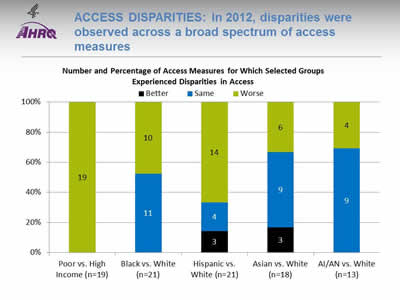
Access Disparities: In 2012, disparities were observed across a broad spectrum of access measures
Image: Chart shows Number and Percentage of Access Measures for Which Selected Groups Experienced Disparities in Access. Poor vs. High Income (n=19): Worse - 19. Black vs. White (n=21): Same - 11; Worse - 10. Hispanic vs. White (n=21): Better - 3; Same - 4; Worse - 14. Asian vs. White (n=18)): Better - 3; Same - 9; Worse - 6. AI/AN vs. White (n=13): Same - 9; Worse - 4.
- Key: AI/AN = American Indian or Alaska Native; n = number of measures.
- Note: Poor indicates family income less than the Federal poverty level; High Income indicates family income four times the Federal poverty level or greater. Numbers of measures differ across groups because of sample size limitations. Measures that achieve an overall performance level of 95% or better are not reported in the QDR and are not included in these analyses. Because disparities are typically eliminated when overall performance reaches 95%, our analyses may overstate the percentage of measures exhibiting disparities.
The relative difference between a selected group and its reference group is used to assess disparities.
- Better = Population had better access to care than reference group. Differences are statistically significant, are equal to or larger than 10%, and favor the selected group.
- Same = Population and reference group had about the same access to care. Differences are not statistically significant or are smaller than 10%.
- Worse = Population had worse access to care than reference group. Differences are statistically significant, are equal to or larger than 10%, and favor the reference group.
Example: Compared with Whites, Hispanics had worse access to care on 14 of the 21 access measures, similar access on 4 measures, and better access on 3 measures.
- Groups With Disparities:
- People in poor households experienced the largest number of disparities, followed by Hispanics and Blacks.
- In 2012, people in poor households had worse access to care than people in high-income households on all access measures (green).
- Blacks had worse access to care than Whites for about half of access measures.
- Hispanics had worse access to care than Whites for two-thirds of access measures.
- Asians and American Indians and Alaska Natives had worse access to care than Whites for about one-third of access measures.
Slide 7
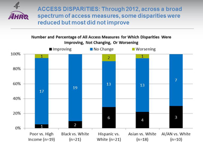
Access Disparities: Through 2012, across a broad spectrum of access measures, some disparities were reduced but most did not improve
Image: Chart shows Number and Percentage of All Access Measures for Which Disparities Were Improving, Not Changing, Or Worsening. Poor vs. High Income (n=19): Improving - 1; Not Changing - 17; Worsening - 1. Black vs. White (n=21): Improving - 2; Not Changing - 19. Hispanic vs. White (n=21): Improving - 6; Not Changing - 13; Worsening - 2. Asian vs. White (n=18): Improving - 4; Not Changing - 13; Worsening - 1. AI/AN vs. White (n=10): Improving - 3; Not Changing - 7.
Key: AI/AN = American Indian or Alaska Native; n = number of measures.
Note: Poor indicates family income less than the Federal poverty level; High Income indicates family income four times the Federal poverty level or greater. Numbers of measures differ across groups because of sample size limitations. For the vast majority of measures, trend data are available from 2001-2002 to 2012.
For each measure, average annual percentage changes were calculated for select populations and reference groups. Measures are aligned so that positive rates indicate improvement in access to care. Differences in rates between groups were used to assess trends in disparities.
- Worsening = Disparities are getting larger. Differences in rates between groups are statistically significant and reference group rates exceed population rates by at least 1% per year.
- No Change = Disparities are not changing. Differences in rates between groups are not statistically significant or differ by less than 1% per year.
- Improving = Disparities are getting smaller. Differences in rates between groups are statistically significant and population rates exceed reference group rates by at least 1% per year.
- Disparity Trends:
- Through 2012, most disparities in access to care related to race, ethnicity, or income showed no significant change (blue), neither getting smaller nor larger.
- In four of the five comparisons shown above, the number of disparities that were improving (black) exceeded the number of disparities that were getting worse (green).
Slide 8
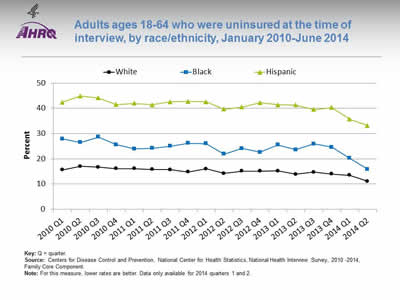
Adults ages 18-64 who were uninsured at the time of interview, by race/ethnicity, January 2010-June 2014
Image: Graph shows adults ages 18-64 who were uninsured at the time of interview:
| Quarter | Hispanic | White | Black |
|---|---|---|---|
| 2010 Q1 | 42.4 | 15.6 | 27.9 |
| 2010 Q2 | 44.9 | 17 | 26.5 |
| 2010 Q3 | 44.1 | 16.7 | 28.6 |
| 2010 Q4 | 41.5 | 16.1 | 25.6 |
| 2011 Q1 | 42 | 16.1 | 23.9 |
| 2011 Q2 | 41.4 | 15.8 | 24.2 |
| 2011 Q3 | 42.6 | 15.7 | 25 |
| 2011 Q4 | 42.7 | 14.8 | 26.2 |
| 2012 Q1 | 42.6 | 16 | 26 |
| 2012 Q2 | 39.7 | 14.2 | 21.9 |
| 2012 Q3 | 40.5 | 15.1 | 24.1 |
| 2012 Q4 | 42.2 | 15.1 | 22.6 |
| 2013 Q1 | 41.4 | 15.2 | 25.5 |
| 2013 Q2 | 41.3 | 13.9 | 23.6 |
| 2013 Q3 | 39.5 | 14.7 | 25.9 |
| 2013 Q4 | 40.3 | 14 | 24.6 |
| 2014 Q1 | 35.7 | 13.5 | 20.2 |
| 2014 Q2 | 33.2 | 11.1 | 15.9 |
Key: Q = quarter.
Source: Centers for Disease Control and Prevention, National Center for Health Statistics, National Health Interview Survey, 2010 -2014, Family Core Component.
Note: For this measure, lower rates are better. Data only available for 2014 quarters 1 and 2.
- Trends: All racial/ethnic groups displayed a decrease from 2013 Q4 to 2014 Q2:
- White: 14.0% to 11.1%.
- Black: 24.6% to 15.9%.
- Hispanic: 40.3% to 33.2%.
- Groups With Disparities: Hispanic adults ages 18-64 were significantly more likely than Whites to be uninsured from January 2010 to June 2014. The percentage peaked in the second quarter of 2010 at 44.9%, then significantly decreased to 33.2% for the second quarter of 2014.
Slide 9
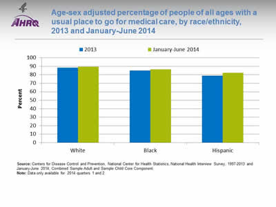
Age-sex adjusted percentage of people of all ages with a usual place to go for medical care, by race/ethnicity, 2013 and January-June 2014
Image: Chart shows age-sex adjusted percentage of people of all ages with a usual place to go for medical care. White: 2013 - 88.3; January-June 2014 - 89.3. Black: 2013 - 85; January-June 2014 - 86.5. Hispanic: 2013 - 79; January-June 2014 - 82.2.
Source: Centers for Disease Control and Prevention, National Center for Health Statistics, National Health Interview Survey, 1997-2013 and January-June 2014, Combined Sample Adult and Sample Child Core Component.
Note: Data only available for 2014 quarters 1 and 2.
- Groups With Disparities:
- From January to June 2014, after adjustment for age and sex, the percentage of people with a usual place to go for medical care was 82.2% for Hispanics, 89.3% for Whites, and 86.5% for Blacks.
- In both years, Hispanics were less likely to have a usual place to go for medical care compared with Blacks and Whites.
Slide 10
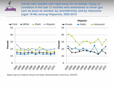
Adults who needed care right away for an illness, injury, or condition in the last 12 months who sometimes or never got care as soon as wanted, by race/ethnicity and by insurance (ages 18-64) among Hispanics, 2002-2012
Image: Graphs show adults who needed care right away for an illness, injury, or condition in the last 12 months who sometimes or never got care as soon as wanted:
Left Graph:
| Race/Ethnicity | 2002 | 2003 | 2004 | 2005 | 2006 | 2007 | 2008 | 2009 | 2010 | 2011 | 2012 |
|---|---|---|---|---|---|---|---|---|---|---|---|
| Total | 15.3 | 14.3 | 14.2 | 15.1 | 15.3 | 13.9 | 15.4 | 14.7 | 14.4 | 13.6 | 14.7 |
| Hispanic | 25.8 | 20.6 | 19.6 | 17.7 | 20.6 | 19.3 | 17.7 | 20.4 | 18.1 | 18.9 | 20.2 |
| White | 12.9 | 12.4 | 12.1 | 12.8 | 13.8 | 12 | 13.5 | 12.5 | 12.6 | 11.9 | 12.9 |
| Black | 18.9 | 18.6 | 17.5 | 20.9 | 16.5 | 17.7 | 22.7 | 19.9 | 16.6 | 15.7 | 17.2 |
Right Graph:
| Insurance | 2002 | 2003 | 2004 | 2005 | 2006 | 2007 | 2008 | 2009 | 2010 | 2011 | 2012 |
|---|---|---|---|---|---|---|---|---|---|---|---|
| Private | 20.8 | 14.9 | 15.0 | 16.3 | 17.9 | 17.3 | 16.6 | 15.4 | 12.4 | 17.8 | 14.1 |
| Public | 23.7 | 19.9 | 21.3 | 18.1 | 20.8 | 18.5 | 15.6 | 24.8 | 13.7 | 18.7 | 23.3 |
| Uninsured | 41.1 | 38.4 | 31.5 | 26.0 | 30.6 | 31.2 | 28.3 | 29.7 | 34.1 | 25.8 | 33.4 |
Source: Agency for Healthcare Research and Quality, Medical Expenditure Panel Survey, 2002-2012.
Note:
- Trends: From 2002 to 2012, the percentage of adults who needed care right away who sometimes or never got care as soon as wanted did not change overall or for any racial/ethnic group.
- Groups With Disparities:
- From 2010 to 2012, Hispanics were less likely than Whites to receive care as soon as wanted.
- In all years, uninsured Hispanic adults were less likely than privately insured Hispanic adults to receive needed care right away for an illness, injury, or condition in the last 12 months.
Slide 11
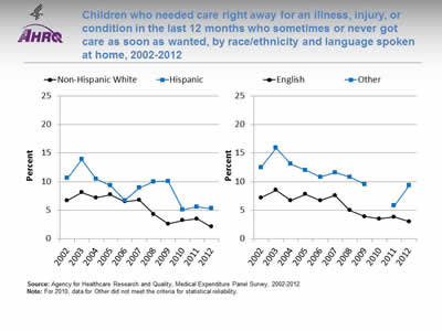
Children who needed care right away for an illness, injury, or condition in the last 12 months who sometimes or never got care as soon as wanted, by race/ethnicity and language spoken at home, 2002-2012
Image: Graphs show children who needed care right away for an illness, injury, or condition in the last 12 months who sometimes or never got care as soon as wanted:
Left Graph:
| Year | Hispanic | Non-Hispanic White |
|---|---|---|
| 2002 | 10.6 | 6.7 |
| 2003 | 13.9 | 8.1 |
| 2004 | 10.5 | 7.2 |
| 2005 | 9.3 | 7.7 |
| 2006 | 6.7 | 6.5 |
| 2007 | 8.9 | 6.8 |
| 2008 | 10.0 | 4.3 |
| 2009 | 10.1 | 2.6 |
| 2010 | 5.1 | 3.2 |
| 2011 | 5.6 | 3.5 |
| 2012 | 5.3 | 2.1 |
Right Graph:
| Year | English | Other |
|---|---|---|
| 2002 | 7.2 | 12.5 |
| 2003 | 8.5 | 15.9 |
| 2004 | 6.7 | 13.1 |
| 2005 | 7.8 | 12 |
| 2006 | 6.7 | 10.8 |
| 2007 | 7.6 | 11.6 |
| 2008 | 5 | 10.8 |
| 2009 | 3.9 | 9.5 |
| 2010 | 3.5 | |
| 2011 | 3.8 | 5.8 |
| 2012 | 3 | 9.3 |
Source: Agency for Healthcare Research and Quality, Medical Expenditure Panel Survey, 2002-2012.
Note: For 2010, data for Other did not meet the criteria for statistical reliability.
- Trends: From 2007 to 2012, Hispanic children were less likely than non-Hispanic White children to get care as soon as wanted.
- Groups With Disparities:
- In 2012, the percentage of children who needed care right away who sometimes or never got care as soon as wanted was 9.3% for those who spoke a language other than English and 3.0% for those who spoke English.
- In all years, English-speaking children were less likely than children speaking other languages to have problems receiving care as soon as wanted.
Slide 12
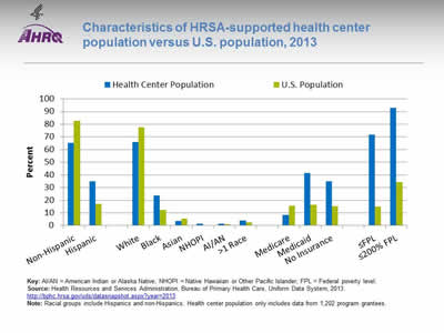
Characteristics of HRSA-supported health center population versus U.S. population, 2013
Image: Chart shows characteristics of HRSA-supported health center population versus U.S. population:
| Characteristic | Health Center Population | U.S. Population |
|---|---|---|
| Non-Hispanic | 65.2 | 82.9 |
| Hispanic | 34.8 | 17.1 |
| White | 66 | 77.7 |
| Black | 23.8 | 12.2 |
| Asian | 3.6 | 5.3 |
| NHOPI | 1.3 | 0.2 |
| AI/AN | 1.4 | 1.2 |
| >1 Race | 3.9 | 2.4 |
| Medicare | 8.4 | 15.7 |
| Medicaid | 41.5 | 16.4 |
| No Insurance | 34.9 | 15.4 |
| =FPL | 71.9 | 15 |
| =200% FPL | 92.8 | 34.2 |
Key: AI/AN = American Indian or Alaska Native; NHOPI = Native Hawaiian or Other Pacific Islander; FPL = Federal poverty level.
Source: Health Resources and Services Administration, Bureau of Primary Health Care, Uniform Data System, 2013. http://bphc.hrsa.gov/uds/datasnapshot.aspx?year=2013.
Note: Racial groups include Hispanics and non-Hispanics. Health center population only includes data from 1,202 program grantees.
- Groups With Disparities:
- In 2013, 71.9% of the health center population was at or below the Federal poverty level compared with 15% of the U.S. population. The health center population also had higher percentages of uninsurance (34.9%) and Medicaid enrollment (41.5%) than the U.S. population (15.4% and 16.4%, respectively).
- In 2013, slightly more than one-third (34.8%) of the health center population was Hispanic, which was twice as much as the percentage in the U.S. population (17.1%). The percentage of Blacks at the health centers was nearly one-quarter (23.8%), nearly twice as much as the percentage in the U.S. population (12.2%).
Slide 13
AHRQ Health Care Innovations in Access to Health Care
- Location: Primarily in rural areas of northern Colorado.
- Population: Mexican immigrants, many of whom are poor, uninsured, and monolingual with limited education.
- Intervention: Reduce health disparities by providing medical and dental care, referrals, and patient education.
- Outcomes: Enhanced access to needed medical care and education in a population who had no other way to access such services.
Slide 14

National Healthcare Quality and Disparities Report Chartbook on Health Care for Hispanics
Part 3: Trends in Access and Priorities of the National Quality Strategy
National Quality Strategy Priorities
Slide 15
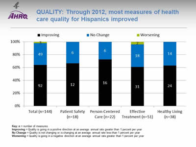
Quality: Through 2012, most measures of health care quality for Hispanics improved
Image: Chart shows measures of health care quality for Hispanics. Total (n=144): Worsening - 3; No Change - 49; Improving - 92. Patient Safety (n=18): No Change - 6; Improving - 12. Person-Centered Care (n=22): No Change - 6; Improving - 16. Effective Treatment (n=51): Worsening - 2; No Change - 18; Improving - 31. Healthy Living (n=38): No Change - 14; Improving - 24.
Key: n = number of measures
Improving = Quality is going in a positive direction at an average annual rate greater than 1 percent per year.
No Change = Quality is not changing or is changing at an average annual rate less than 1 percent per year.
Worsening = Quality is going in a negative direction at an average annual rate greater than 1 percent per year.
Note:
- Quality of care for Hispanics:
- Improved for 64% (92 out of 144) of the measures.
- Worsened for 2% (3 out of 144) of the measures.
- Did not change for 34% (49 out of 144) of the measures.
- Among the NQS priorities, quality of care for Hispanics:
- Improved for 67% (12 of 18) of Patient Safety measures and did not change for 33% (6 of 18).
- Improve for 73% (16 of 22) of Person-Centered Care measures and did not change for 27% (6 of 22).
- Improved for 61% (31 of 51) of Effective Treatment measures, worsened for 4% (2 of 51), and did not change for 35% (18 of 51).
- Improved for 63% (24 of 38) of Healthy Living measures and did not change for 37% (14 of 38).
- There are insufficient numbers of reliable measures of Care Coordination and Care Affordability to summarize in this way.
Slide 16
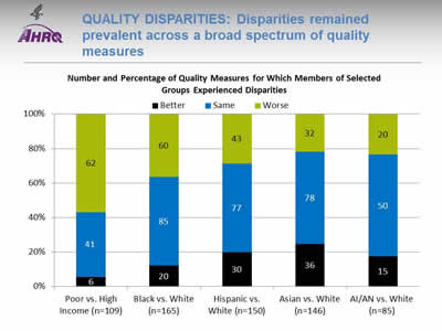
Quality Disparities: Disparities remained prevalent across a broad spectrum of quality measures
Image: Chart shows Number and Percentage of Quality Measures for Which Members of Selected Groups Experienced Disparities. Poor vs. High Income (n=109): Better - 6; Same - 41; Worse - 62. Black vs. White (n=165): Better - 20; Same - 85; Worse - 60. Hispanic vs. White (n=150): Better - 30; Same - 77; Worse - 43. Asian vs. White (n=146): Better - 36; Same - 78; Worse - 32. AI/AN vs. White (n=85): Better - 15; Same - 50; Worse - 20.
Key: AI/AN = American Indian or Alaska Native; n = number of measures.
Note: Poor indicates family income less than the Federal poverty level; High Income indicates family income four times the Federal poverty level or greater. Numbers of measures differ across groups because of sample size limitations. For most measures, data from 2012 are shown. Measures that achieve an overall performance level of 95% or better are not reported in the QDR and are not included in these analyses. Because disparities are typically eliminated when overall performance reaches 95%, our analyses may overstate the percentage of measures exhibiting disparities.
The relative difference between a selected group and its reference group is used to assess disparities.
- Better = Population received better quality of care than reference group. Differences are statistically significant, are equal to or larger than 10%, and favor the selected group.
- Same = Population and reference group received about the same quality of care. Differences are not statistically significant or are smaller than 10%.
- Worse = Population received worse quality of care than reference group. Differences are statistically significant, are equal to or larger than 10%, and favor the reference group.
- Groups With Disparities:
- People in poor households experienced the largest number of disparities, followed by Blacks and Hispanics.
- People in poor households received worse care than people in high-income households on more than half of quality measures (green).
- Blacks received worse care than Whites for about one-third of quality measures.
- Hispanics, American Indians and Alaska Natives, and Asians received worse care than Whites for some quality measures and better care for some measures.
- For each group, disparities in quality of care are similar to disparities in access to care, although access problems are more common than quality problems.
Slide 17
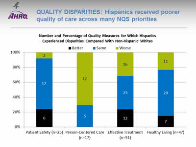
Quality Disparities: Hispanics received poorer quality of care across many NQS priorities
Image: Chart shows Number and Percentage of Quality Measures for Which Hispanics Experienced Disparities Compared With Non-Hispanic Whites. Patient Safety (n=25): Better - 6; Same - 17; Worse - 2. Person-Centered Care (n=17): Same - 5; Worse - 12. Effective Treatment (n=51): Better - 12; Same - 23; Worse - 16. Healthy Living (n=47): Better - 7; Same - 29; Worse - 11.
Key: n = number of measures.
Note: For most measures, data from 2012 are shown. Measures that achieve an overall performance level of 95% or better are not reported in the QDR and are not included in these analyses. Because disparities are typically eliminated when overall performance reaches 95%, our analyses may overstate the percentage of measures exhibiting disparities.
The relative difference between a selected group and its reference group is used to assess disparities.
- Better = Population received better quality of care than reference group. Differences are statistically significant, are equal to or larger than 10%, and favor the selected group.
- Same = Population and reference group received about the same quality of care. Differences are not statistically significant or are smaller than 10%.
- Worse = Population received worse quality of care than reference group. Differences are statistically significant, equal to or larger than 10%, and favor the reference group.
- Groups With Disparities:
- Hispanics received worse care for 70% of Person-Centered Care measures.
- Hispanics received worse care for about 30% of measures of Effective Treatment and Healthy Living.
- Hispanics received worse care for 8% of Patient Safety measures.
Slide 18
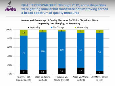
Quality Disparities: Through 2012, some disparities were getting smaller but most were not improving across a broad spectrum of quality measures
Image: Chart shows Number and Percentage of Quality Measures for Which Disparities Were Improving, Not Changing, or Worsening. Poor vs. High Income (n=98): Worsening - 13; No Change - 76; Improving - 9. Black vs. White (n=148): Worsening - 9; No Change - 126; Improving - 13. Hispanic vs. White (n=130): Worsening - 5; No Change - 109; Improving - 16. Asian vs. White (n=123): Worsening - 9; No Change - 97; Improving - 17. AI/AN vs. White (n=64): Worsening - 5; No Change - 55; Improving - 4.
Key: AI/AN = American Indian or Alaska Native; n = number of measures.
Note: Poor indicates family income less than the Federal poverty level; High Income indicates family income four times the Federal poverty level or greater. Numbers of measures differ across groups because of sample size limitations. For the majority of measures, trend data are available from 2001-2002 to 2012.
For each measure, average annual percentage changes were calculated for select populations and reference groups. Measures are aligned so that positive rates indicate improvement in access to care. Differences in rates between groups were used to assess trends in disparities.
- Worsening = Disparities are getting larger. Differences in rates between groups are statistically significant and reference group rates exceed population rates by at least 1% per year.
- No Change = Disparities are not changing. Differences in rates between groups are not statistically significant or differ by less than 1% per year.
- Improving = Disparities are getting smaller. Differences in rates between groups are statistically significant and population rates exceed reference group rates by at least 1% per year.
- Disparity Trends:
- Through 2012, most disparities in quality of care related to race, ethnicity, or income showed no significant change (blue), neither getting smaller nor larger.
- When changes in disparities occurred, measures of disparities were more likely to show improvement (black) than decline (green). However, for people in poor households, more measures showed worsening disparities than improvement.
Slide 19
Quality Disparities: Several quality measures showed elimination or widening of Hispanic-White disparities
- One quality measure showed elimination of a Hispanic-White disparity:
- Adults with obesity who ever received advice from a health professional about eating fewer high-fat foods.
- Two quality measures showed widening of Hispanic-White disparities:
- Hospice patients who received care consistent with their stated end-of-life wishes.
- Hospice patients who received the right amount of medicine for pain management.
Slide 20
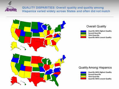
Quality Disparities: Overall quality and quality among Hispanics varied widely across States and often did not match
Image: Two maps of the United States are color-coded by state to compare overall quality and quality among Hispanics.
Source: Agency for Healthcare Research and Quality, 2014 State Snapshots.
Note: An overall quality score is computed for each State based on the number of quality measures that are above, at, or below the average across all States; States are ranked and quartiles are shown in the top map. A quality score for Hispanics is computed in a similar manner but only using data for Hispanics. Go to State Snapshots at http://nhqrnet.ahrq.gov/inhqrdr/state/select for more detailed methods.
- Geographic Disparities:
- There was significant variation in overall quality among States. States in the New England, Middle Atlantic, West North Central, and Mountain census divisions tended to have higher overall quality (blue and green) while States in the South census region tended to have lower quality (yellow and red).
- There was also significant variation among States in quality for Hispanics. Hispanics tended to receive higher quality care in States in the South Atlantic and East South Central census divisions (blue and green) and lower quality care in States in the New England, Middle Atlantic, and West South Central census divisions (yellow and red).
- The variation in State performance on overall quality and among specific priority populations may point to differential strategies for improvement. States with high overall quality but poor quality for Hispanics might target this population for support; States with low overall quality and high quality for Hispanics might seek to improve care for everyone.
- The State Snapshots tool (http://nhqrnet.ahrq.gov/inhqrdr/state/select), part of the QDR Web site, focuses on variation across States and helps State health leaders, researchers, and consumers understand the status of health care in individual States and the District of Columbia. It is based on more than 100 QDR measures for which State estimates are possible.
Slide 21
National Healthcare Quality and Disparities Report Chartbook on Health Care for Hispanics
Part 3: Trends in Access and Priorities of the National Quality Strategy
NQS Priority:Patient Safety
Slide 22
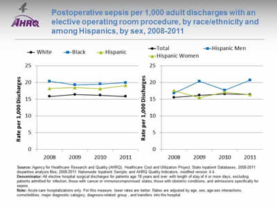
Postoperative sepsis per 1,000 adult discharges with an elective operating room procedure, by race/ethnicity and among Hispanics, by sex, 2008-2011
Image: Graphs show postoperative sepsis per 1,000 adult discharges with an elective operating room procedure:
Left Graph:
| Year | White | Hispanic | Black |
|---|---|---|---|
| 2008 | 15.9 | 18.2 | 20.4 |
| 2009 | 16.4 | 18.5 | 19.3 |
| 2010 | 16.2 | 18.2 | 19.6 |
| 2011 | 15.9 | 19.1 | 20.0 |
Right Graph:
| Year | Total | Hispanic Men | Hispanic Women |
|---|---|---|---|
| 2008 | 15.6 | 16.8 | 17.6 |
| 2009 | 16.2 | 20.4 | 15.5 |
| 2010 | 16.6 | 17.7 | 17.2 |
| 2011 | 16.4 | 20.7 | 16.4 |
Source: Agency for Healthcare Research and Quality (AHRQ), Healthcare Cost and Utilization Project, State Inpatient Databases, 2008-2011 disparities analysis files; 2008-2011 Nationwide Inpatient Sample; and AHRQ Quality Indicators, modified version 4.4.
Denominator: All elective hospital surgical discharges for patients age 18 years and over with length of stay of 4 or more days, excluding patients admitted for infection, those with cancer or immunocompromised states, those with obstetric conditions, and admissions specifically for sepsis.
Note: Acute care hospitalizations only. For this measure, lower rates are better. Rates are adjusted by age, sex, age-sex interactions, comorbidities, major diagnostic category, diagnosis-related group , and transfers into the hospital.
- Overall Rate: In 2011, the postoperative sepsis rate was 16.4 per 1,000 adult discharges with an elective operating room procedure.
- Trends: From 2008 through 2011, there were no statistically significant changes overall or for any racial/ethnic group in the rate of postoperative sepsis.
- Groups With Disparities:
- In all years, Hispanic patients and Black patients had higher rates of postoperative sepsis than their White counterparts.
- In 2009 and 2011, Hispanic men had higher rates of postoperative sepsis than Hispanic women.
- Groups With Disparities: From January 2009 through December 2011 combined, there were no statistically significant differences by language spoken in rates of postoperative sepsis.
Slide 23
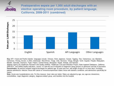
Postoperative sepsis per 1,000 adult discharges with an elective operating room procedure, by patient language, California, 2009-2011 (combined)
Image: Chart shows postoperative sepsis per 1,000 adult discharges with an elective operating room procedure by language: English - 11.84; Spanish - 10.54; API Languages - 14.44; Other Languages - 10.47.
Key: API = Asian and Pacific Islander; languages include Chinese, Hindi, Japanese, Korean, Tagalog, Thai, Vietnamese, Lao, Mandarin, Cantonese, Hmong, Ilocano, Iu Mien, Indonesian, Mon-Khmer, Tonga, Urdu, Burmese, Telugu, Bengali, Tamil, Gujarati, Panjabi, Malayalam, Marathi, Kannada, Chamorro, Fijian, Filipino, Central Khmer, Mongolian, Nepali, Sinhala, and Samoan.
Source: Agency for Healthcare Research and Quality (AHRQ), Healthcare Cost and Utilization Project, State Inpatient Databases, California, 2009-2011, and AHRQ Quality Indicators, version 4.5 with the use of indication of diagnoses being present on admission and day of procedure.
Denominator: All elective hospital surgical discharges for patients age 18 years and over with length of stay of 4 or more days, excluding patients admitted for infection, those with cancer or immunocompromised states, those with obstetric conditions, and admissions specifically for sepsis.
Note: Acute care hospitalizations only. For this measure, lower rates are better. Rates are adjusted by age, sex, age-sex interactions, comorbidities, major diagnostic category, diagnosis-related group, and transfers into the hospital.
- Groups With Disparities: From January 2009 through December 2011 combined, there were no statistically significant differences by language spoken in rates of postoperative sepsis.
Slide 24
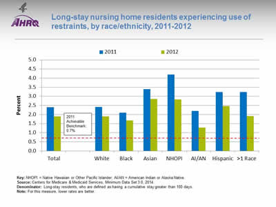
Long-stay nursing home residents experiencing use of restraints, by race/ethnicity, 2011-2012
Image: Chart shows long-stay nursing home residents experiencing use of restraints:
| Race/Ethnicity | 2011 | 2012 |
|---|---|---|
| Total | 2.4 | 1.9 |
| White | 2.4 | 1.9 |
| Black | 2.1 | 1.7 |
| Asian | 3.4 | 2.9 |
| NHOPI | 4.2 | 2.8 |
| AI/AN | 2.2 | 1.3 |
| Hispanic | 3.2 | 2.5 |
| >1 Race | 3.2 | 1.9 |
2011 Achievable Benchmark: 0.7%.
Key: NHOPI = Native Hawaiian or Other Pacific Islander; AI/AN = American Indian or Alaska Native.
Source: Centers for Medicare & Medicaid Services, Minimum Data Set 3.0, 2014.
Denominator: Long-stay residents, who are defined as having a cumulative stay greater than 100 days.
Note: For this measure, lower rates are better.
- Importance: Residents who are restrained daily can become weak, lose their ability to go to the bathroom by themselves, and develop pressure ulcers or other medical conditions.
- Overall Rate: In 2012, the percentage of long-stay nursing home residents who were physically restrained on a daily basis was 1.9%.
- Groups With Disparities:
- In 2012, Asians, Native Hawaiians and Other Pacific Islanders, and Hispanics had higher rates of daily restraint use compared with Whites.
- Blacks and American Indians and Alaska Natives had lower rates of daily restraint use compared with Whites.
- Achievable Benchmark:
- In 2011, the top 5 State achievable benchmark for restraint use was 0.7%. The States that contributed to the achievable benchmark are Kansas, Maine, Nebraska, New Hampshire, and Vermont.
- No group has achieved the benchmark.
Slide 25
National Healthcare Quality and Disparities Report Chartbook on Health Care for Hispanics
Part 3: Trends in Access and Priorities of the National Quality Strategy
NQS Priority: Person-Centered Care
Slide 26
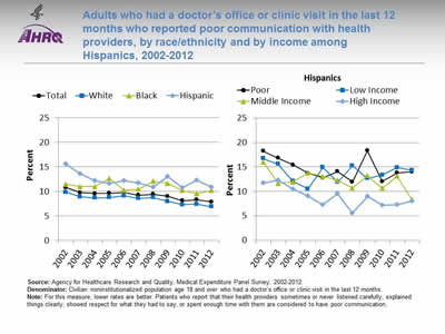
Adults who had a doctor's office or clinic visit in the last 12 months who reported poor communication with health providers, by race/ethnicity and by income among Hispanics, 2002-2012
Image: Graphs show adults who had a doctor's office or clinic visit in the last 12 months who reported poor communication with health providers:
Left Graph:
| Race/Ethnicity | 2002 | 2003 | 2004 | 2005 | 2006 | 2007 | 2008 | 2009 | 2010 | 2011 | 2012 |
|---|---|---|---|---|---|---|---|---|---|---|---|
| Total | 10.8 | 9.8 | 9.6 | 9.7 | 9.8 | 9.3 | 9.5 | 9.0 | 8.1 | 8.3 | 7.9 |
| White | 9.8 | 8.9 | 8.7 | 8.8 | 9.1 | 8.6 | 8.8 | 8.0 | 7.3 | 7.4 | 6.9 |
| Black | 11.5 | 11.0 | 11.0 | 12.7 | 10.3 | 10.5 | 12.1 | 11.7 | 10.2 | 9.6 | 10.2 |
| Hispanic | 15.6 | 13.6 | 12.2 | 11.7 | 12.2 | 11.8 | 10.9 | 13.0 | 10.8 | 12.3 | 10.9 |
Right Graph (Hispanics):
| Income | 2002 | 2003 | 2004 | 2005 | 2006 | 2007 | 2008 | 2009 | 2010 | 2011 | 2012 |
|---|---|---|---|---|---|---|---|---|---|---|---|
| Poor | 18.3 | 16.8 | 15.4 | 13.7 | 12.8 | 14.1 | 11.9 | 18.3 | 12.0 | 13.8 | 14.0 |
| Low Income | 16.7 | 15.6 | 12.1 | 10.5 | 14.9 | 11.9 | 15.3 | 12.7 | 13.4 | 14.9 | 14.3 |
| Middle Income | 16.0 | 11.6 | 11.9 | 13.8 | 13.1 | 12.3 | 10.7 | 13.2 | 10.6 | 13.1 | 8.3 |
| High Income | 11.7 | 12.3 | 10.5 | 9.1 | 7.3 | 9.6 | 5.6 | 9.0 | 7.2 | 7.3 | 8.0 |
Source: Agency for Healthcare Research and Quality, Medical Expenditure Panel Survey, 2002-2012.
Denominator: Civilian noninstitutionalized population age 18 and over who had a doctor's office or clinic visit in the last 12 months.
Note: For this measure, lower rates are better. Patients who report that their health providers sometimes or never listened carefully, explained things clearly, showed respect for what they had to say, or spent enough time with them are considered to have poor communication.
- Trends: From 2002 to 2012, the percentage of adults who reported poor communication with health providers significantly decreased for Whites, Hispanics, and all income groups. There were no statistically significant changes among Blacks.
- Groups With Disparities:
- In all years, Hispanics were significantly more likely than Whites to have poor communication with their health providers.
- In all years except 2006, Blacks were significantly more likely than Whites to have poor communication with their health providers.
- In all years except 2003, poor Hispanics were significantly more likely than high-income Hispanics to have poor communication with their health providers.
Slide 27
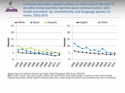
Children who had a doctor's office or clinic visit in the last 12 months whose parents reported poor communication with health providers, by race/ethnicity and language spoken at home, 2002-2012
Image: Graphs show children who had a doctor's office or clinic visit in the last 12 months whose parents reported poor communication with health providers:
Left Graph:
| Race/Ethnicity | 2002 | 2003 | 2004 | 2005 | 2006 | 2007 | 2008 | 2009 | 2010 | 2011 | 2012 |
|---|---|---|---|---|---|---|---|---|---|---|---|
| White | 5.6 | 4.8 | 4.8 | 4.4 | 4.2 | 4.2 | 4.0 | 3.6 | 3.1 | 2.7 | 3.3 |
| Black | 7.1 | 7.5 | 6.3 | 5.7 | 4.8 | 5.1 | 4.0 | 5.1 | 4.3 | 5.2 | 4.1 |
| Hispanic | 10.2 | 8.4 | 7.9 | 8.8 | 7.0 | 6.8 | 5.8 | 7.4 | 5.9 | 5.1 | 4.8 |
Right Graph:
| Language | 2002 | 2003 | 2004 | 2005 | 2006 | 2007 | 2008 | 2009 | 2010 | 2011 | 2012 |
|---|---|---|---|---|---|---|---|---|---|---|---|
| English | 6.3 | 5.6 | 5.4 | 5.0 | 4.6 | 4.5 | 4.1 | 4.3 | 3.8 | 3.6 | 3.5 |
| Other | 11.7 | 9.5 | 8.0 | 8.7 | 6.7 | 7.1 | 5.9 | 8.0 | 5.2 | 4.7 | 4.7 |
Source: Agency for Healthcare Research and Quality, Medical Expenditure Panel Survey, 2002-2012.
Note: For this measure, lower rates are better. Parents who report that their child's health providers sometimes or never listened carefully, explained things clearly, showed respect for what they had to say, or spent enough time with them are considered to have poor communication.
- Trends: From 2002 to 2012, the percentage of children whose parents reported poor communication with health providers significantly decreased for all racial/ethnic groups and both language groups.
- Ethnicity:
- Whites: 5.6% to 3.3%.
- Blacks: 7.1% to 4.1%.
- Hispanics: 10.2% to 4.8%.
- Preferred language:
- English: 6.3% to 3.5%.
- Other: 11.7% to 4.7%.
- Ethnicity:
- Groups With Disparities:
- In 2012, parents of Hispanic children were significantly more likely to report poor communication compared with parents of White children.
- Also in 2012, there were no statistically significant differences between Blacks and Whites or by preferred language.
Slide 28
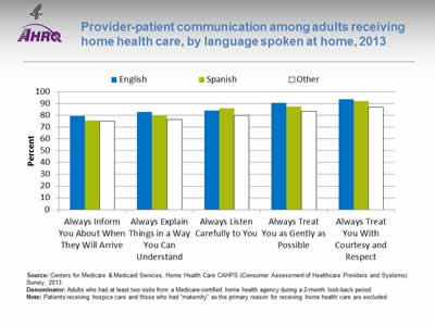
Provider-patient communication among adults receiving home health care, by language spoken at home, 2013
Image: Bar chart shows provider-patient communication among adults receiving home health care, by language spoken at home:
| Language | Always Inform You About When They Will Arrive | Always Explain Things in a Way You Can Understand | Always Listen Carefully to You | Always Treat You as Gently as Possible | Always Treat You With Courtesy and Respect |
|---|---|---|---|---|---|
| English | 79.6 | 83.1 | 84.3 | 90.7 | 93.8 |
| Other | 75.0 | 76.8 | 80.1 | 83.7 | 87.1 |
| Spanish | 75.7 | 80.4 | 86.2 | 87.5 | 92.3 |
Source: Centers for Medicare & Medicaid Services, Home Health Care CAHPS (Consumer Assessment of Healthcare Providers and Systems) Survey, 2013.
Denominator: Adults who had at least two visits from a Medicare-certified home health agency during a 2-month look-back period.
Note: Patients receiving hospice care and those who had "maternity" as the primary reason for receiving home health care are excluded
- Groups With Disparities:
- In 2013, compared with English speakers, adults speaking Spanish or another language at home were significantly less likely to:
- Always be informed about when their provider would arrive.
- Always have things explained in a way that was easy to understand.
- Always be treated as gently as possible.
- Always be treated with courtesy and respect.
- In 2013, compared with English speakers, adults speaking Spanish or another language at home were significantly less likely to:
- Adults speaking a language other than English or Spanish were significantly less likely than English- and Spanish-speaking adults to always have the provider listen carefully to them.
- Adults speaking Spanish at home were significantly more likely than English-speaking adults to report that the provider always listened carefully to them.
Slide 29
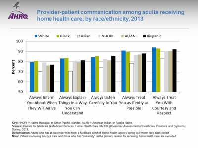
Provider-patient communication among adults receiving home health care, by race/ethnicity, 2013
Image: Bar chart shows provider-patient communication among adults receiving home health care:
| Race / Ethnicity | Always Inform You About When They Will Arrive | Always Explain Things in a Way You Can Understand | Always Listen Carefully to You | Always Treat You as Gently as Possible | Always Treat You With Courtesy and Respect |
|---|---|---|---|---|---|
| AI/AN | 76.2 | 79.5 | 81.4 | 87.2 | 90.4 |
| Asian | 70.5 | 70.7 | 74.1 | 78.4 | 83.0 |
| Black | 80.8 | 83.6 | 85.5 | 89.6 | 93.0 |
| NHOPI | 79.5 | 80.7 | 82.7 | 86.2 | 90.1 |
| White | 79.5 | 83.2 | 84.6 | 90.9 | 94.1 |
| Hispanic | 77.2 | 81.4 | 85.6 | 88.1 | 92.2 |
Key: NHOPI = Native Hawaiian or Other Pacific Islander; AI/AN = American Indian or Alaska Native.
Source: Centers for Medicare & Medicaid Services, Home Health Care CAHPS (Consumer Assessment of Healthcare Providers and Systems) Survey, 2013.
Denominator: Adults who had at least two visits from a Medicare-certified home health agency during a 2-month look-back period.
Note: Patients receiving hospice care and those who had "maternity" as the primary reason for receiving home health care are excluded.
- Groups With Disparities:
- In 2013, among home health care patients, compared with Whites:
- Asians, American Indians and Alaska Natives (AI/ANs), and Hispanics were significantly less likely to always be informed about when their provider would arrive.
- Asians, Native Hawaiians and Other Pacific Islanders (NHOPIs), AI/ANs, and Hispanics were significantly less likely to always have things explained in a way that was easy to understand.
- Asians, NHOPIs, and AI/ANs were significantly less likely to always be listened to carefully.
- Blacks, Asians, NHOPIs, AI/ANs, and Hispanics were significantly less likely to always be treated as gently as possible.
- Blacks, Asians, NHOPIs, AI/ANs, and Hispanics were significantly less likely to always be treated with courtesy and respect.
- In 2013, among home health care patients, compared with Whites:
Slide 30
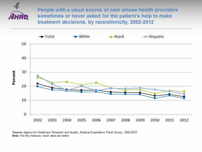
People with a usual source of care whose health providers sometimes or never asked for the patient's help to make treatment decisions, by race/ethnicity, 2002-2012
Image: Graph shows people with a usual source of care whose health providers sometimes or never asked for the patient's help to make treatment decisions:
| Race/Ethnicity | 2002 | 2003 | 2004 | 2005 | 2006 | 2007 | 2008 | 2009 | 2010 | 2011 | 2012 |
|---|---|---|---|---|---|---|---|---|---|---|---|
| Total | 21.9 | 18.9 | 17.7 | 17.2 | 17.3 | 15.9 | 15.6 | 15.4 | 13.2 | 14.3 | 12.7 |
| White | 19.9 | 17.5 | 16.8 | 15.9 | 16.1 | 14.5 | 14.3 | 14.2 | 11.5 | 13.4 | 11.5 |
| Black | 26.4 | 22.6 | 23.4 | 20.9 | 22.7 | 18.9 | 17.5 | 17.7 | 14.9 | 17 | 16.4 |
| Hispanic | 27.6 | 21.6 | 17.2 | 20 | 17 | 18.5 | 18.4 | 18.9 | 17.7 | 16.5 | 14.5 |
Source: Agency for Healthcare Research and Quality, Medical Expenditure Panel Survey, 2002-2012.
Note: For this measure, lower rates are better.
- Trends: Significant improvements were observed from 2002 to 2012:
- Total: 21.9% to 12.7%.
- Whites: 19.9% to 11.5%.
- Blacks: 26.4% to 16.4%.
- Hispanics: 27.6% to 14.5%.
- Groups With Disparities:
- In all years, Blacks were significantly less likely than Whites to be involved in their treatment decisions.
- In all years except 2004 and 2006, Hispanics were significantly less likely than Whites to be involved in their treatment decisions.
Slide 31
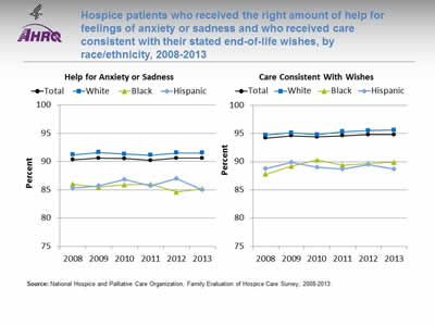
Hospice patients who received the right amount of help for feelings of anxiety or sadness and who received care consistent with their stated end-of-life wishes, by race/ethnicity, 2008-2013
Image: Graphs show hospice patients who received the right amount of help for feelings of anxiety or sadness and who received care consistent with their stated end-of-life wishes:
Left Graph (Help for Anxiety or Sadness):
| Race/Ethnicity | 2008 | 2009 | 2010 | 2011 | 2012 | 2013 |
|---|---|---|---|---|---|---|
| Total | 90.3 | 90.6 | 90.5 | 90.2 | 90.6 | 90.6 |
| White | 91.2 | 91.6 | 91.3 | 91.1 | 91.5 | 91.5 |
| Black | 86 | 85.5 | 85.9 | 86 | 84.6 | 85.2 |
| Hispanic | 85.3 | 85.7 | 86.8 | 85.7 | 87 | 85 |
Right Graph (Care Consistent With Wishes):
| Race/Ethnicity | 2008 | 2009 | 2010 | 2011 | 2012 | 2013 |
|---|---|---|---|---|---|---|
| Total | 94.2 | 94.6 | 94.4 | 94.6 | 94.8 | 94.8 |
| White | 94.7 | 95.1 | 94.8 | 95.3 | 95.5 | 95.6 |
| Black | 87.8 | 89.2 | 90.3 | 89.4 | 89.7 | 89.9 |
| Hispanic | 88.8 | 89.9 | 89 | 88.7 | 89.5 | 88.7 |
Source: National Hospice and Palliative Care Organization, Family Evaluation of Hospice Care Survey, 2008-2013.
Note:
- Help for Anxiety or Sadness:
- Trends: From 2008 to 2013, there were no statistically significant changes by race/ethnicity in the percentage of hospice patients who received the right amount of help for feelings of anxiety or sadness.
- Groups With Disparities: In 2013, Hispanics and Blacks were significantly less likely than Whites to receive the right amount of help for feelings of anxiety or sadness.
- Care Consistent With Stated Wishes:
- Trends: From 2008 to 2013, the percentage of hospice patients age 65 and over who received care consistent with their stated end-of-life wishes significantly improved from 94.4% to 95.1% (data not shown). From 2008 to 2013, White (94.7% to 95.6%) and Black (87.8% to 89.9%) hospice patients showed significant improvement, whereas Hispanics showed no statistically significant changes during this period.
- Groups With Disparities: In 2013, Black and Hispanic hospice patients were significantly less likely than White patients to receive care consistent with their stated end-of-life wishes.
Slide 32
AHRQ Health Care Innovations in Hospice Care
- Location: Boca Raton, Florida.
- Population: Hispanic patients and families.
- Intervention: Abriendo Puertas featured cultural competency training for all staff; a dedicated, bilingual care team; and outreach to educate local Hispanics and their physicians about the availability and purpose of hospice services.
- Outcomes: Enhanced awareness of, attitudes about, and willingness to accept hospice services among Hispanics, as well as improved cultural competency among staff.
Slide 33
National Healthcare Quality and Disparities Report Chartbook on Health Care for Hispanics
Part 3: Trends in Access and Priorities of the National Quality Strategy
NQS Priority: Care Coordination
Slide 34
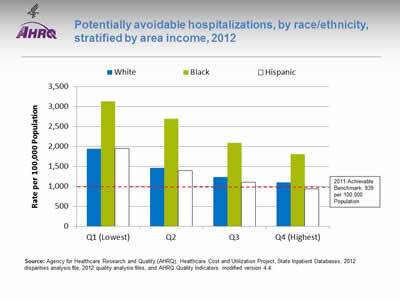
Potentially avoidable hospitalizations, by race/ethnicity, stratified by area income, 2012
Image: Chart shows potentially avoidable hospitalizations:
| Income | White | Black | Hispanic |
|---|---|---|---|
| Q1 (Lowest) | 1936 | 3131.3 | 1945.9 |
| Q2 | 1464.9 | 2694.8 | 1390.9 |
| Q3 | 1226.7 | 2091.6 | 1104.1 |
| Q4 (Highest) | 1096.5 | 1800.3 | 932 |
2011 Achievable Benchmark: 939 per 100,000 Population.
Source: Agency for Healthcare Research and Quality (AHRQ), Healthcare Cost and Utilization Project, State Inpatient Databases, 2012 disparities analysis file, 2012 quality analysis files, and AHRQ Quality Indicators, modified version 4.4.
Note:
- Groups With Disparities: In 2012, in all income groups, rates of potentially avoidable hospitalizations for all conditions were higher for Blacks than Whites.
- Achievable Benchmark:
- In 2011, the top 4 State achievable benchmark for all potentially avoidable hospitalizations was 939 per 100,000 population. %. The States that contributed to the achievable benchmark are Hawaii, Oregon, Utah, and Washington.
- The overall achievable benchmark could not be attained for 13 years.
- Hispanics in the highest income quartile have already achieved the benchmark.
Slide 35
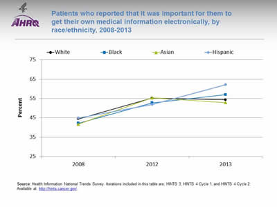
Patients who reported that it was important for them to get their own medical information electronically, by race/ethnicity, 2008-2013
Image: Graph shows patients who reported that it was important for them to get their own medical information electronically:
| Race/Ethnicity | 2008 | 2012 | 2013 |
|---|---|---|---|
| White | 44.4 | 55.2 | 54.3 |
| Black | 42.2 | 52.7 | 57 |
| Asian | 41.7 | 55.3 | 52.9 |
| Hispanic | 44.9 | 51.9 | 62.2 |
Source: Health Information National Trends Survey. Iterations included in this table are; HINTS 3, HINTS 4 Cycle 1, and HINTS 4 Cycle 2. Available at http://hints.cancer.gov/.
Note:
- Trends:
- From 2008 to 2013, the percentage of Black, White, and Hispanic patients who reported that it was very important to be able to get their medical information electronically increased significantly.
- Groups With Disparities:
- In 2013, Hispanic patients were more likely than White patients to report that it was very important to be able to get their medical information electronically.
Slide 36
AHRQ Health Care Innovations in Care Coordination
- Location: Springfield, Massachusetts.
- Population: Predominantly Latino patients with chronic illnesses and disabilities.
- Intervention: With funding from a per capita payment system, nurses at this community-based primary care clinic provide culturally competent care coordination.
- Outcomes: Improved the provision of recommended care processes, reduced health care costs, and enhanced self-management capabilities.
Slide 37
National Healthcare Quality and Disparities Report Chartbook on Health Care for Hispanics
Part 3: Trends in Access and Priorities of the National Quality Strategy
NQS Priority: Effective Treatment
- Most measures of Effective Treatment tracked in the QDR relate to priorities of the Heckler Report. Here, we illustrate effective treatment of conditions that were not priorities of the Heckler Report:
- Chronic kidney diseases.
- Musculoskeletal diseases.
- Respiratory diseases.
Slide 38
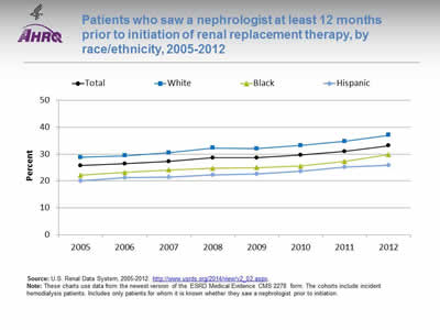
Patients who saw a nephrologist at least 12 months prior to initiation of renal replacement therapy, by race/ethnicity, 2005-2012
Image: Graph shows patients who saw a nephrologist at least 12 months prior to initiation of renal replacement therapy:
| Race/Ethnicity | 2005 | 2006 | 2007 | 2008 | 2009 | 2010 | 2011 | 2012 |
|---|---|---|---|---|---|---|---|---|
| Total | 25.7 | 26.4 | 27.3 | 28.6 | 28.6 | 29.6 | 31 | 33.1 |
| Hispanic | 20 | 21.3 | 21.4 | 22.3 | 22.6 | 23.7 | 25.1 | 25.9 |
| Black | 22.2 | 23.2 | 24.1 | 24.7 | 25.0 | 25.6 | 27.3 | 29.8 |
| White | 28.8 | 29.4 | 30.5 | 32.3 | 32.0 | 33.2 | 34.7 | 37 |
Source: U.S. Renal Data System, 2005-2012. http://www.usrds.org/2014/view/v2_02.aspx.
Note: These charts use data from the newest version of the ESRD Medical Evidence CMS 2278 form. The cohorts include incident hemodialysis patients. Includes only patients for whom it is known whether they saw a nephrologist prior to initiation.
- Importance:
- Early referral to a nephrologist is important for patients with progressive chronic kidney disease who are approaching kidney failure.
- Patients who begin nephrology care more than a year before kidney failure are less likely to begin dialysis with a catheter, experience infections related to vascular access, or die during the months after dialysis initiation (USRDS, 2013*).
- Trends: The percentage of new end stage renal disease (ESRD) patients who began nephrology care at least 12 months prior to initiation of renal replacement therapy improved overall and among Whites but there were no statistically significant improvements among Hispanics and Blacks.
- Groups With Disparities: In all years, the percentage of new ESRD patients who began nephrology care at least 12 months prior to initiation of renal replacement therapy was higher Whites than for Hispanics.
* U.S. Renal Data System. USRDS 2013 annual data report: atlas of chronic kidney disease and end-stage renal disease in the United States. Bethesda, MD: National Institutes of Health, National Institute of Diabetes and Digestive and Kidney Diseases; 2013. Available at: http://www.usrds.org/2014/view/v2_02.aspx. Accessed September 19, 2015.
Slide 39
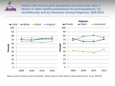
Adults with chronic joint symptoms who have ever seen a doctor or other health professional for joint symptoms, by race/ethnicity and by insurance among Hispanics, 2009-2012
Image: Graphs show adults with chronic joint symptoms who have ever seen a doctor or other health professional for joint symptoms:
Left Graph:
| Race/Ethnicity | 2009 | 2010 | 2011 | 2012 |
|---|---|---|---|---|
| Total | 70.5 | 69.1 | 72.1 | 72.1 |
| Hispanic | 65.9 | 64.7 | 63.2 | 65.9 |
| Black | 75.2 | 75.0 | 73.7 | 77.6 |
| White | 71.0 | 69.2 | 73.5 | 73.0 |
Right Graph (Hispanics):
| Insurance | 2009 | 2010 | 2011 | 2012 |
|---|---|---|---|---|
| Private | 72.7 | 65.3 | 65.5 | 70.7 |
| Public | 68.5 | 78.2 | 80.8 | 75.3 |
| Uninsured | 42.9 | 40.3 | 36.7 | 45.8 |
Source: Centers for Disease Control and Prevention, National Center for Health Statistics, National Health Interview Survey, 2009-2012.
Note:
- Trends:
- In 2012, 72.1% of adults with chronic joint symptoms reported seeing a doctor or other health professional for joint symptoms.
- There were no statistically significant improvements overall or among any racial/ethnic group.
- Groups With Disparities:
- In all years, Hispanics were less likely than Whites to report seeing a doctor or other health professional for joint symptoms.
- In all years, uninsured Hispanics were less likely than privately insured Hispanics to report seeing a doctor or other health professional for joint symptoms.
Slide 40
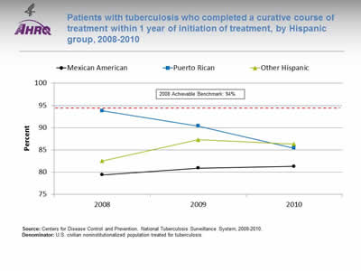
Patients with tuberculosis who completed a curative course of treatment within 1 year of initiation of treatment, by Hispanic group, 2008-2010
Image: Graph shows patients with tuberculosis who completed a curative course of treatment within 1 year of initiation of treatment:
| Hispanic Group | 2008 | 2009 | 2010 |
|---|---|---|---|
| Mexican American | 79.4 | 80.9 | 81.3 |
| Puerto Rican | 93.8 | 90.4 | 85.4 |
| Other Hispanic | 82.5 | 87.3 | 86.3 |
2008 Achievable Benchmark: 94%.
Source: Centers for Disease Control and Prevention, National Tuberculosis Surveillance System, 2008-2010.
Denominator: U.S. civilian noninstitutionalized population treated for tuberculosis.
Note:
- Groups With Disparities:
- There is considerable variation among Hispanic groups in completion of treatment for tuberculosis.
- Most groups are far from the 2008 top 4 State achievable benchmark of 94%. The States that contributed to the achievable benchmark are Colorado, Kansas, Mississippi, and Oregon.
Slide 41
National Healthcare Quality and Disparities Report Chartbook on Health Care for Hispanics
Part 3: Trends in Access and Priorities of the National Quality Strategy
NQS Priority: Healthy Living
Slide 42
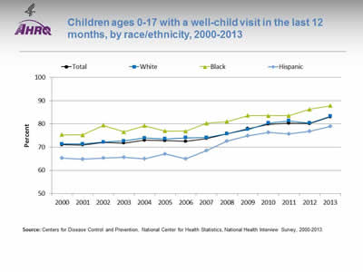
Children ages 0-17 with a well-child visit in the last 12 months, by race/ethnicity, 2000-2013
Image: Graph shows children ages 0-17 with a well-child visit in the last 12 months:
| Year | Total | White | Black | Hispanic |
|---|---|---|---|---|
| 2000 | 71.0 | 71.3 | 75.4 | 65.3 |
| 2001 | 71.0 | 71.4 | 75.2 | 64.9 |
| 2002 | 72.1 | 72.1 | 79.4 | 65.4 |
| 2003 | 71.8 | 72.7 | 76.5 | 65.6 |
| 2004 | 73.0 | 73.9 | 79.2 | 64.9 |
| 2005 | 72.8 | 73.6 | 77.0 | 67.1 |
| 2006 | 72.5 | 74.0 | 76.9 | 64.9 |
| 2007 | 73.7 | 74.1 | 80.3 | 68.5 |
| 2008 | 75.8 | 75.7 | 81.0 | 72.6 |
| 2009 | 78.0 | 77.6 | 83.6 | 74.9 |
| 2010 | 79.9 | 80.4 | 83.5 | 76.3 |
| 2011 | 80.3 | 81.3 | 83.6 | 75.8 |
| 2012 | 80.2 | 80.3 | 86.3 | 76.8 |
| 2013 | 83.0 | 83.3 | 87.8 | 79.0 |
Source: Centers for Disease Control and Prevention, National Center for Health Statistics, National Health Interview Survey, 2000-2013.
Note:
- Trends:
- Overall, the percentage of children ages 0-17 years who had a well-child visit (as distinct from a symptom-driven visit) in the last 12 months increased from 71% in 2000 to 83% in 2013.
- From 2000 to 2013, the percentage of children who had a well-child visit increased significantly for Whites (71.3% to 83.3%), Blacks (75.4% to 87.8%), and Hispanics (65.3% to 79%).
- Groups With Disparities:
- In all years, Hispanic children were less likely than White children to have had at least one well-child visit during the year.
- In all years except 2006 and 2011, Black children were more likely than White children to have at least one well-child visit.
- There were no statistically significant changes in disparities over time.
Slide 43
Prevention: Receipt of Recommended Vaccinations by Young Children
The U.S. Surgeon General, Dr. Vivek H. Murthy, and Elmo want everyone to stay healthy and get vaccinated! https://youtu.be/viS1ps0r4K0.
Slide 44
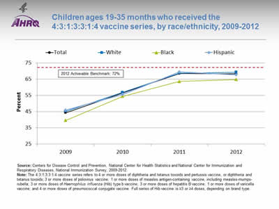
Children ages 19-35 months who received the 4:3:1:3:3:1:4 vaccine series, by race/ethnicity, 2009-2012
Image: Graph shows children ages 19-35 months who received the 4:3:1:3:3:1:4 vaccine series:
| Race/Ethnicity | 2009 | 2010 | 2011 | 2012 |
|---|---|---|---|---|
| Total | 44.3 | 56.6 | 68.5 | 68.4 |
| Hispanic | 45.9 | 55.5 | 69.5 | 67.8 |
| Black | 39.6 | 54.5 | 63.7 | 64.8 |
| White | 45.2 | 56.9 | 68.8 | 69.3 |
2012 Achievable Benchmark: 72%.
Source: Centers for Disease Control and Prevention, National Center for Health Statistics and National Center for Immunization and Respiratory Diseases, National Immunization Survey, 2009-2012.
Note: The 4:3:1:3:3:1:4 vaccine series refers to 4 or more doses of diphtheria and tetanus toxoids and pertussis vaccine, or diphtheria and tetanus toxoids; 3 or more doses of poliovirus vaccine; 1 or more doses of measles antigen-containing vaccine, including measles-mumps-rubella; 3 or more doses of Haemophilus influenza (Hib) type b vaccine; 3 or more doses of hepatitis B vaccine; 1 or more doses of varicella vaccine; and 4 or more doses of pneumococcal conjugate vaccine. Full series of Hib vaccine is =3 or =4 doses, depending on brand type.
- Trends:
- From 2009 to 2012, the percentage of children ages 19-35 months who received the 4:3:1:3:3:1:4 vaccination series improved from 44.3% to 68.4%.
- From 2009 to 2012, the percentage of children who received all recommended vaccinations improved for Blacks (39.6% to 64.8%), Hispanics (45.9% to 67.8%), and Whites (45.2% to 69.3%).
- Groups With Disparities:
- In 2012, there were no statistically significant differences between Hispanic children and White children in the percentage who received all recommended vaccines, while Black children were less likely than White children to receive all recommended vaccines.
- Achievable Benchmark:
- The 2012 top 5 State achievable benchmark was 72%. The top 5 States that contributed to the achievable benchmark are Louisiana, Maryland, Massachusetts, New Hampshire, and Ohio.
- White, Black, and Hispanic children could achieve the benchmark within a year.
Slide 45
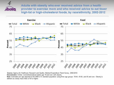
Adults with obesity who ever received advice from a health provider to exercise more and who received advice to eat fewer high-fat or high-cholesterol foods, by race/ethnicity, 2002-2012
Image: Graphs show adults with obesity who ever received advice from a health provider to exercise more and who received advice to eat fewer high-fat or high-cholesterol foods:
Left Graph (Exercise):
| Race/Ethnicity | 2002 | 2003 | 2004 | 2005 | 2006 | 2007 | 2008 | 2009 | 2010 | 2011 | 2012 |
|---|---|---|---|---|---|---|---|---|---|---|---|
| Total | 55.6 | 57.0 | 57.2 | 56.7 | 57.1 | 57.9 | 57.4 | 59.1 | 58.4 | 59.6 | 59.3 |
| White | 57.5 | 59.0 | 60.1 | 59.7 | 58.8 | 58.7 | 57.8 | 59.1 | 57.8 | 60.7 | 58.9 |
| Black | 55.8 | 56.6 | 55.1 | 56.3 | 56.8 | 60.8 | 54.7 | 58.5 | 59.1 | 59.2 | 62.4 |
| Hispanic | 45.9 | 49.7 | 47.4 | 46.5 | 50.8 | 52.8 | 57.2 | 59.4 | 58.8 | 55.7 | 55.9 |
Right Graph (Food):
| Race/Ethnicity | 2002 | 2003 | 2004 | 2005 | 2006 | 2007 | 2008 | 2009 | 2010 | 2011 | 2012 |
|---|---|---|---|---|---|---|---|---|---|---|---|
| Total | 47.7 | 48.3 | 47.4 | 48.1 | 48.5 | 50.0 | 49.2 | 51.3 | 51.4 | 50.6 | 50.2 |
| White | 49.3 | 49.7 | 49.9 | 50.9 | 50.1 | 50.2 | 48.7 | 50.4 | 49.8 | 50.4 | 49.5 |
| Black | 46.7 | 47.4 | 44.7 | 47.1 | 45.8 | 51.3 | 48.0 | 50.3 | 54.5 | 51.3 | 52.3 |
| Hispanic | 38.6 | 44.3 | 41.0 | 40.9 | 45.7 | 48.1 | 53.0 | 56.7 | 53.7 | 51.2 | 50.2 |
Source: Agency for Healthcare Research and Quality, Medical Expenditure Panel Survey, 2002-2012.
Denominator: Civilian noninstitutionalized adults age 18 and over with obesity.
Note: Estimates are age adjusted to the 2000 U.S. standard population using three age groups: 18-44, 45-64, and 65 and over. Obesity is defined as a body mass index of 30 or higher.
- Advice About Exercise:
- Overall Rate: In 2012, overall, 59.3% of adults with obesity had ever received advice from a health provider to exercise more.
- Trends: From 2002 to 2012, the percentage of obese adults who ever received advice from a health provider to exercise more improved for Blacks (from 55.8% to 62.4%) and Hispanics (from 45.9% to 55.9%).
- Groups With Disparities: In 7 of 11 years, Hispanic adults with obesity were less likely to ever receive advice from a health provider to exercise more compared with White adults with obesity. The disparity has narrowed between obese Hispanic adults and obese White adults.
- Advice About Healthy Eating:
- Overall Rate: In 2012, overall, 50.2% of adults with obesity were reported to have ever received advice from a health provider about eating fewer high-fat or high-cholesterol foods.
- Trends: From 2002 to 2012, the percentage of adults with obesity who ever received advice about healthy eating improved for Blacks (from 46.7% to 52.3%) and Hispanics (from 38.6% to 50.2%).
- Groups With Disparities: In 4 of 11 years, the percentage of Hispanic adults with obesity who ever received advice about healthy eating was lower compared with White adults with obesity. The disparity between obese Hispanic and White adults has narrowed.
Slide 46
AHRQ Health Care Innovations in Weight Management
Lutheran Family Health Centers
- Location: Brooklyn, New York.
- Population: Children in 3rd and 4th grades.
- Intervention: With its school-based health program at PS 24, developed Cuerpo Sano/Mente Sana, a 36-week weight management program.
- Outcomes: Data on the program's effectiveness are not yet available.
Slide 47
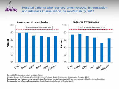
Hospital patients who received pneumococcal immunization and influenza immunization, by race/ethnicity, 2012
Image: Bar chart shows hospital patients who received pneumococcal immunization and influenza immunization. Pneumococcal Immunization: Total - 89%; White - 90.0%; Black - 86.1%; Asian - 85.7%; AI/AN - 83.5%; Hispanic - 85.8%. Influenza Immunization: Total - 87.2%; White - 88.6%; Black - 84.9%; Asian - 83.3%; AI/AN - 76.3%; Hispanic - 82.2%. 2012 Achievable Benchmark: 93%.
Key: AI/AN = American Indian or Alaska Native.
Source: Centers for Medicare & Medicaid Services, Medicare Quality Improvement Organization Program, 2012.
Denominator for Pneumococcal Immunization: Discharged hospital patients age 65 and over or ages 6-64 with a high risk condition.
Denominator for Influenza Immunization: Hospital patients discharged in October-March.
Note:
- Importance: Hospitals are important sites for ensuring people receive needed immunizations, including pneumococcal and influenza immunizations.
- Pneumococcal Immunization:
- Overall Rate: In 2012, 89% of hospital patients received pneumococcal immunization.
- Groups With Disparities: In 2012, the percentage of hospital patients who received pneumococcal immunization was lower among Blacks, Asians, AI/ANs, and Hispanics compared with Whites.
- Achievable Benchmark: The 2012 top 5 State achievable benchmark was 93%. The top 5 States that contributed to the achievable benchmark are Delaware, Florida, Ohio, South Carolina, and West Virginia. All groups were below the benchmark.
- Influenza Immunization:
- Overall Rate: in 2012, 87.2% of hospital patients received influenza immunization.
- Groups With Disparities: In 2012, the percentage of hospital patients who received influenza immunization was lower among Blacks, Asians, AI/ANs, and Hispanics compared with Whites.
- Achievable Benchmark: The 2012 top 5 State achievable benchmark was 93%. The top 5 States that contributed to the achievable benchmark are Delaware, Maryland, New Hampshire, South Carolina, and West Virginia. All groups were below the benchmark.
Slide 48
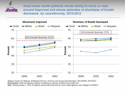
Adult home health patients whose ability to move or walk around improved and whose episodes of shortness of breath decreased, by race/ethnicity, 2010-2012
Image: Graphs show adult home health patients whose ability to move or walk around improved and whose episodes of shortness of breath decreased:
Left Graph (Movement Improved):
| Year | Total | White | Black | Hispanic |
|---|---|---|---|---|
| 2010 | 54.4 | 55.6 | 51.2 | 48.1 |
| 2011 | 57 | 58.2 | 53.8 | 51.1 |
| 2012 | 59.7 | 60.9 | 56.2 | 54.7 |
2010 Achievable Benchmark: 62.5%.
Right Graph (Shortness of Breath Decreased):
| Year | Total | White | Black | Hispanic |
|---|---|---|---|---|
| 2010 | 62.3 | 63.6 | 62.3 | 50.1 |
| 2011 | 63 | 64.8 | 62.4 | 48.4 |
| 2012 | 64.2 | 65.7 | 63 | 52 |
2010 Achievable Benchmark: 70.7%.
Source: Centers for Medicare & Medicaid Services, Outcome and Assessment Information Set (OASIS), 2010-2012.
Denominator: Adult nonmaternity patients completing an episode of skilled home health care.
Note: Starting January 1, 2010, the patient assessment instrument for home health agencies was changed to OASIS-C.
- Importance: Many patients who receive home health care are recovering from an injury or illness and may have difficulty walking or moving around safely. Maintaining and improving functional status, such as patients' ability to ambulate, improves quality of life and allows them to stay at home as long as possible. Getting better at walking or moving around may be a sign that their health status is improving. Shortness of breath interferes with activities such as walking and is an important health status indicator.
- Improved Movement:
- Overall Rate: In 2012, 59.7% of home health patients showed improvement in walking or moving around.
- Groups With Disparities: In all years, Hispanic home health patients were less likely than White home health patients to get better at walking or moving around. In 2011 and 2012, Black home health patients were less likely than White patients to get better at walking or moving around.
- Achievable Benchmark: The 2010 top 5 State achievable benchmark was 62.5%. The top 5 States that contributed to the achievable benchmark are Maine, Missouri, New Jersey, South Carolina, and Utah. No group has achieved the benchmark. Data are insufficient to determine time to benchmark.
- Decreased Shortness of Breath:
- Overall Rate: In 2012, 64.2% of home health patients had less shortness of breath.
- Groups With Disparities: In all years, Hispanics were less likely than Whites to show improvement in shortness of breath.
- Achievable Benchmark: The 2010 top 5 State achievable benchmark was 70.7%. The top 5 States that contributed to the achievable benchmark are District of Columbia, Hawaii, Maryland, New Jersey, and South Carolina. No group has achieved the benchmark. Data are insufficient to determine time to benchmark.
Slide 49
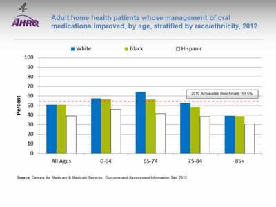
Adult home health patients whose management of oral medications improved, by age, stratified by race/ethnicity, 2012
Image: Chart shows adult home health patients whose management of oral medications improved, by age:
| Age | White | Black | Hispanic |
|---|---|---|---|
| All Ages | 50.9 | 51 | 39.2 |
| 0-64 | 57.4 | 56.6 | 45.9 |
| 65-74 | 64.1 | 56.2 | 41.4 |
| 75-84 | 52.7 | 48.4 | 38.6 |
| 85+ | 39.3 | 39 | 30.8 |
2010 Achievable Benchmark: 53.5%.
Source: Centers for Medicare & Medicaid Services, Outcome and Assessment Information Set, 2012.
Note:
- Importance: Patients who have problems taking their medications as prescribed are at risk for adverse outcomes, including lack of improvement, worsening of disease, serious side effects, and death.
- Overall Rate: In 2012, 49.7% of home health patients got better at taking their medications, compared with 47.3% in 2011 and 46.2% in 2010 (data not shown).
- Groups with Disparities: In 2012, Hispanic home health patients in all age groups were less likely than Whites and Blacks to get better at taking their medications.
- Achievable Benchmark:
- The 2010 top 5 State achievable benchmark was 53.5%. The top 5 States that contributed to the achievable benchmark are District of Columbia, Illinois, New Jersey, North Dakota, and South Carolina.
- In 2012, White and Black home health patients ages 0-64 and 65-74 had a rate higher than the benchmark.
- Data are insufficient to determine time to benchmark for other groups.
Slide 50

National Healthcare Quality and Disparities Report Chartbook on Health Care for Hispanics
Part 3: Trends in Access and Priorities of the National Quality Strategy
NQS Priority: Care Affordability
Slide 51
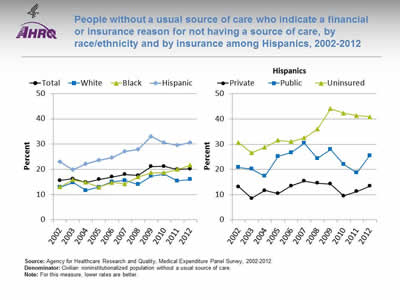
People without a usual source of care who indicate a financial or insurance reason for not having a source of care, by race/ethnicity and by insurance among Hispanics, 2002-2012
Image: Graphs show people without a usual source of care who indicate a financial or insurance reason for not having a source of care:
Left Graph:
| Race/Ethnicity | 2002 | 2003 | 2004 | 2005 | 2006 | 2007 | 2008 | 2009 | 2010 | 2011 | 2012 |
|---|---|---|---|---|---|---|---|---|---|---|---|
| Total | 15.6 | 16.3 | 14.8 | 16.0 | 17.0 | 18.0 | 17.6 | 21.1 | 21.2 | 19.9 | 20.2 |
| White | 12.8 | 14.8 | 11.6 | 13.0 | 15.1 | 15.6 | 14.0 | 17.3 | 18.0 | 15.4 | 16.0 |
| Black | 13.1 | 15.8 | 14.8 | 12.9 | 14.8 | 14.3 | 17.0 | 18.6 | 18.7 | 20.0 | 21.6 |
| Hispanic | 23.0 | 19.8 | 22.1 | 23.6 | 24.6 | 27.0 | 27.9 | 33.0 | 30.6 | 29.5 | 30.6 |
Right Graph (Hispanics):
| Insurance | 2002 | 2003 | 2004 | 2005 | 2006 | 2007 | 2008 | 2009 | 2010 | 2011 | 2012 |
|---|---|---|---|---|---|---|---|---|---|---|---|
| Private | 13.1 | 8.5 | 11.7 | 10.4 | 13.4 | 15.3 | 14.6 | 14.2 | 9.5 | 11.2 | 13.3 |
| Public | 20.8 | 20.2 | 17.4 | 25.2 | 26.7 | 30.4 | 24.4 | 27.9 | 22.0 | 18.7 | 25.5 |
| Uninsured | 30.6 | 26.6 | 28.8 | 31.5 | 31.0 | 32.5 | 36.0 | 44.1 | 42.4 | 41.3 | 40.9 |
Source: Agency for Healthcare Research and Quality, Medical Expenditure Panel Survey, 2002-2012.
Denominator: Civilian noninstitutionalized population without a usual source of care.
Note: For this measure, lower rates are better.
- Importance: High-quality health care is facilitated by having a regular provider, but some Americans may not be able to afford one.
- Overall Rate: In 2012, 20.2% of people without a usual source of care indicated a financial or insurance reason for not having a source of care.
- Trends:
- The overall percentage worsened from 2002 to 2010 and then leveled off.
- The percentage worsened among Blacks and Hispanics.
- Groups With Disparities: In all years, the percentage of people without a usual source of care who indicated a financial or insurance reason for not having a source of care was higher:
- Among Hispanics compared with Whites.
- Among uninsured Hispanics compared with privately insured Hispanics.
- Among publicly insured Hispanics compared with privately insured Hispanics (except in 2004).
Slide 52
AHRQ Health Care Innovations in Reducing Costs
- Location: Long Beach, California.
- Intervention: Instituted TeleSalud, a 24-hour bilingual advice line that provides callers with direct access to a registered nurse who can address their health and interpreter needs in their preferred language.
- Outcomes: Significantly increased the number of calls coming from Spanish-speaking members and has helped members to make wiser choices, leading to fewer emergency department visits and significant cost savings.


