Access to Health Care Chartbook: Slide Presentation
National Healthcare Quality and Disparities Report
Slide 1
National Healthcare Quality and Disparitites Report
Chartbook on Access to Health Care
May 2016
Slide 2
National Healthcare Quality and Disparities Report
- Annual report to Congress mandated in the Healthcare Research and Quality Act of 1999 (P.L. 106-129).
- Provides a comprehensive overview of:
- Quality of health care received by the general U.S. population.
- Disparities in care experienced by different racial, ethnic, and socioeconomic groups.
- Assesses the performance of our health system and identifies areas of strength and weakness along three main axes:
- Access to health care.
- Quality of health care.
- Priorities of the National Quality Strategy.
Slide 3
National Healthcare Quality and Disparities Report
- Based on more than 250 measures of quality and disparities covering a broad array of health care services and settings.
- Includes data from 2015 QDR, which generally cover 2001-2013.
- Produced with the help of an Interagency Work Group led by the Agency for Healthcare Research and Quality and submitted on behalf of the Secretary of Health and Human Services.
Slide 4
Chartbook Contents
- This chartbook includes:
- Summary of disparities across measures of access to health care from the QDR.
- Figures illustrating select measures of access.
- Introduction and Methods contains information about methods used in the chartbook.
- A Data Query tool (http://nhqrnet.ahrq.gov/inhqrdr/data/query) provides access to all data tables.
Slide 5
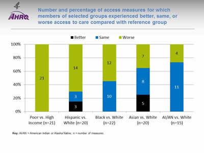
Number and percentage of access measures for which members of selected groups experienced better, same, or worse access to care compared with reference group
Key: AI/AN = American Indian or Alaska Native; n = number of measures.
| Measures | Poor vs. High Income (n=21) | Hispanic vs. White (n=20) | Black vs. White (n=22) | Asian vs. White (n=20) | AI/AN vs. White (n=15) |
|---|---|---|---|---|---|
| Total | 21 | 20 | 22 | 20 | 15 |
| Better | 0 | 3 | 0 | 5 | 0 |
| Same | 0 | 3 | 10 | 8 | 11 |
| Worse | 21 | 14 | 12 | 7 | 4 |
Image: Chart shows number and percentage of access measures for which members of selected groups experienced better, same, or worse access to care compared with reference group
Note: Poor indicates family income less than the Federal poverty level; High Income indicates family income four times the Federal poverty level or greater. Numbers of measures differ across groups because of sample size limitations. For most measures, data from 2013 are shown. The relative difference between a selected group and its reference group is used to assess disparities.
- Better = Selected group had better access to care than reference group. Differences are statistically significant, are equal to or larger than 10%, and favor the selected group.
- Same = Selected group and reference group had about the same access to care. Differences are not statistically significant or are smaller than 10%.
- Worse = Selected group had worse access to care than reference group. Differences are statistically significant, are equal to or larger than 10%, and favor the reference group.
Groups With Disparities:
- People in poor households had worse access to care than people in high-income households on all access measures (green).
- Hispanics had worse access to care than Whites for more than two-thirds of access measures.
- Blacks had worse access to care than Whites for about half of access measures.
- Asians had worse access to care than Whites for about one-third of access measures, and American Indians and Alaska Natives had worse access to care than Whites for about one-quarter of access measures.
Slide 6
Elements of Access to Health Care
- Access to health care means having "the timely use of personal health services to achieve the best health outcomes" (IOM, 1993).
- Access to health care consists of four components (Healthy People 2020):
- Insurance coverage.
- Services.
- Timeliness.
- Workforce.
Notes:
- Coverage: facilitates entry into the health care system. Uninsured people are less likely to receive medical care and more likely to have poor health status.
- Services: Having a usual source of care is associated with adults receiving recommended screening and prevention services.
- Timeliness: ability to provide health care when the need is recognized.
- Workforce: capable, qualified, culturally competent providers.
Slide 7
Coverage
- Health insurance facilitates entry into the health care system.
- Uninsured people are less likely to receive medical care and more likely to have poor health status (Healthy People 2020).
- Many people rely on public health insurance, such as Medicaid.
Notes:
- Public health insurance also includes Children's Health Insurance Program (CHIP), State-sponsored or other government-sponsored health plans, Medicare, and military plans.
- For access measures in this chartbook, a small number of people were covered by both public and private plans and were included in both categories.
Slide 8
Measures of Coverage
- People under age 65 without health insurance coverage at the time of interview by:
- Age.
- Race/ethnicity.
- Poverty status.
Slide 9
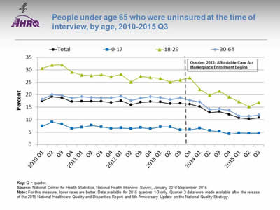
People under age 65 who were uninsured at the time of interview, by age, 2010-2015 Q3
Key: Q = quarter.
Source: National Center for Health Statistics, National Health Interview Survey, January 2010-September 2015.
Note: For this measure, lower rates are better. Data available for 2015 quarters 1-3 only. Quarter 3 data were made available after the release of the 2015 National Healthcare Quality and Disparities Report and 5th Anniversary Update on the National Quality Strategy.
Image: Chart shows people under age 65 who were uninsured at the time of interview, by age, 2010-2015 Q3
| Quarter | Total | 0-17 | 18-29 | 30-64 |
|---|---|---|---|---|
| 2010 Q1 | 17.5 | 7.4 | 30.6 | 18.2 |
| Q2 | 19.2 | 9.1 | 31.9 | 20 |
| Q3 | 18.8 | 8.2 | 32 | 19.7 |
| Q4 | 17.2 | 6.5 | 29.1 | 18.6 |
| 2011 Q1 | 17.4 | 6.9 | 27.9 | 19.2 |
| Q2 | 17.4 | 7.7 | 27.6 | 18.9 |
| Q3 | 17.3 | 7.1 | 28.1 | 18.8 |
| Q4 | 16.9 | 6.5 | 27.2 | 18.7 |
| 2012 Q1 | 17.6 | 6.7 | 28.2 | 19.4 |
| Q2 | 16 | 6.4 | 25.1 | 17.7 |
| Q3 | 17 | 6.8 | 27.4 | 18.6 |
| Q4 | 17.2 | 6.4 | 26.9 | 19.2 |
| 2013 Q1 | 17.1 | 7.1 | 26.5 | 18.9 |
| Q2 | 16.4 | 7.1 | 25.1 | 18.1 |
| Q3 | 16.5 | 5.9 | 25.9 | 18.7 |
| Q4 | 16.2 | 6 | 26.8 | 17.8 |
| 2014 Q1 | 15.2 | 6.6 | 22.2 | 17.1 |
| Q2 | 12.9 | 5.6 | 19.8 | 14.1 |
| Q3 | 13.2 | 5.3 | 21.5 | 14.3 |
| Q4 | 12.1 | 4.2 | 19.1 | 13.7 |
| 2015 Q1 | 10.7 | 4.6 | 17.2 | 11.5 |
| Q2 | 10.3 | 4.5 | 15.2 | 11.4 |
| Q3 | 10.8 | 4.5 | 16.9 | 11.9 |
October 2013: Affordable Care Act Marketplace Enrollment Begins.
Notes:
- Trends:
- From January 2010 to September 2015, the percentage of people under age 65 who were uninsured at the time of interview decreased from 17.5% to 10.8%.
- The percentage of people who were uninsured at the time of interview decreased for all age groups under age 65. Adults ages 18-29 experienced the largest declines.
Slide 10
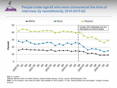
People under age 65 who were uninsured at the time of interview, by race/ethnicity, 2010-2015 Q3
Key: Q = quarter.
Source: National Center for Health Statistics, National Health Interview Survey, January 2010-September 2015.
Note: For this measure, lower rates are better. Data available for 2015 quarters 1-3 only. White and Black are non-Hispanic. Hispanic includes all races.
Image: Chart shows people under age 65 who were uninsured at the time of interview, by race/ethnicity, 2010-2015 Q3
| Race/Ethnicity | White | Black | Hispanic |
|---|---|---|---|
| 2010 Q1 | 15.6 | 27.9 | 42.4 |
| Q2 | 17 | 26.5 | 44.9 |
| Q3 | 16.7 | 28.6 | 44.1 |
| Q4 | 16.1 | 25.6 | 41.5 |
| 2011 Q1 | 16.1 | 23.9 | 42 |
| Q2 | 15.8 | 24.2 | 41.4 |
| Q3 | 15.7 | 25 | 42.6 |
| Q4 | 14.8 | 26.2 | 42.7 |
| 2012 Q1 | 16 | 26 | 42.6 |
| Q2 | 14.2 | 21.9 | 39.7 |
| Q3 | 15.1 | 24.1 | 40.5 |
| Q4 | 15.1 | 22.6 | 42.2 |
| 2013 Q1 | 15.2 | 25.5 | 41.4 |
| Q2 | 13.9 | 23.6 | 41.3 |
| Q3 | 14.7 | 25.9 | 39.5 |
| Q4 | 14 | 24.6 | 40.3 |
| 2014 Q1 | 13.5 | 20.2 | 35.7 |
| Q2 | 11.1 | 15.9 | 33.2 |
| Q3 | 11.4 | 17.5 | 34 |
| Q4 | 10.5 | 17.2 | 31.8 |
| 2015 Q1 | 8.7 | 15.6 | 28.3 |
| Q2 | 8.8 | 13.5 | 26.1 |
| Q3 | 8.9 | 14.7 | 29.3 |
October 2013: Affordable Care Act Marketplace Enrollment Begins.
Notes:
- Trends: From January 2010 to September 2015, the percentage of people under age 65 who were uninsured at the time of interview decreased for all racial/ethnic groups.
- Groups With Disparities:
- In all quarters, Blacks and Hispanics were more likely to be uninsured than Whites.
- Gaps related to race/ethnicity were getting smaller over time.
Slide 11
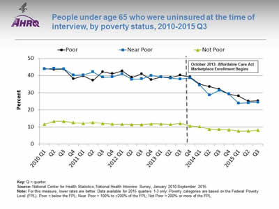
People under age 65 who were uninsured at the time of interview, by poverty status, 2010-2015 Q3
Key: Q = quarter.
Source: National Center for Health Statistics, National Health Interview Survey, January 2010-September 2015.
Note: For this measure, lower rates are better. Data available for 2015 quarters 1-3 only. Poverty categories are based on the Federal Poverty Level (FPL). Poor = below the FPL; Near Poor = 100% to <200% of the FPL; Not Poor = 200% or more of the FPL.
Image: Chart shows people under age 65 who were uninsured at the time of interview, by poverty status, 2010-2015 Q3
| Quarter | Poor | Near Poor | Not Poor |
|---|---|---|---|
| 2010 Q1 | 44 | 43.8 | 11.5 |
| Q2 | 43.5 | 44.2 | 13.2 |
| Q3 | 43.7 | 43.9 | 13.2 |
| Q4 | 38.1 | 40.2 | 12.4 |
| 2011 Q1 | 39.8 | 40.3 | 12 |
| Q2 | 37.2 | 42.1 | 12.5 |
| Q3 | 42.2 | 39 | 12 |
| Q4 | 41.1 | 39.2 | 11.6 |
| 2012 Q1 | 42.7 | 41 | 11.5 |
| Q2 | 38.9 | 37.8 | 11.3 |
| Q3 | 41 | 38 | 11.3 |
| Q4 | 37.6 | 40 | 11.7 |
| 2013 Q1 | 39.1 | 39.2 | 11.7 |
| Q2 | 38.9 | 38.4 | 11.4 |
| Q3 | 40.2 | 37.9 | 12 |
| Q4 | 39.2 | 38.6 | 10.5 |
| 2014 Q1 | 34.9 | 34.4 | 10.1 |
| Q2 | 33.5 | 28.5 | 8.6 |
| Q3 | 32 | 31.3 | 8.5 |
| Q4 | 29.1 | 29.2 | 8.3 |
| 2015 Q1 | 28 | 23.8 | 7.5 |
| Q2 | 25 | 24 | 7.5 |
| Q3 | 25.2 | 24.4 | 8.1 |
October 2013: Affordable Care Act Marketplace Enrollment Begins.
Notes:
- Trends: From January 2010 to June 2015, the percentage of people under age 65 who were uninsured at the time of interview decreased for all poverty status groups.
- Groups With Disparities:
- In all quarters, people in poor and near-poor households were more likely to be uninsured than people in households that were not poor.
- Gaps in rates of uninsurance between people who were poor and those who were not poor and between people who were near poor and those who were not poor were getting smaller over time.
Slide 12
Services
- People with a usual source of care have better health outcomes, fewer disparities, and lower costs (Healthy People 2020).
- People with a usual place of care and a usual provider are more likely to receive preventive services and recommended screenings than people with no usual source of care (Blewett, et al., 2008).
Slide 13
Measures of Services
- Age-sex adjusted percentage of people of all ages with a usual place to go for medical care.
- People who were unable to get or delayed in getting needed medical care, dental care, or prescription medicines in the last 12 months.
- People who were unable to get or delayed in getting needed medical care, dental care, or prescription medicines in the last 12 months.
Slide 14
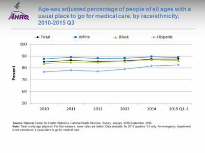
Age-sex adjusted percentage of people of all ages with a usual place to go for medical care, by race/ethnicity, 2010-2015 Q3
Source: National Center for Health Statistics, National Health Interview Survey, January 2010-September 2015.
Note: Total is only age adjusted. For this measure, lower rates are better. Data available for 2015 quarters 1-3 only. An emergency department is not considered a usual place to go for medical care.
Image: Chart shows age-sex adjusted percentage of people of all ages with a usual place to go for medical care, by race/ethnicity, 2010-2015 Q3
| Race/Ethnicity | 2010 | 2011 | 2012 | 2013 | 2014 | 2015 Q1-3 |
|---|---|---|---|---|---|---|
| Total | 85.1 | 86.5 | 85.5 | 86.1 | 87.6 | 87.6 |
| White | 87.7 | 89.1 | 88.1 | 88.3 | 89.6 | 89 |
| Black | 83.7 | 85 | 84.9 | 85.4 | 87 | 86.2 |
| Hispanic | 76.6 | 78 | 77.1 | 78.9 | 81.6 | 82.6 |
Notes:
- Trends: From January 2010 to September 2015, the percentage of people with a usual place to go for medical care increased overall, for Blacks, and for Hispanics. There were no statistically significant changes for Whites.
- Groups With Disparities:
- In all years, Blacks and Hispanics were less likely than Whites to have a usual place to go for medical care.
- Gaps related to race/ethnicity were getting smaller over time.
Slide 15
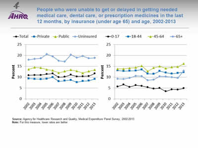
People who were unable to get or delayed in getting needed medical care, dental care, or prescription medicines in the last 12 months, by insurance (under age 65) and age, 2002-2013
Source: Agency for Healthcare Research and Quality, Medical Expenditure Panel Survey, 2002-2013.
Note: For this measure, lower rates are better.
Image: Charts show people who were unable to get or delayed in getting needed medical care, dental care, or prescription medicines in the last 12 months, by insurance (under age 65) and age, 2002-2013
Left Chart:
| Year | Total | Private | Public | Uninsured |
|---|---|---|---|---|
| 2002 | 10.9 | 9.4 | 13.6 | 18 |
| 2003 | 11 | 9.2 | 14.5 | 18.4 |
| 2004 | 11 | 9.1 | 14.3 | 18.7 |
| 2005 | 11.4 | 9.3 | 13.5 | 20.6 |
| 2006 | 11.7 | 10 | 13.1 | 19.5 |
| 2007 | 10 | 8.1 | 12 | 17.5 |
| 2008 | 10.2 | 8.4 | 12.7 | 17.2 |
| 2009 | 11.1 | 8.7 | 13.4 | 20.3 |
| 2010 | 10.3 | 7.7 | 12.8 | 19 |
| 2011 | 10.4 | 8.2 | 11.9 | 19.7 |
| 2012 | 10.5 | 8.4 | 12.7 | 18.7 |
| 2013 | 11.7 | 9.2 | 13.4 | 18.9 |
Right Chart:
| Year | 0-17 | 18-44 | 45-64 | 65+ |
|---|---|---|---|---|
| 2002 | 5.7 | 13.1 | 13.8 | 9.3 |
| 2003 | 6.6 | 12.8 | 13.8 | 9.2 |
| 2004 | 5.5 | 12.9 | 14.2 | 9.6 |
| 2005 | 6.3 | 13 | 14.4 | 10.6 |
| 2006 | 6 | 13.5 | 15.2 | 10.5 |
| 2007 | 5.4 | 11.6 | 12.7 | 8.6 |
| 2008 | 4.7 | 11.5 | 14.3 | 8.9 |
| 2009 | 5 | 12.8 | 15 | 10.4 |
| 2010 | 3.5 | 12.1 | 14.1 | 10.3 |
| 2011 | 4.4 | 11.6 | 14.6 | 10 |
| 2012 | 4.3 | 11.9 | 14.8 | 9.6 |
| 2013 | 4.9 | 12.3 | 16.2 | 12.9 |
Notes:
- Overall Rate: In 2013, the overall percentage of people unable to get or delayed in getting needed medical care, dental care, or prescription medicines in the last 12 months was 11.7%.
- Trends: From 2002 to 2013, there were no statistically significant changes in the percentage of people who were unable to get or delayed in getting needed medical care, dental care, or prescription medicines in the last 12 months for any insurance or age group, except people ages 0-17. The percentage for that group decreased.
- Groups With Disparities:
- In all years, among people under age 65, the percentage unable to get or delayed in getting needed medical care, dental care, or prescription medicines was higher for uninsured people and people with public insurance compared with people with private insurance. The gap between uninsured people and people with private insurance was growing larger over time.
- In all years, the percentage of people unable to get or delayed in getting needed medical care, dental care, or prescription medicines was higher for adults ages 18-44 than for children ages 0-17. The gap between adults ages 45-64 and adults ages 18-44 was growing larger over time, as was the gap between adults ages 45-64 and adults age 65 and over.
Slide 16
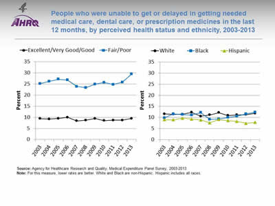
People who were unable to get or delayed in getting needed medical care, dental care, or prescription medicines in the last 12 months, by perceived health status and ethnicity, 2003-2013
Source: Agency for Healthcare Research and Quality, Medical Expenditure Panel Survey, 2003-2013.
Note: For this measure, lower rates are better. White and Black are non-Hispanic. Hispanic includes all races.
Image: Charts show people who were unable to get or delayed in getting needed medical care, dental care, or prescription medicines in the last 12 months, by perceived health status and ethnicity, 2003-2013
Left Chart:
| Year | Excellent / Very Good / Good | Fair / Poor |
|---|---|---|
| 2003 | 9.4 | 25.2 |
| 2004 | 9.2 | 26.2 |
| 2005 | 9.5 | 27.2 |
| 2006 | 10 | 26.8 |
| 2007 | 8.4 | 23.9 |
| 2008 | 8.7 | 23.4 |
| 2009 | 9.5 | 24.9 |
| 2010 | 8.5 | 25.7 |
| 2011 | 8.7 | 24.8 |
| 2012 | 8.7 | 25.8 |
| 2013 | 9.5 | 29.5 |
Right Chart:
| Race/Ethnicity | 2003 | 2004 | 2005 | 2006 | 2007 | 2008 | 2009 | 2010 | 2011 | 2012 | 2013 |
|---|---|---|---|---|---|---|---|---|---|---|---|
| White | 11.6 | 11.4 | 11.5 | 12.3 | 10.6 | 11.2 | 12.2 | 10.9 | 11.2 | 11.3 | 11.9 |
| Black | 9.8 | 11.6 | 11.3 | 11.1 | 12.2 | 9.2 | 9.3 | 10 | 10.6 | 11.6 | 12.4 |
| Hispanic | 9 | 9 | 9.7 | 9.3 | 8.9 | 7.6 | 9.1 | 8.6 | 8.3 | 7.4 | 7.8 |
Notes:
- Trends:
- From 2002 to 2013, there were no statistically significant changes among people with fair/poor or excellent/very good/good perceived health status in the percentage of people who were unable to get or delayed in getting needed medical care, dental care, or prescription medicines.
- From 2002 to 2013, there were no statistically significant changes among Whites or Blacks in the percentage of people who were unable to get or delayed in getting needed medical care, dental care, or prescription medicines.
- From 2003 to 2013, the percentage of people who were unable to get or delayed in getting needed medical care, dental care, or prescription medicines improved for Hispanics.
- Groups With Disparities:
- In 2013, there was no statistically significant change in the gap between people who perceived their health status to be fair or poor and people who perceived their health status to be excellent, very good, or good.
- In 2013, Hispanics were less likely than Whites to have difficulty getting needed medical care, dental care, or prescription medicines.
Slide 17
Timeliness
- Timeliness in health care is the system's capacity to provide care quickly after a need is recognized. (Healthy People 2020).
- Timely delivery of appropriate care can help reduce mortality and morbidity for chronic conditions, such as kidney disease (Smart & Titus, 2011).
Slide 18
Measures of Timeliness
- Adults who needed care right away for an illness, injury, or condition in the last 12 months who sometimes or never got care as soon as wanted.
- Children who needed care right away for an illness, injury, or condition in the last 12 months who sometimes or never got care as soon as wanted.
Slide 19
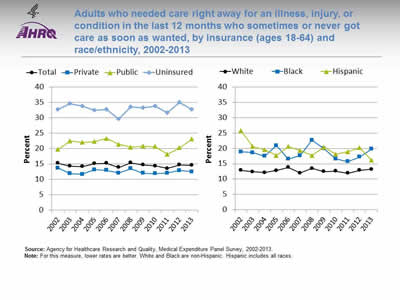
Adults who needed care right away for an illness, injury, or condition in the last 12 months who sometimes or never got care as soon as wanted, by insurance (ages 18-64) and race/ethnicity, 2002-2013
Source: Agency for Healthcare Research and Quality, Medical Expenditure Panel Survey, 2002-2013.
Note: For this measure, lower rates are better. White and Black are non-Hispanic. Hispanic includes all races.
Image: Charts show adults who needed care right away for an illness, injury, or condition in the last 12 months who sometimes or never got care as soon as wanted, by insurance (ages 18-64) and race/ethnicity, 2002-2013
Left Chart:
| Insurance | 2002 | 2003 | 2004 | 2005 | 2006 | 2007 | 2008 | 2009 | 2010 | 2011 | 2012 | 2013 |
|---|---|---|---|---|---|---|---|---|---|---|---|---|
| Total | 15.3 | 14.3 | 14.2 | 15.1 | 15.3 | 13.9 | 15.4 | 14.7 | 14.4 | 13.6 | 14.7 | 14.6 |
| Private | 13.7 | 11.9 | 11.7 | 13.2 | 13 | 12.1 | 13.5 | 12 | 11.9 | 12.1 | 12.9 | 12.5 |
| Public | 19.7 | 22.5 | 22 | 22.3 | 23.3 | 21.4 | 20.5 | 20.8 | 20.7 | 18.2 | 20.3 | 23.1 |
| Uninsured | 32.8 | 34.6 | 33.8 | 32.5 | 32.8 | 29.7 | 33.6 | 33.3 | 33.8 | 31.7 | 35 | 32.8 |
Right Chart:
| Race/Ethnicity | 2002 | 2003 | 2004 | 2005 | 2006 | 2007 | 2008 | 2009 | 2010 | 2011 | 2012 | 2013 |
|---|---|---|---|---|---|---|---|---|---|---|---|---|
| White | 12.9 | 12.4 | 12.1 | 12.8 | 13.8 | 12 | 13.5 | 12.5 | 12.6 | 11.9 | 12.9 | 13.2 |
| Black | 18.9 | 18.6 | 17.5 | 20.9 | 16.5 | 17.7 | 22.7 | 19.9 | 16.6 | 15.7 | 17.2 | 19.8 |
| Hispanic | 25.8 | 20.6 | 19.6 | 17.7 | 20.6 | 19.3 | 17.7 | 20.4 | 18.1 | 18.9 | 20.2 | 16.2 |
Notes:
- Overall Rate: In 2013, the overall percentage of adults who needed care right away who sometimes or never got care as soon as wanted was 14.6%.
- Trends:
- From 2002 to 2013, there were no statistically significant changes by insurance in the percentage of adults who needed care right away who sometimes or never got care as soon as wanted. In 2013, the percentages were 32.8% for uninsured people, 23.1% for those with public insurance, and 12.5% for those with private insurance.
- From 2002 to 2013, there were no statistically significant changes among Whites or Blacks in the percentage of adults who needed care right away who sometimes or never got care as soon as wanted. In 2013, the percentage was 19.8% for Blacks and 13.2% for Whites.
- From 2002 to 2013, the percentage of adults who needed care right away who sometimes or never got care as soon as wanted was improving for Hispanic people (from 25.8% to 16.2%).
- Groups With Disparities:
- In most years, the percentage of adults who needed care right away who sometimes or never got care as soon as wanted was higher for adults who had public insurance compared with adults with private insurance.
- In all years, uninsured adults were less likely than adults with private insurance to receive needed care right away for an illness, injury, or condition.
- Although there were no statistically significant changes from 2010 to 2013, by the end of that period, Hispanics were more likely than Whites to receive care as soon as wanted.
Slide 20
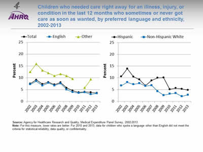
Children who needed care right away for an illness, injury, or condition in the last 12 months who sometimes or never got care as soon as wanted, by preferred language and ethnicity, 2002-2013
Source: Agency for Healthcare Research and Quality, Medical Expenditure Panel Survey, 2002-2013.
Note: For this measure, lower rates are better. For 2010 and 2013, data for children who spoke a language other than English did not meet the criteria for statistical reliability, data quality, or confidentiality.
Image: Charts show children who needed care right away for an illness, injury, or condition in the last 12 months who sometimes or never got care as soon as wanted, by preferred language and ethnicity, 2002-2013
Left Chart:
| Year | Total | English | Other |
|---|---|---|---|
| 2002 | 7.5 | 7.2 | 12.5 |
| 2003 | 9.1 | 8.5 | 15.9 |
| 2004 | 7.3 | 6.7 | 13.1 |
| 2005 | 8.1 | 7.8 | 12 |
| 2006 | 7.1 | 6.7 | 10.8 |
| 2007 | 8 | 7.6 | 11.6 |
| 2008 | 5.7 | 5 | 10.8 |
| 2009 | 4.5 | 3.9 | 9.5 |
| 2010 | 3.8 | 3.5 | |
| 2011 | 4 | 3.8 | 5.8 |
| 2012 | 3.8 | 3 | 9.3 |
| 2013 | 3.5 | 3.4 |
Right Chart:
| Year | Hispanic | Non-Hispanic White |
|---|---|---|
| 2002 | 10.6 | 6.7 |
| 2003 | 13.9 | 8.1 |
| 2004 | 10.5 | 7.2 |
| 2005 | 9.3 | 7.7 |
| 2006 | 6.7 | 6.5 |
| 2007 | 8.9 | 6.8 |
| 2008 | 10.0 | 4.3 |
| 2009 | 10.1 | 2.6 |
| 2010 | 5.1 | 3.2 |
| 2011 | 5.6 | 3.5 |
| 2012 | 5.3 | 2.1 |
| 2013 | 4.8 | 2.8 |
Notes:
- Overall Rate: In 2013, the overall percentage of children who needed care right away who sometimes or never got care as soon as wanted was 3.5%.
- Trends:
- From 2002 to 2013, there no statistically significant changes in the percentage of English-speaking children and children speaking other languages who needed care right away who sometimes or never got care as soon as wanted.
- From 2010 to 2013, there were no statistically significant changes in the percentage of Hispanic and non-Hispanic White children who needed care right away who sometimes or never got care as soon as wanted.
- Groups With Disparities:
- From 2002 to 2013, Hispanic children were more likely than non-Hispanic White children to sometimes or never get care as soon as wanted.
Slide 21
Workforce Capacity
- Ensuring well-coordinated, high-quality health care requires the establishment of a supportive health system infrastructure (IOM, 2010).
- Key elements include:
- Well-distributed capable and qualified workforce.
- Organizational capacity to support culturally competent services and ongoing improvement efforts.
- Health care safety net for hospital admissions of vulnerable populations.
Slide 22
Infrastructure Measures
- Physicians and surgeons per 100,000 population, by race and ethnicity.
- Primary care medical residents per 100,000 population, by sex and ethnicity.
- Characteristics of HRSA-supported health center population versus U.S. population.
- Distribution of trauma center utilization (Level I and II) for severe injuries in the United States, by age and geographic location.
- Medicaid and uninsured discharges in U.S. short-term acute hospitals, by facility characteristics.
Slide 23
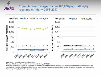
Physicians and surgeons per 100,000 population, by race and ethnicity, 2006-2013
Key: AI/AN = American Indian or Alaska Native.
Source: U.S. Census Bureau, American Community Survey, 2006-2013.
Note: The 2008 and 2013 data for AI/ANs did not meet the criteria for statistical reliability, data quality, or confidentiality. White and Black are non-Hispanic. Hispanic includes all races. The rate of physicians is calculated by dividing the number of reported physicians from the American Community Survey by the U.S. population sample
Image: Charts show physicians and surgeons per 100,000 population, by race and ethnicity, 2006-2013
Left Chart:
| Year | AI/AN | Asian | Black | White |
|---|---|---|---|---|
| 2006 | 79.9 | 1228.3 | 113.3 | 287.2 |
| 2007 | 96.1 | 1205.4 | 118.4 | 293.7 |
| 2008 | 1163.2 | 121 | 299.2 | |
| 2009 | 60.3 | 1153.5 | 113.9 | 290.6 |
| 2010 | 82.7 | 1155.2 | 115.2 | 289.9 |
| 2011 | 72.6 | 1200.8 | 125.6 | 296.6 |
| 2012 | 68.1 | 1123.2 | 120.6 | 298.6 |
| 2013 | 1212.5 | 130.3 | 297.5 |
Right Chart:
| Year | White | Black | Hispanic |
|---|---|---|---|
| 2006 | 301.6 | 113 | 112.8 |
| 2007 | 312 | 118.5 | 101.4 |
| 2008 | 322.9 | 122.4 | 112 |
| 2009 | 313.3 | 115.8 | 108.7 |
| 2010 | 317.3 | 114.2 | 104.8 |
| 2011 | 325.7 | 127.8 | 101.3 |
| 2012 | 325.8 | 120.7 | 113.9 |
| 2013 | 325.7 | 130.3 | 115.5 |
Notes:
- Importance:
- Diversity in the composition of the health care workforce is important because it affects outcomes, quality, safety, and satisfaction. Racial and ethnic concordance in health care provider-patient relationships has been shown to improve care. Race-concordant patient-provider relationships, as opposed to race-discordant, have been found to result in longer medical visits with higher ratings of positive affect, shared decisionmaking, and satisfaction (Schoenthaler, et al., 2012).
- Additional research has found that health care providers from groups underrepresented in the health professions are more likely to serve minority and economically disadvantaged patients. It has also been found that Black and Hispanic physicians practice in areas with larger Black and Hispanic populations than other physicians (Brown, et al., 2009) and that Black and Hispanic Americans were likely to seek race- concordant physicians due to several factors, including language accessibility (Saha, et. al., 2000).
- Further studies have also shown patient trust with providers may influence clinical outcomes and medication adherence regardless of patient–physician racial/ethnic composition.
- Groups With Disparities:
- From 2006 to 2013, the rate of physicians per 100,000 population was higher for Asians than for Whites, Blacks, and American Indians and Alaska Natives (through 2012).
- From 2006 to 2013, the rate of physicians per 100,000 population was higher for non-Hispanic Whites than for non-Hispanic Blacks. The rate of physicians per 100,000 population was lower for Hispanics from 2007 to 2013.
Slide 24
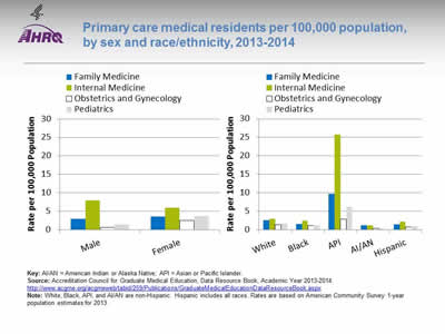
Primary care medical residents per 100,000 population, by sex and race/ethnicity, 2013-2014
Key: AI/AN = American Indian or Alaska Native; API = Asian or Pacific Islander.
Source: Accreditation Council for Graduate Medical Education, Data Resource Book, Academic Year 2013-2014. http://www.acgme.org/acgmeweb/tabid/259/Publications/GraduateMedicalEducationDataResourceBook.aspx
Note: White, Black, API, and AI/AN are non-Hispanic. Hispanic includes all races. Rates are based on American Community Survey 1-year population estimates for 2013.
Image: Charts show primary care medical residents per 100,000 population, by sex and race/ethnicity, 2013-2014
Left Chart:
| Sex | Family Medicine | Internal Medicine | Obstetrics and Gynecology | Pediatrics |
|---|---|---|---|---|
| Male | 2.9 | 7.9 | 0.6 | 1.4 |
| Female | 3.5 | 5.9 | 2.5 | 3.7 |
Right Chart:
| Race/Ethnicity | Family Medicine | Internal Medicine | Obstetrics and Gynecology | Pediatrics |
|---|---|---|---|---|
| White | 2.6 | 2.9 | 1.3 | 1.7 |
| Black | 1.6 | 2.4 | 1.1 | 1.1 |
| API | 9.7 | 25.8 | 2.9 | 6.2 |
| AI/AN | 1.1 | 1.1 | 0.3 | 0.3 |
| Hispanic | 1.4 | 2.2 | 0.7 | 0.9 |
Notes:
- Importance:
- Primary care providers and patients who have established clear communication and trusting relationships can yield better outcomes for patients; however, not all providers and patients can establish these relationships. Increased racial and ethnic diversity among primary care medical residents may lend itself to a provider workforce with strong cultural competency.
- Groups With Disparities:
- In 2013-2014, the rate of primary care medical residents was higher for females than for males in family medicine, obstetrics and gynecology, and pediatrics. The rate for males was higher than for females in internal medicine.
- In 2013-2014, the rate of primary care medical residents was higher for Asians and Pacific Islanders than for all other racial/ethnic groups, with the highest rate in internal medicine.
- In 2013-2014, American Indian and Alaska Native medical residents had the smallest rate of representation across all medical specialties.
Slide 25
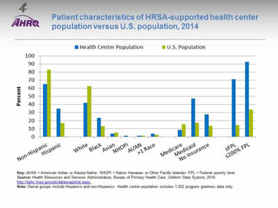
Patient characteristics of HRSA-supported health center population versus U.S. population, 2014
Key: AI/AN = American Indian or Alaska Native; NHOPI = Native Hawaiian or Other Pacific Islander; FPL = Federal poverty level.
Source: Health Resources and Services Administration, Bureau of Primary Health Care, Uniform Data System, 2014. http://bphc.hrsa.gov/uds/datasnapshot.aspx.
Note: Racial groups include Hispanics and non-Hispanics. Health center population includes 1,202 program grantees data only.
Image: Chart shows patient characteristics of HRSA-supported health center population versus U.S. population, 2014
| Patient Characteristics | Health Center Population | U.S. Population |
|---|---|---|
| Non-Hispanic | 65.2 | 82.9 |
| Hispanic | 34.9 | 17.1 |
| White | 41.9 | 62.6 |
| Black | 23.4 | 13.2 |
| Asian | 3.8 | 5.3 |
| NHOPI | 1.2 | 0.2 |
| AI/AN | 1.3 | 1.2 |
| >1 Race | 3.7 | 2.4 |
| Medicare | 8.6 | 15.6 |
| Medicaid | 47.3 | 17.3 |
| No Insurance | 27.9 | 13.4 |
| <FPL | 71.2 | 14.5 |
| <200% FPL | 92.8 | 33.9 |
Notes:
- Importance: Patients who receive health care in health centers may experience greater disparities in care compared with the general U.S. population.
- Population Differences:
- In 2014, slightly more than one-third (34.9%) of the health center population was Hispanic, which was twice as much as the percentage in the U.S. population (17.1%). Nearly one-quarter (23.4%) of the health center population was Black, almost twice as much as the percentage in the U.S. population (13.2%).
- The health center population also had higher percentages of uninsurance (27.9%) and Medicaid enrollment (47.3%) than the U.S. population (13.4% and 17.3%, respectively).
- In 2014, 71.2% of the health center population was at or below the Federal poverty level compared with 14.5% of the U.S. population.
Slide 26
Trauma Center Utilization for Severe Injuries
- Trauma care systems were developed to provide complex medical care to injured patients using a network of care facilities.
- Trauma systems are composed of levels ranging from level I to III centers, with level I denoting the most clinically sophisticated hospital.
- The hospital with the highest level is designated as the lead hospital in a trauma care system.
Slide 27
Trauma Center Levels
- Level I: Required to have a specific number of surgeons and anesthesiologists on duty at all times, as well as education, prevention, and outreach programs.
- Level II: Provide initial definitive trauma care regardless of the severity of the injury.
- Level III: Typically considered community or rural-based hospitals that provide prompt assessment, resuscitation, stabilization, emergency operations, and treatment.
Notes:
- The 24-hour coverage of surgery in level I facilities also provides trauma patients with many surgical specialties, including neurosurgery, as well as radiology, internal medicine, and critical care.
- When a level II center cannot provide the required care, the patient may be triaged to a Level I center.
- Level III facilities may transfer patients to hospitals with additional resources.
Slide 28
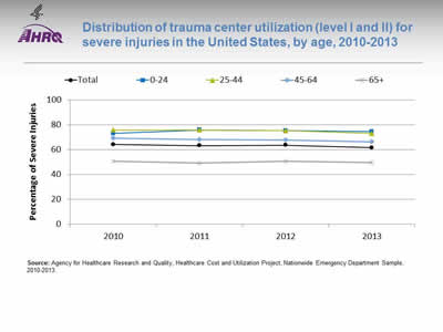
Distribution of trauma center utilization (level I and II) for severe injuries in the United States, by age, 2010-2013
Source: Agency for Healthcare Research and Quality, Healthcare Cost and Utilization Project, Nationwide Emergency Department Sample, 2010-2013.
Image: Chart shows distribution of trauma center utilization (level I and II) for severe injuries in the United States, by age, 2010-2013
| Age | 2010 | 2011 | 2012 | 2013 |
|---|---|---|---|---|
| Total | 64.0 | 63.2 | 63.4 | 61.4 |
| 0-24 | 72.9 | 75.7 | 75.1 | 74.4 |
| 25-44 | 75.7 | 75.8 | 75.2 | 72.9 |
| 45-64 | 69.0 | 68.0 | 67.6 | 66.3 |
| 65+ | 50.8 | 49.1 | 50.8 | 49.7 |
Notes:
- Importance: Well-coordinated and timely treatment for trauma patients can prevent needless injury to those who have suffered from an accident or other life-threating condition. Trauma centers in the United States provide care for both pediatric and adult populations. People the age of 45 years use trauma center services at a higher rate.
- Trends: From 2010 to 2013, the percentage of people who used trauma centers declined overall and among people ages 25-44 and 45-64.
- Groups With Disparities: From 2010 to 2013, people age 65 and over were less likely to use level I and II trauma centers than people under age 65.
Slide 29
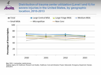
Distribution of trauma center utilization (Level I and II) for severe injuries in the United States, by geographic location, 2010-2013
Key: MSA = metropolitan statistical area.
Source: Agency for Healthcare Research and Quality, Healthcare Cost and Utilization Project, Nationwide Emergency Department Sample, 2010-2013.
Image: Chart shows distribution of trauma center utilization (Level I and II) for severe injuries in the United States, by geographic location, 2010-2013
| Geographic Location | 2010 | 2011 | 2012 | 2013 |
|---|---|---|---|---|
| Total | 64.0 | 63.2 | 63.4 | 61.4 |
| Large Central MSA | 70.5 | 68.8 | 69.2 | 63.8 |
| Large Fringe MSA | 65.7 | 61.4 | 67.0 | 63.5 |
| Medium MSA | 69.1 | 68.7 | 67.6 | 65.2 |
| Small MSA | 48.9 | 58.0 | 51.6 | 59.6 |
| Micropolitan | 56.3 | 53.0 | 49.2 | 50.9 |
| Non-Core | 56.4 | 57.3 | 56.6 | 54.4 |
Notes:
- Importance: In 2013, patients with intracranial injuries represented 53.6% of trauma center visits. Triaging patients to level I and II trauma centers with intracranial or other injuries is driven by many variables, including geographic proximity of the trauma center. Therefore, residents of rural areas may have difficulty gaining access to care in trauma centers.
- Trends: From 2010 to 2013, the percentage of people who used trauma centers declined among residents of large central metropolitan areas, medium metropolitan areas, and micropolitan areas.
- Groups With Disparities: In 2013, 63.8% of residents from a large central metropolitan area were treated in a level I or II trauma center compared with 50.9% of residents from a micropolitan area.
Slide 30
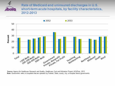
Rate of Medicaid and uninsured discharges in U.S. short-term acute hospitals, by facility characteristics, 2012-2013
Source: Agency for Healthcare Research and Quality, Healthcare Cost and Utilization Project, HCUPnet, 2013.
Note: Government refers to hospitals that are operated by Federal, State, county, city, or hospital district governments.
Image: Chart shows rate of Medicaid and uninsured discharges in U.S. short-term acute hospitals, by facility characteristics, 2012-2013
| Facility Characteristics | 2012 | 2013 |
|---|---|---|
| Total | 26.5 | 26.7 |
| <100 Beds | 23.4 | 23.3 |
| 100-299 Beds | 25.2 | 25.2 |
| 300-499 Beds | 26.9 | 27.5 |
| 500+ Beds | 28.9 | 29 |
| Government | 36.2 | 36 |
| Private, Nonprofit | 24.5 | 24.8 |
| Private, For Profit | 28.5 | 28.4 |
| Teaching | 28.3 | 28.5 |
| Nonteaching | 24.5 | 24.6 |
| Northeast | 24.8 | 24.6 |
| Midwest | 23.2 | 23.3 |
| South | 28.2 | 28.5 |
| West | 28.7 | 28.8 |
Notes:
- Importance: Some hospitals contribute to the safety net and provide care for more Medicaid and uninsured patients than others.
- Trends:
- There were no statistically significant changes in Medicaid and uninsured patient discharges from 2012 to 2013.
- Differences Between Types of Hospitals:
- In 2013, compared with hospitals with 500 or more beds (29.0%), hospitals with bed sizes under 300 (23.3% for <100 beds and 25.2% for 100-299 beds) had a smaller percentage of Medicaid or uninsured patients.
- In 2013, 28.4% of patients in private, for-profit hospitals had Medicaid or were uninsured, compared with 36.0% in government hospitals.
- Also in 2013, teaching hospitals (28.5%) had a larger percentage of Medicaid or uninsured patients compared with nonteaching hospitals (24.6%).
- In 2013, hospitals in the West and in the South had a greater percentage of Medicaid and uninsured patients (28.8% and 28.5%, respectively), while hospitals in the Midwest had the lowest percentage of these patients (23.3%).
Slide 31
References
- Blewett LA, Johnson PJ, Lee B, et al. When a usual source of care and usual provider matter: adult prevention and screening services. J Gen Intern Med 2008 Sep;23(9):1354-60. http://www.ncbi.nlm.nih.gov/pmc/articles/PMC2518015/. Accessed April 14, 2016.
- Brown T, Liu JX, Scheffler RM. Does the under- or overrepresentation of minority physicians across geographical areas affect the location decisions of minority physicians? Health Serv Res 2009;44:1290-1308. http://www.ncbi.nlm.nih.gov/pmc/articles/PMC2739029/. Accessed April 14, 2016.
- Healthy People 2020. Access to Health Services. Washington, DC: U.S. Department of Health and Human Services, Office of Disease Prevention and Health Promotion. http://www.healthypeople.gov/2020/topics-objectives/topic/Access-to-Health-Services. Accessed April 14, 2016.
- Institute of Medicine, Committee on Monitoring Access to Personal Health Care Services. Access to health care in America. Washington, DC: National Academy Press; 1993. http://www.nap.edu/catalog/2009/access-to-health-care-in-america. Accessed April 14, 2016.
- Institute of Medicine, Board of Health Care Services. Future directions for the National Healthcare Quality and Disparities Reports. Washington, DC: National Academies Press; 2010. http://www.nap.edu/catalog/12846/future-directions-for-the-national-healthcare-quality-and-disparities-reports. Accessed April 14, 2016.
- Saha S, Taggart SH, Komaromy M, et al. Do patients choose physicians of their own race? Health Aff 2000;19:76-83. http://content.healthaffairs.org/content/19/4/76.long. Accessed May 18, 2016.
- Schoenthaler A, Allegrante JP, Chaplin W, et al. The effect of patient-provider communication on medication adherence in hypertensive Black patients: does race concordance matter? Ann Behav Med 2012;43(3):372-82. http://www.ncbi.nlm.nih.gov/pmc/articles/PMC3665951/. Accessed April 14, 2016.
- Smart NA, Titus TT. Outcomes of early versus late nephrology referral in chronic kidney disease: a systematic review. Am J Med 2011 Nov;124(11):1073-80e2. http://www.sciencedirect.com/science/article/pii/S0002934311004128. Accessed April 14, 2016.


