Chartbook on Black Health Care: Slide Presentation
National Healthcare Quality and Disparities Report
Contents
Introduction
Part 1: Overviews of the Report and the Black Population
Part 2: Trends in Priorities of the Heckler Report
Part 3: Trends in Access and Priorities of the National Quality Strategy
Introduction
Slide 1

National Healthcare Quality and Disparities Report
Chartbook on Health Care for Blacks
February 2016
Slide 2
Goals of the Chartbook on Health Care for Blacks
- Commemorates the 30th Anniversary of the Report of the Secretary's Task Force on Black and Minority Health (Heckler Report).
- Highlights progress for Blacks on priorities of the Heckler Report.
- Summarizes trends in health care disparities by race related to:
- Access to health care.
- Priorities of the National Quality Strategy (NQS).
Slide 3
Organization of the Chartbook on Health Care for Blacks
- Part of a series related to the National Healthcare Quality and Disparities Report (QDR).
- Organized into three parts:
- Overviews of the QDR and the Black population, one of AHRQ's priority populations.
- Summary of trends in health care for the Black population related to priorities of the Heckler Report.
- Summary of trends in health care for the Black population related to access to health care and NQS priorities.
Slide 4
Terminology: Race
- For the sake of brevity, Blacks refers both to African Americans (U.S. born) and foreign-born Blacks.
- Foreign-born Blacks represent a growing percentage of the population but most data sources do not distinguish between U.S.- and foreign-born Blacks.
Slide 5
Terminology: Race
- In 2000 and later U.S. Census Bureau surveys:
- U.S.-born Blacks refer to people born in the United States, Puerto Rico, or other U.S. territories and those born abroad to at least one parent who is a U.S. citizen.
- Foreign-born Blacks refer to people born outside the United States, Puerto Rico, or other U.S. territories.
- Both terms refer to people whose race is Black or mixed Black, regardless of Hispanic origin.
Note: This terminology is used in 2000 and later U.S. Census Bureau surveys.
Source: American Community Survey and Puerto Rico Community Survey, 2013. 2013 Subject Definitions. http://www.census.gov/programs-surveys/acs/technical-documentation/code-lists.2013.html
Slide 6

Terminology: Income
- The QDR's income data comes in two formats, which is a determinant of the diverse sources of our data:
- Poor, low income, middle income, and high income.
- Quartiles: Q1- Q4.
Slide 7
Terminology: Disparities
- Comparisons in this chartbook are between Blacks and Whites whenever the data are available.
- Some comparisons are between non-Hispanic Blacks and non-Hispanic Whites when those are the only data available; the terms "Blacks" and "Whites" are still used in these cases.
Slide 8
Key Findings of the Chartbook on Health Care for Blacks
- Data on access to and quality of health care received by Blacks were available for almost all measures tracked in the QDR.
- Among Heckler Report priorities, disparities in colorectal cancer care and diabetes care presented major challenges for Blacks.
- Blacks have worse access to care although this is improving since the Affordable Care Act.
- Blacks receive poorer quality of care, especially on measures of as related to person centeredness and care coordination.
Part 1: Overviews of the Report and the Black Population
Slide 9
National Healthcare Quality and Disparities Report Chartbook on Health Care for Blacks
Part 1: Overviews of the Report and the Black Population
Slide 10
National Healthcare Quality and Disparities Report
- Annual report to Congress mandated in the Healthcare Research and Quality Act of 1999 (P.L. 106-129).
- Provides a comprehensive overview of:
- Quality of health care received by the general U.S. population.
- Disparities in care experienced by different racial, ethnic, and socioeconomic groups.
- Assesses the performance of our health system and identifies areas of strengths and weaknesses along three main themes:
- Access to health care.
- Quality of health care.
- NQS priorities.
Slide 11
National Healthcare Quality and Disparities Report
- Based on more than 250 measures of quality and disparities covering a broad array of health care services and settings.
- Data from 2015 QDR, generally reflecting collection through 2014.
- Produced with the help of an Interagency Work Group led by the Agency for Healthcare Research and Quality and submitted on behalf of the Secretary of Health and Human Services.
Slide 12
Chartbook on Health Care for Blacks
- This chartbook includes summaries of trends in health care for Black populations related to:
- Priorities of the Heckler Report.
- Access to health care.
- Priorities of the National Quality Strategy.
- QDR Introduction and Methods contains information about methods used in the chartbook.
- A Data Query tool (http://nhqrnet.ahrq.gov/inhqrdr/data/query) provides access to all data tables.
Slide 13
Key Metrics Used in Chartbooks
- Trends: Assesses the rate of change over time (typically 2002-2013) for a population.
- Disparities: Assesses whether measure estimates for two populations differ at the most recent time point.
- Change in Disparities: Assesses whether the rates of change over time for two populations differ.
- Achievable Benchmarks: Defines a level of performance for a measure that has been attained by the best performing States (top 10 percent).
Slide 14
HHS Data Collection Standards for Race and Ethnicity, 2011
|
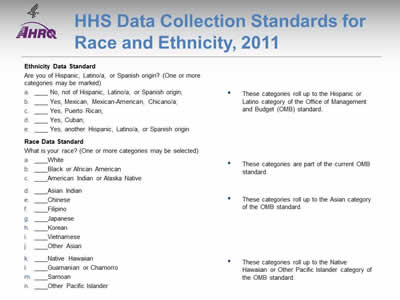
Ethnicity Data Standard Are you of Hispanic, Latino/a, or Spanish origin? (One or more categories may be marked)
These categories roll up to the Hispanic or Latino category of the Office of Management and Budget (OMB) standard. Race Data Standard What is your race? (One or more categories* may be selected)
These categories are part of the current OMB standard.
These categories roll up to the Asian category of the OMB standard.
These categories roll up to the Native Hawaiian or Other Pacific Islander category of the OMB standard. |
Note:
- The Affordable Care Act includes several provisions aimed at eliminating health disparities in America. Section 4302 (Understanding health disparities: data collection and analysis) focuses on the standardization, collection, analysis, and reporting of health disparities data. Section 4302 requires the Secretary of Health and Human Services (HHS) to establish data collection standards for race, ethnicity, sex, primary language, and disability status. Adopted October 31, 2011, these data collection standards are to be used, to the extent practicable, in HHS-sponsored population health surveys.
- The new data standards improve the quality of HHS data collection by building on the Office of Management and Budget (OMB) minimum standard, including additional specificity as well as categories that can be consolidated to the current OMB standard. For many large HHS surveys, including the National Health Interview Survey, National Survey on Drug Use and Health, and Medical Expenditure Panel Survey, slight differences in subcategories limited the ability to compare racial and ethnic groups between surveys; the new standards create uniform categories to facilitate these comparisons (Dorsey, et al., 2014).
Source: Sorsey R, Graham G, Glied S, et al. Implementing health reform: improved data collection and the monitoring of health disparities. Annu Rev Public Health 2014;35:123-38.
Slide 15
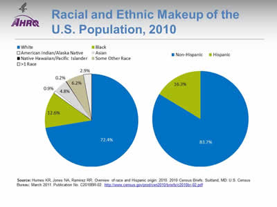
Racial and Ethnic Makeup of the U.S. Population, 2010
Image: Two pie charts show the racial and ethnic makeup of the U.S. population:
- White, 72.4%.
- Black, 12.6%.
- American Indian/Alaskan Native, 0.9%.
- Asian, 4.8%.
- Native Hawaiian/Pacific Islander, 0.2%.
- Some Other Race, 6.2%.
- More than One Race, 2.9%.
- Non-Hispanic, 83.7%.
- Hispanic, 16.3%.
Source: Humes KR, Jones NA, Ramirez RR. Overview of race and Hispanic origin: 2010. 2010 Census Briefs. Suitland, MD: U.S. Census Bureau; March 2011. Publication No. C2010BR-02. http://www.census.gov/prod/cen2010/briefs/c2010br-02.pdf (5.4 MB).
Note:
- According to the 2010 Census, Whites made up 72% of the population of the United States in comparison to 83% in 1980 (refer to 1980 Census at http://www2.census.gov/prod2/decennial/documents/1980/1980censusofpopu8011u_bw.pdf [21.24 MB]) and 88% at the beginning of the 20th century (refer to 1910 Census, available at http://www.census.gov/prod/www/decennial.html).
- In 1980, minorities made up about 20% of the population in the United States, African Americans being the largest minority group at 11.7%. In 2010, Hispanics were the largest minority group, making up more than 16% of the total population, and African Americans just under 13%.
Slide 16
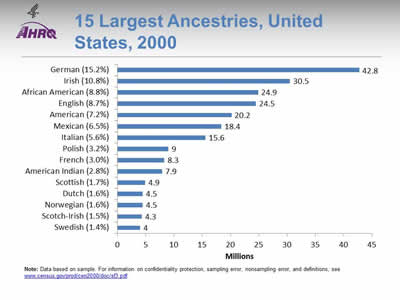
15 Largest Ancestries, United States, 2000
Image: Chart shows 15 Largest Ancestries, United States, 2000.
Numbers in millions:
- German (15.2%). 42.8.
- Irish (10.8%), 30.5.
- African American (8.8%), 24.9.
- English (8.7%), 24.5.
- American (7.2%), 20.2.
- Mexican (6.5%), 18.4.
- Italian (5.6%), 15.6.
- Polish (3.2%), 9.
- French (3.0%), 8.3.
- American Indian (2.8%), 7.9.
- Scottish (1.7%), 4.9.
- Dutch (1.6%), 4.5.
- Norwegian (1.6%), 4.5.
- Scotch-Irish (1.5%), 4.3.
- Swedish (1.4%), 4.
Note: Data based on sample. For information on confidentiality protection, sampling error, nonsampling error, and definitions, go to www.census.gov/prod/cen2000/doc/sf3.pdf (5.67 MB).
Slide 17
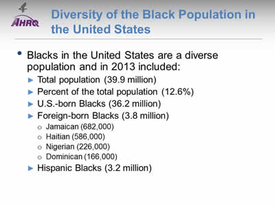
Diversity of the Black Population in the United States
- Blacks in the United States are a diverse population and in 2013 included:
- Total population (39.9 million).
- Percent of the total population (12.6%).
- U.S.-born Blacks (36.2 million).
- Foreign-born Blacks (3.8 million):
- Jamaican (682,000).
- Haitian (586,000).
- Nigerian (226,000).
- Dominican (166,000).
- Hispanic Blacks (3.2 million).
Note:
- Other foreign-born Blacks include people from Ghana (147,000), Guyana (122,000), Kenya (107,000), Liberia (83,000), Somalia (79,000), Mexico (70,000), Barbados (51,000), Cameroon (48,000), Cuba (41,000), Sierra Leone (36,000), Grenada (34,000), Eritrea (33,000), Panama (32,000), Belize (32,000), Sudan (30,000), Bahamas (27,000), and England (22,000).
- Foreign-born Blacks include single-race blacks and multiple-race Blacks, regardless of Hispanic origin.
- Foreign-born Black populations do not add up to the total foreign-born Black population because regions with fewer Black immigrants, such as Asia, the Middle East, and most of Europe were not included.
Source: U.S. Census Bureau. American FactFinder. http://factfinder.census.gov/faces/tableservices/jsf/pages/productview.xhtml?pid=ACS_13_1YR_B05003B&prodType=table and Anderson M. A rising share of the U.S. black population is foreign born. Washington, DC: Pew Research Center; April 2015. http://www.pewsocialtrends.org/2015/04/09/a-rising-share-of-the-u-s-black-population-is-foreign-born.
Slide 18

Distribution of the U.S. Black Population, 2010
Image: A map of the United States is color-coded by county to show distribution of the U.S. Black Population.
Source: U.S. Census Bureau. 2010 Census Summary File 1. Map generated from the Census Data Mapper at https://www.census.gov/programs-surveys/geography/data/interactive-maps.html.
Note: For information on confidentiality protection, nonsampling error, and definitions, see http://www.census.gov/prod/cen2010/doc/sf1.pdf (7.38 MB).
- Blacks are the second largest minority population, following the Hispanic/Latino population. In 2010, most Blacks lived in the South (55% of the U.S. Black population), while 36% of the White population lived in the South.
- The 10 States with the largest Black population are Florida, Texas, New York, Georgia, California, North Carolina, Illinois, Maryland, Virginia, and Ohio. Combined, these 10 States represent 58% of the total Black population.
- Of the 10 largest places in the United States with 100,000 or more population, Detroit, Michigan, had the largest percentage of Blacks (84%), followed by Jackson, Mississippi (80%).
Slide 19
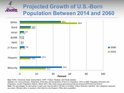
Projected Growth of U.S.-Born Population Between 2014 and 2060
Image: Bar graph shows projected growth of foreign-born population between 2014 and 2060:
- White, 2060 - 49.4%, 2014 - 68.8%.
- Black, 2060 - 13.3%, 2014 - 13.0%.
- Asian, 2060 - 5.0%, 2014 - 2.0%.
- AI/AN, 2060 - 0.8%, 2014 - 0.8%.
- NHPI, 2060 - 0.2%, 2014 - 0.2%.
- Two or more races, 2060 - 5.8%, 2014 - 2.1%.
- Hispanic, 2060 - 25.5%, 2014 - 13.0%.
- Minority, 2060 - 50.6%, 2014 - 31.2%.
Key: AI/AN = American Indian Alaska Native; NHPI = Native Hawaiian and Pacific Islander.
Source: U.S. Census Bureau. Projections of the Size and Composition of the U.S. Population: 2014 to 2060. Population Estimates and Projections. Current Population Reports, March 2015. http://www.census.gov/newsroom/press-releases/2015/cb15-tps16.html
Note: The percentages for each group in each year may not add to 100 due to rounding. Unless otherwise specified, race categories represent race alone. Minority refers to everyone other than the non-Hispanic White alone population.
- Between 2014 and 2060, the Black population is projected to increase moderately, from 13% to 14% of the total population (data not shown).
- The U.S.-born Black population is not expected to change much over the next four decades.
Slide 20
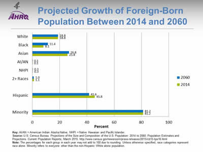
Projected Growth of Foreign-Born Population Between 2014 and 2060
Image: Bar graph shows projected growth of U.S.-born population between 2014 and 2060:
- White, 2060 - 18.8%. 2014 - 18.8%.
- Black, 2060 - 11.4%, 2014 - 8.1%.
- Asian, 2060 - 26.8%, 2014 - 25.8%.
- AI/AN, 2060 - 0.1%, 2014 - 0.1%.
- NHPI, 2060 - 0.3%, 2014 - 0.3%.
- Two or more races, 2060 - 1.0%, 2014 - 1.1%.
- Hispanic, 2060 - 41.6%, 2014 - 45.8%.
- Minority, 2060 - 81.2%, 2014 - 81.2%.
Key: AI/AN = American Indian Alaska Native; NHPI = Native Hawaiian and Pacific Islander.
Source: U.S. Census Bureau. Projections of the Size and Composition of the U.S. Population: 2014 to 2060. Population Estimates and Projections. Current Population Reports, March 2015. http://www.census.gov/newsroom/press-releases/2015/cb15-tps16.html
Note: The percentages for each group in each year may not add to 100 due to rounding. Unless otherwise specified, race categories represent race alone. Minority refers to everyone other than the non-Hispanic White alone population.
- Between 2014 and 2060 the percentage of foreign-born Blacks is expected to increase from 8.1% in 2014 to 11.4% in 2060.
Slide 21
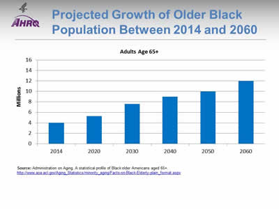
Projected Growth of Older Black Population Between 2014 and 2060
Image: Bar graph shows projected growth of the older black population (adults age 65+) in millions:
- 2014, 4.
- 2020, 5.3.
- 2030, 7.6.
- 2040, 9.
- 2050, 10.
- 2060, 12.
Source: Administration on Aging. A statistical profile of Black older Americans aged 65+. http://www.aoa.acl.gov/Aging_Statistics/minority_aging/Facts-on-Black-Elderly-plain_format.aspx.
- The non-Hispanic Black older population was 4 million in 2014 and is projected to grow to 12 million by 2060. In 2014, Blacks made up 9% of the older population. By 2060, the percentage of the older population that is Black is projected to grow to 12%.
- Centenarians: In 2014, there were 8,582 Blacks age 100 years and over (1,558 men and 7,024 women). They made up 12% of all centenarians.
- Residence: In 2013, more than half of older Blacks lived in eight States: New York (331,114), Florida (286,438), Texas (255,362), Georgia (252,101), California (248,195), North Carolina (221,725), Illinois (196,584), and Maryland (177,521).
- Self-Rated Health Status: During 2011-2013, 27% of both older Black men and older Black women reported very good/excellent health status. Among older non-Hispanic Whites, this figure was 45% for men and 47% for women. Positive health evaluations decline with age. Among Black men ages 65-74, 31% reported very good/excellent health compared with 17% among those age 85 and over. Similarly, among Black women, this rate declined from 30% at ages 65-74 to 20% at age 85 and over.
- Chronic Conditions:
- Most older people have at least one chronic condition and many have multiple conditions. Some of the most frequently occurring conditions among older non-Hispanic Blacks in 2011-2013 were:
- Hypertension (85% in 2009-2012).
- Diagnosed arthritis (51%).
- All types of heart disease (27%).
- Diagnosed diabetes (39% in 2009-2012).
- Cancer (17%).
- The comparable figures for all older persons were: hypertension (71% in 2009-2012), diagnosed arthritis (49%), all types of heart disease (31%), diagnosed diabetes (21% in 2009-2012), and cancer (25%).
- Most older people have at least one chronic condition and many have multiple conditions. Some of the most frequently occurring conditions among older non-Hispanic Blacks in 2011-2013 were:
- Access to Medical Care: In 2013, 34% of older Blacks had both Medicare and supplementary private health insurance and 11% were covered by both Medicare and Medicaid. In comparison, almost 50% of all older adults had both Medicare and supplementary private health insurance and 6% were covered by both Medicare and Medicaid. In 2011-2013, 4% of older non-Hispanic Blacks reported they had no usual source of health care, the same as the percentage for all older Americans.
Slide 22
Health of the Black Population in the United States
- Health of Blacks is influenced by various social determinants, such as poverty, lack of access to high-quality education, unemployment, unhealthy housing, unsafe neighborhoods, and other cultural barriers.
- Social determinants of health are economic and physical conditions in the environments in which people are born, live, learn, work, play, worship, and age that affect a wide range of health, functioning, and quality-of-life outcomes and risks.
- Blacks have higher rates of mortality than any other racial or ethnic group for 8 of the top 10 causes of death.
Source: Kelly RL. 2015 Kelly report: health disparities in America. https://cbcbraintrust-kelly.house.gov/media-center/kelly-report.
Part 2: Trends in Priorities of the Heckler Report
Slide 23

National Healthcare Quality and Disparities Report Chartbook on Health Care for Blacks
Part 2: Trends in Priorities of the Heckler Report
Slide 24
Report of the Secretary's Task Force on Black and Minority Health (Heckler Report)
- 30th anniversary of the Heckler Report
- Released in 1985 under the leadership of then U.S. Department of Health and Human Services Secretary Margaret M. Heckler.
- Documented persistent health disparities that accounted for 60,000 excess deaths each year.
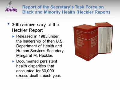
Image: The Heckler Report.
Note:
- The year 2015 marked the 30th anniversary of the Report of the Secretary’s Task Force on Black and Minority Health (also known as the Heckler Report), released in 1985 under the leadership of then U.S. Department of Health and Human Services (HHS) Secretary Margaret M. Heckler.
- The landmark report marked the first convening of a group of health experts by the U.S. Government to conduct a comprehensive study of racial and ethnic minority health and elevated minority health onto the national stage.
- The Heckler Report documented persistent health disparities that accounted for 60,000 excess deaths each year and synthesized ways to advance health equity. This marked the beginning of a new era in addressing minority health issues, beginning with the creation of the HHS Office of Minority Health in 1986 and leading up to the Affordable Care Act in 2010.
Slide 25
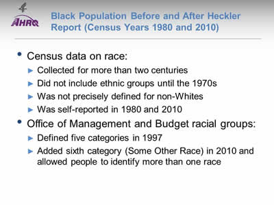
Black Population Before and After Heckler Report (Census Years 1980 and 2010)
- Census data on race:
- Collected for more than two centuries.
- Did not include ethnic groups until the 1970s.
- Was not precisely defined for non-Whites.
- Was self-reported in 1980 and 2010.
- Office of Management and Budget racial groups:
- Defined five categories in 1997:
- White.
- Black or African American.
- American Indian or Alaska Native.
- Asian.
- Native Hawaiian.
- Added sixth category (Some Other Race) in 2010 and allowed people to identify more than one race
- Defined five categories in 1997:
- Question 6 of the 2010 Census regarding race had 15 different choices and respondents could identify one or more choice.
- Historically, there has been undercounting of the population in key geographic areas, particularly those with increased minority representation.
- Data from the 1980 and 2010 Census were used whenever possible for this section; data from the Current Population Survey were used to depict a more updated view of the population within these time periods (1985 and 2015) and are so noted.
Slide 26
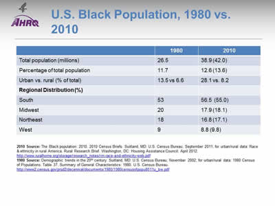
U.S. Black Population, 1980 vs. 2010
| 1980 | 2010 | |
|---|---|---|
| Total population (millions) | 26.5 | 38.9 (42.0) |
| Percentage of total population | 11.7 | 12.6 (13.6) |
| Urban vs. rural (% of total) | 13.5 vs 6.6 | 28.1 vs. 8.2 |
| Regional Distribution (%) | ||
| South | 53 | 56.5 (55.0) |
| Midwest | 20 | 17.9 (18.1) |
| Northeast | 18 | 16.8 (17.1) |
| West | 9 | 8.8 (9.8) |
2010 Source: The Black population: 2010. 2010 Census Briefs. Suitland, MD: U.S. Census Bureau; September 2011; for urban/rural data: Race & ethnicity in rural America. Rural Research Brief. Washington, DC: Housing Assistance Council; April 2012. http://www.ruralhome.org/storage/research_notes/rrn-race-and-ethnicity-web.pdf (1.4 MB).
1980 Source: Demographic trends in the 20th century. Suitland, MD: U.S. Census Bureau; November 2002; for urban/rural data: 1980 Census of Populations. Table 37. Summary of General Characteristics: 1980. U.S. Census Bureau. http://www2.census.gov/prod2/decennial/documents/1980/1980censusofpopu8011u_bw.pdf (21.24 MB).
Note:
- African Americans or Blacks in the United States have undergone different definitions as a racial/ethnic minority. Census data represent the most reliable and consistent data available; however, methods and definitions of race, poverty, environment, and other categories have changed over time. These different definitions make comparison of data challenging. Information on all populations is provided in certain areas to best show how the African American population is being affected.
- Total population data used were "Black only" reported in the 1980 census. For the 2010 data, the first number represents "Black only" and the number in parentheses represents Black alone or in combination with another race.
- According to the 1980 census definition, the urban population comprises all persons living in places of 2,500 or more inhabitants incorporated as cities, villages, boroughs (except in Alaska and New York), and towns (except in the New England States, New York, and Wisconsin).
Slide 27
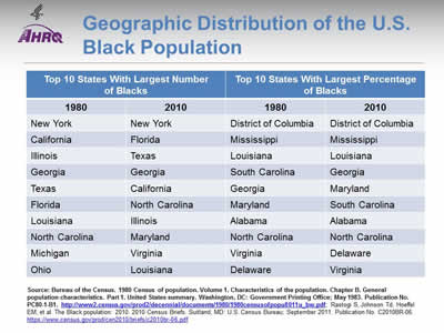
Geographic Distribution of the U.S. Black Population
| Top 10 States With Largest Number of Blacks | Top 10 States With Largest Percentage of Blacks | ||
|---|---|---|---|
| 1980 | 2010 | 1980 | 2010 |
| New York | New York | District of Columbia | District of Columbia |
| California | Florida | Mississippi | Mississippi |
| Illinois | Texas | Louisiana | Louisiana |
| Georgia | Georgia | South Carolina | Georgia |
| Texas | California | Georgia | Maryland |
| Florida | North Carolina | Maryland | South Carolina |
| Louisiana | Illinois | Alabama | Alabama |
| North Carolina | Maryland | North Carolina | North Carolina |
| Michigan | Virginia | Virginia | Delaware |
| Ohio | Louisiana | Delaware | Virginia |
Source: Bureau of the Census. 1980 Census of population. Volume 1. Characteristics of the population. Chapter B. General population characteristics. Part 1. United States summary. Washington, DC: Government Printing Office; May 1983. Publication No. PC80-1-B1. http://www2.census.gov/prod2/decennial/documents/1980/1980censusofpopu8011u_bw.pdf (21.24 MB); Rastogi S, Johnson Td, Hoeffel EM, et al. The Black population: 2010. 2010 Census Briefs. Suitland, MD: U.S. Census Bureau; September 2011. Publication No. C2010BR-06. https://www.census.gov/prod/cen2010/briefs/c2010br-06.pdf (9.975 MB).
Note:
- According to the U.S. Census Bureau, Blacks live throughout the country, with the highest concentration in the South (about 55%). In 2010, the District of Columbia had the largest percentage of Blacks (51%), and Mississippi was second with 37%. New York had the largest number of Black residents (3.1 million) although States in the South had a higher percentage of Blacks.
- According to a report by the University of South Carolina (Probst, et al., 2002):
- Seventy percent of poor Blacks in nonmetropolitan areas live in Mississippi, Georgia, North Carolina, Louisiana, Alabama, and South Carolina.
- "Rural poverty affects both individuals and communities. The proportion of poor persons is higher among minority populations, and total community economic resources are more constrained in communities where minority groups represent over half of the population."
- Thirty-four percent of the nonmetropolitan Black population is poor compared with 13% of the nonmetropolitan White population.
- In nonmetropolitan counties where the majority of the population is Black, the average total county income is 67% of the national value, and bank deposits average 56% of the value for majority White counties.
Slide 28
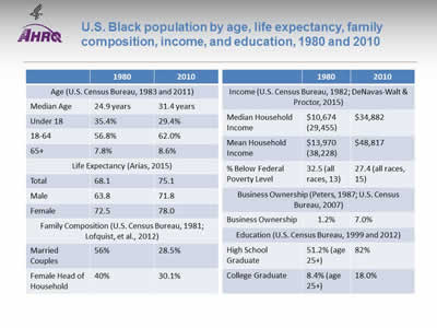
U.S. Black population by age, life expectancy, family composition, income, and education, 1980 and 2010
| Characteristics | 1980 | 2010 | |
|---|---|---|---|
| Age (U.S. Census Bureau, 1983 and 2011) | |||
| Median Age | 24.9 years | 31.4 years | |
| Under 18 | 35.4% | 29.4% | |
| 18-64 | 56.8% | 62.0% | |
| 65+ | 7.8% | 8.6% | |
| Life Expectancy (Arias, 2015) | |||
| Total | 68.1 | 75.1 | |
| Male | 63.8 | 71.8 | |
| Female | 72.5 | 78.0 | |
| Family Composition (U.S. Census Bureau, 1981; Lofquist, et al., 2012) | |||
| Married Couples | 56% | 28.5% | |
| Female Head of Household | 40% | 30.1% | |
| Income (U.S. Census Bureau, 1982; DeNavas-Walt & Proctor, 2015) | |||
| Median Household Income | $10,674 (29,455) | $34,882 | |
| Mean Household Income | $13,970 (38,228) | $48,817 | |
| % Below Federal Poverty Level | 32.5 (all races, 13) | 27.4 (all races, 15) | |
| Business Ownership (Peters, 1987; U.S. Census Bureau, 2007) | |||
| Business Ownership | 1.2% | 7.0% | |
| Education (U.S. Census Bureau, 1999 and 2012) | |||
| High School Graduate | 51.2% (age 25+) | 82% | |
| College Graduate | 8.4% (age 25+) | 18.0% | |
Note:
- The percentage of female head of household with children under 18 years at home has increased for all races since the 1950s. Blacks had the largest increase from the 1950s to the present.
- Between 1970 and 1980 the percentage of Black women maintaining a household more than doubled. In 1980, women first became eligible to be identified as "householder of a married couple household"; since then, they have "...represented an increasing proportion of all married couple householders for every race and Hispanic origin since 1980" (Hobbs & Stoops, 2002).
- In 1950, 78% of Black families were married couples, compared with 56% in 1980 and 28.5% in 2010. In 2010, the percentage of Black families maintained by a single female was 30%. In 2010, nonfamily households represented 35% of Black households. Unmarried couple households (opposite and same sex) could be family or nonfamily, depending on the relationship of others in the household; these represented 7% of Black households.
- Blacks' median income is under the level of all other racial and ethnic groups, including Whites, Asian, and Hispanics.
- From 1960 to the present, Black-owned businesses have transitioned from predominantly small personal service types (e.g., beauty salons, barber shops) to industrial types. The business ownership rate for Blacks has been lower than for other racial and ethnic groups. For example, in 1982, Blacks owned 12.1 firms per thousand, compared to 62.9 for Whites, 28.6 for Asians and 19.5 for Hispanics (Peters, 1987). In 2007, 7% of U.S. firms were owned by Blacks, and 1.9% of U.S. firms with employees were owned by Blacks (U.S. Census Bureau, 2007).
- "[B]usinesses owned by disadvantaged minorities tend to be smaller and less successful than non-minority-owned businesses." (Fairlie & Robb, 2008).
Slide 29
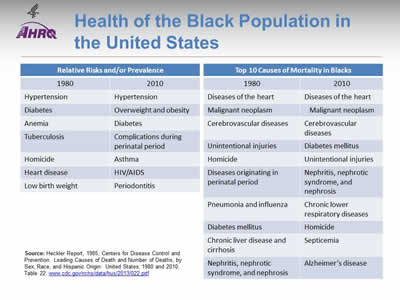
Health of the Black Population in the United States
| Relative Risks and/or Prevalence | |
|---|---|
| 1980 | 2010 |
| Hypertension | Hypertension |
| Diabetes | Overweight and obesity |
| Anemia | Diabetes |
| Tuberculosis | Complications during perinatal period |
| Homicide | Asthma |
| Heart disease | HIV/AIDS |
| Low birth weight | Periodontitis |
| Top 10 Causes of Mortality in Blacks | |
|---|---|
| 1980 | 2010 |
| Diseases of the heart | Diseases of the heart |
| Malignant neoplasm | Malignant neoplasm |
| Cerebrovascular diseases | Cerebrovascular diseases |
| Unintentional injuries | Diabetes mellitus |
| Homicide | Unintentional injuries |
| Diseases originating in perinatal period | Nephritis, nephrotic syndrome, and nephrosis |
| Pneumonia and influenza | Chronic lower respiratory diseases |
| Diabetes mellitus | Homicide |
| Chronic liver disease and cirrhosis | Septicemia |
| Nephritis, nephrotic syndrome, and nephrosis | Alzheimer's disease |
Source: Heckler Report, 1985; Centers for Disease Control and Prevention. Leading Causes of Death and Number of Deaths, by Sex, Race, and Hispanic Origin: United States, 1980 and 2010. Table 22. www.cdc.gov/nchs/data/hus/2013/022.pdf (130 KB).
Note:
- A 2002 South Carolina University report indicated that "84% of counties where African Americans are the majority of the population are HPSA's [Health Professions Shortage Areas]" (Probst, 2002). The 1985 Heckler report indicated, "Relative risks for specific causes of death... are disturbingly high among Blacks compared to the White populations...Relative risk does not indicate the largest numbers of deaths; rather, it reflects the comparative likelihood of dying from a particular cause." For Blacks, tuberculosis, hypertension, homicide, and anemia were among the top life-limiting conditions. Diabetes was also identified as a reason for increased morbidity among Blacks in the 1980s.
- In the early 1980s, HIV/AIDS was not well identified or diagnosed. In the 21st century, it had high prevalence and is the 11th or 12th (depending on gender and age) leading cause of death among Blacks. In 2010, 49% of all HIV-related death were among Blacks. In the United States in 2011, the diagnosis rate of HIV/AIDS was 15.8 per 100,000, but among Blacks this rate was 60.4. Of total HIV diagnoses made between 2008 and 2011, Blacks made up 47% of the total, 64% of women, 66% of infections documented as heterosexual contact, and 67% of children under age 13 years. Blacks diagnosed with HIV are less likely to be linked to care, remain in care, or receive adequate treatment (CDC, 2014).
Slide 30
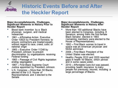
Historic Events Before and After the Heckler Report
| Major Accomplishments, Challenges, Significant Moments in History Prior to Heckler Report
Major Accomplishments, Challenges, Significant Moments in History After Heckler Report
|
Note:
- Blacks in the United States, including slaves, descendants of slaves, and other immigrants have been an integral part of America's history. They have been scientists, educators, laborers, and leaders; they have been part of every major event or era in America's history.
- After the Emancipation Proclamation by President Lincoln, they have also been essential to the U.S. government. Since the 41st Congress in 1869, there has been Black representation in Congress, mostly in the House of Representatives.
- Three Senators were elected in the period before the Heckler report, and six Senators have been elected since. The first Black female Senator was elected for the 103rd Congress in 1993.
- Several Black Supreme Court Justices have been appointed, the first by President Johnson in 1967, the Court's 96th Justice. Another Black Justice was appointed in 1991.
- The first Black President was elected in 2008.
Slide 31
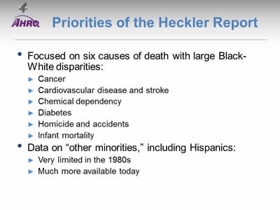
Priorities of the Heckler Report
- Focused on six causes of death with large Black-White disparities:
- Cancer.
- Cardiovascular disease and stroke.
- Chemical dependency.
- Diabetes.
- Homicide and accidents.
- Infant mortality.
- Data on "other minorities," including Hispanics:
- Very limited in the 1980s.
- Much more available today.
Note:
- The Heckler Report found that six causes of death accounted for more than 80% of mortality among Blacks and other minority groups compared with Whites. These include cancer; cardiovascular disease and stroke; chemical dependency (measured by deaths due to cirrhosis); diabetes; homicide and accidents (unintentional injuries); and infant mortality. Based on the findings, the report outlined recommendations in areas of urgent need, including health information and education; health services delivery and financing; health professions development; data development; and research agenda.
- Data on "other minorities," including Hispanics:
- Was very limited in the 1980s.
- Is much more available today.
- With the rapidly increasing diversity of the Nation and persistence of health disparities, the Heckler Report 30th anniversary serves as a call for all Americans to take action and accelerate efforts toward ending health disparities and achieving health equity in their community.
Slide 32
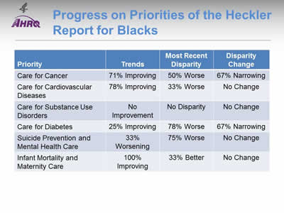
Progress on Priorities of the Heckler Report for Blacks
| Priority | Trends | Most Recent Disparity | Disparity Change |
|---|---|---|---|
| Care for Cancer | 71% Improving | 50% Worse | 67% Narrowing |
| Care for Cardiovascular Diseases | 78% Improving | 33% Worse | No Change |
| Care for Substance Use Disorders | No Improvement | No Disparity | No Change |
| Care for Diabetes | 25% Improving | 78% Worse | 67% Narrowing |
| Suicide Prevention and Mental Health Care | 33% Worsening | 75% Worse | No Change |
| Infant Mortality and Maternity Care | 100% Improving | 33% Better | No Change |
Note:
- Trends:
- All measures for infant mortality and maternity care and most measures of care for cancer and care for cardiovascular diseases were improving for Blacks.
- No measures of care for substance use disorders were improving and suicide prevention seemed to be getting worse for Blacks.
- Groups With Disparities:
- For many measures of care for mental health disorders, diabetes, and infant mortality, Blacks received worse quality of care than Whites. Blacks tended to receive better quality of maternity care.
- Of measures for which Blacks received worse quality of care than Whites, narrowing of the gap was observed for several measures of cancer and diabetes care. No narrowing of disparities was observed among measures of cardiovascular and mental health care.
- Summary: Of priorities in the Heckler Report:
- Suicide prevention and mental health care for Blacks is worsening, with many disparities and no reductions in disparities over time.
- Blacks also experience many disparities in care for diabetes.
- Care for substance use disorders is poor for all ethnic groups.
Slide 33

National Healthcare Quality and Disparities Report Chartbook on Health Care for Blacks
Part 2: Trends in Priorities of the Heckler Report
Care for Cancer
- Thirty years ago, the Heckler Report found that:
- Overall age-adjusted cancer incidence rates for Blacks were higher than for Whites or minorities. Specific sites of excess incidence among Blacks were the stomach, prostate, esophagus, pancreas, and cervix.
- The overall 5-year relative survival rate of Blacks was lower than that of Whites.
- In addition, quality care for cancer has changed. Evidence-based mass screening is recommended in specific populations for four cancers: breast, cervical, colorectal, and lung cancer. Screening is the first step in the process of cancer prevention (Pap testing for cervical and colonoscopy for colorectal) and early detection (mammography for breast and CT scan for lung) in the process of cancer control. Thus, cancers amenable to screening are included in this chartbook.
Slide 34
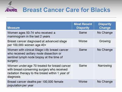
Breast Cancer Care for Blacks
| Measure | Most Recent Disparity | Disparity Change |
|---|---|---|
| Women ages 50-74 who received a mammogram in the last 2 years | Same | No Change |
| Breast cancer diagnosed at advanced stage per 100,000 women age 40+ | Worse | Growing |
| Women with clinical Stage I-IIb breast cancer who received axillary node dissection or sentinel lymph node biopsy at the time of surgery | Same | No Change |
| Women under age 70 treated for breast cancer with breast-conserving surgery who received radiation therapy to the breast within 1 year of diagnosis | Same | Narrowing |
| Breast cancer deaths per 100,000 female population per year | Worse | No Change |
Note:
- Trends: Most measures of breast cancer care for Blacks were improving.
- Groups With Disparities:
- Rates of mammography were similar between Black and White women. This disparity did not change over time.
- Rates of diagnosis with advanced stage breast cancer were worse for Blacks compared with Whites and these disparities worsened over time.
- Rates of women with clinical Stage I-IIb breast cancer who received axillary node dissection at time of surgery were similar between Black and White women. This disparity did not change over time.
- Rates of women who received radiation therapy after breast-conserving surgery were similar between Black and White women, and this disparity narrowed over time.
- Breast cancer death rates were worse for Blacks compared with Whites. This disparity did not change over time.
Slide 35
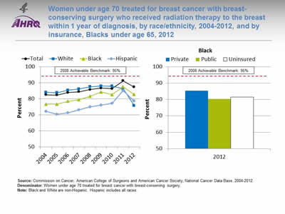
Women under age 70 treated for breast cancer with breast-conserving surgery who received radiation therapy to the breast within 1 year of diagnosis, by race/ethnicity, 2004-2012, and by insurance, Blacks under age 65, 2012
Image: Charts show women under age 70 treated for breast cancer with breast-conserving surgery who received radiation therapy to the breast within 1 year of diagnosis, by race/ethnicity, 2004-2012, and by insurance, Blacks under age 65, 2012:
Left Chart:
| Race/Ethnicity | 2004 | 2005 | 2006 | 2007 | 2008 | 2009 | 2010 | 2011 | 2012 |
|---|---|---|---|---|---|---|---|---|---|
| Total | 82.6 | 82.4 | 84.0 | 84.5 | 85.9 | 86.7 | 86.4 | 91.3 | 87.4 |
| White | 84.2 | 83.8 | 85.5 | 86.2 | 87.6 | 88.1 | 88.0 | 86.4 | 75.8 |
| Black | 76.7 | 76.8 | 78.6 | 79.6 | 81.7 | 84.4 | 82.7 | 87.6 | 82.8 |
| Hispanic | 72.3 | 70.5 | 71.4 | 73.2 | 75.1 | 76.2 | 77.2 | 85.2 | 78.8 |
Right Chart (Insurance, Blacks under age 65, 2012):
- Private - 85.3.
- Public - 80.3.
- Uninsured - 81.4
2008 Achievable Benchmark: 95%.
Source: Commission on Cancer, American College of Surgeons and American Cancer Society, National Cancer Data Base, 2004-2012.
Denominator: Women under age 70 treated for breast cancer with breast-conserving surgery.
Note: Black and White are non-Hispanic. Hispanic includes all races.
- Importance: Radiation therapy after breast-conserving surgery reduces the risk of cancer recurrence and death.
- Trends: From 2004 to 2011, the percentage of women with breast-conserving surgery who received radiation therapy to the breast improved overall and for Blacks and Hispanics.
- Groups With Disparities:
- In 7 of 9 years, Black and Hispanic women were less likely to receive radiation therapy to the breast compared with White women.
- In 2012, Black women with public insurance (80.3%) were less likely than those with private insurance (85.3%) to receive radiation therapy to the breast.
- Achievable Benchmark:
- The 2008 top 5 State achievable benchmark was 95%. The top 5 States that contributed to the achievable benchmark are Kansas, Minnesota, Montana, New Hampshire, and Wisconsin.
- At the current rates of improvement, the benchmark could be achieved overall within 9 years.
- At the current rates of improvement, Blacks and Hispanics would need 11 and 12 years, respectively, to reach the benchmark. Whites are moving away from the benchmark.
Slide 36
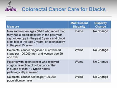
Colorectal Cancer Care for Blacks
| Measure | Most Recent Disparity | Disparity Change |
|---|---|---|
| Men and women ages 50-75 who report that they had a blood stool test in the past year, sigmoidoscopy in the past 5 years and blood stool test in the past 3 years, or colonoscopy in the past 10 years | Same | No Change |
| Colorectal cancer diagnosed at advanced stage per 100,000 men and women age 50 and over | Worse | No Change |
| Patients with colon cancer who received surgical resection of colon cancer that included at least 12 lymph nodes pathologically examined | Worse | No Change |
| Colorectal cancer deaths per 100,000 population per year | Worse | No Change |
Note:
- Trends: All measures of colorectal cancer care for Blacks were improving.
- Groups With Disparities:
- Rates for colorectal cancer screening were similar between Blacks and Whites. This disparity did not change over time.
- Rates of diagnosis with advanced stage colorectal cancer, surgical resection of colon cancer that included at least 12 lymph nodes pathologically examined, and deaths due to colorectal cancer were worse for Blacks compared with Whites. These disparities were not changing over time.
Slide 37
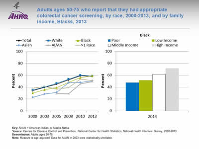
Adults ages 50-75 who report that they had appropriate colorectal cancer screening, by race, 2000-2013, and by family income, Blacks, 2013
Image: Charts show adults ages 50-75 who report that they had appropriate colorectal cancer screening, by race, 2000-2013, and by family income, Blacks, 2013:
Left Chart:
| Race | 2000 | 2003 | 2005 | 2008 | 2010 | 2013 |
|---|---|---|---|---|---|---|
| Total | 34.1 | 39.6 | 45.0 | 52.2 | 59.2 | 58.2 |
| Black | 30.0 | 35.9 | 39.1 | 48.2 | 56.1 | 59.1 |
| White | 35.1 | 40.3 | 46.3 | 53.4 | 60.2 | 58.6 |
| AI/AN | 34.9 | 29.0 | 28.7 | 45.6 | 49.4 | |
| Asian | 22.7 | 28.3 | 31.3 | 47.5 | 47.8 | 50.6 |
| >1 Race | 38.1 | 40.9 | 36.5 | 39.3 | 53.5 | 50.9 |
Right Chart (Family Income, Blacks, 2013):
- Poor - 47.6.
- Low Income - 51.5.
- Middle Income - 61.7.
- High Income - 71.6.
Key: AI/AN = American Indian or Alaska Native.
Source: Centers for Disease Control and Prevention, National Center for Health Statistics, National Health Interview Survey, 2000-2013.
Denominator: Adults ages 50-75.
Note: Measure is age adjusted. Data for AI/AN in 2003 were statistically unreliable.
- Importance: Screening can detect abnormal colorectal growths before they develop into cancer. Early detection increases treatment options and the chances for cure. Effective screening modalities include fecal occult blood testing (FOBT), FOBT with flexible sigmoidoscopy, and colonoscopy.
- Trends: From 2000 to 2013, the percentage of adults ages 50-75 who received appropriate colorectal cancer screening increased overall (from 34.1% to 58.2%) and among all racial/ethnic groups.
- Groups With Disparities:
- In 5 of 6 years, the percentage of adults who received appropriate colorectal cancer screening was lower among Asians compared with Whites.
- In 3 of 6 years, the percentage of adults who received appropriate colorectal cancer screening was lower among Blacks compared with Whites.
- In 2013, the percentage of adults who received appropriate colorectal cancer screening was lower among poor (47.6%), low-income (51.5%), and middle income (61.7%) Blacks compared with high-income Blacks (71.6%).
Slide 38
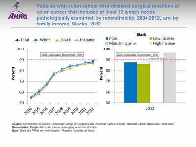
Patients with colon cancer who received surgical resection of colon cancer that included at least 12 lymph nodes pathologically examined, by race/ethnicity, 2004-2012, and by family income, Blacks, 2012
Image: Charts show patients with colon cancer who received surgical resection of colon cancer that included at least 12 lymph nodes pathologically examined:
Left Chart:
| Race/Ethnicity | 2004 | 2005 | 2006 | 2007 | 2008 | 2009 | 2010 | 2011 | 2012 |
|---|---|---|---|---|---|---|---|---|---|
| Total | 55.4 | 60.5 | 67.4 | 77.4 | 81.4 | 84.2 | 85.3 | 87.4 | 88.2 |
| White | 55.3 | 60.7 | 67.3 | 77.4 | 81.6 | 84.5 | 85.4 | 87.5 | 88.6 |
| Black | 54.6 | 58.9 | 66.6 | 76.1 | 80.2 | 82.4 | 84.9 | 86.3 | 87.2 |
| Hispanic | 56.3 | 61.8 | 68.7 | 78.0 | 81.0 | 85.1 | 85.1 | 87.6 | 86.7 |
Right Chart (Family Income, Blacks, 2012):
- Poor - 87.7.
- Low Income - 86.5.
- Middle Income - 91.5.
- High Income - 96.6.
2008 Achievable Benchmark: 90%.
Source: Commission on Cancer, American College of Surgeons and American Cancer Society, National Cancer Data Base, 2004-2012.
Denominator: People with colon cancer undergoing resection of colon.
Note: Black and White are non-Hispanic. Hispanic includes all races.
- Importance: Recommended cancer treatment depends on different factors, such as the stage or extent of the cancer within the body, especially whether the disease has spread from the original site to other parts of the body. Colon cancer typically begins as a benign polyp that may become cancerous and then spread to local lymph nodes. Hence, ensuring adequate examination of lymph nodes when surgery is performed is important.
- Trends: From 2004 to 2012, the percentage of patients with colon cancer who received surgical resection of colon cancer that included at least 12 lymph nodes pathologically examined improved overall (55.4% to 88.2%) and for all racial/ethnic groups.
- Groups With Disparities:
- From 2004 to 2012, there were almost no statistically significant differences between racial/ethnic groups in the percentage of patients with colon cancer who received surgical resection of colon cancer that included at least 12 lymph nodes pathologically examined. In 2 years, Blacks were less likely than Whites to receive surgery, and in 1 year, Hispanics were less likely than Whites to receive surgery.
- In 2012, the percentage of patients with colon cancer who received surgical resection of colon cancer that included at least 12 lymph nodes pathologically examined was lower among poor (87.7%) and low-income (86.5%) Blacks compared with high-income Blacks (96.6%).
- Achievable Benchmark:
- The 2008 top 5 State achievable benchmark was 90%. The top 5 States that contributed to the achievable benchmark are Delaware, Missouri, Utah, Vermont, and Wisconsin.
- At the current rates of improvement, the achievable benchmark could be attained overall and for all racial/ethnic groups within a year.
Slide 39
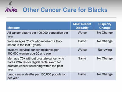
Other Cancer Care for Blacks
| Measure | Most Recent Disparity | Disparity Change |
|---|---|---|
| All cancer deaths per 100,000 population per year | Worse | No Change |
| Women ages 21-65 who received a Pap smear in the last 3 years | Same | No Change |
| Invasive cervical cancer incidence per 100,000 women age 20 and over | Worse | Narrowing |
| Men age 75+ without prostate cancer who had a PSA test or digital rectal exam for prostate cancer screening within the past year | Same | No Change |
| Lung cancer deaths per 100,000 population per year | Same | No Change |
Note:
- Trends: Most measures of other cancer care for Blacks were improving.
- Groups With Disparities:
- Death rates were higher among Blacks compared with Whites and were not changing over time.
- Blacks were more likely to develop invasive cervical cancer compared with Whites. This disparity was narrowing over time.
- Rates among Blacks and Whites were similar for Pap smears, prostate cancer screening, and lung cancer deaths and these disparities were not changing over time.
Slide 40
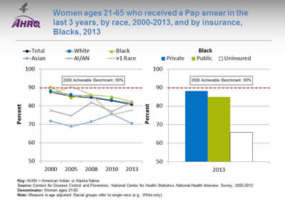
Women ages 21-65 who received a Pap smear in the last 3 years, by race, 2000-2013, and by insurance, Blacks, 2013
Image: Charts show women ages 21-65 who received a Pap smear in the last 3 years, by race, 2000-2013, and by insurance, Blacks, 2013:
Left Chart:
| Race | 2000 | 2005 | 2008 | 2010 | 2013 |
|---|---|---|---|---|---|
| Total | 87.5 | 85.3 | 84.5 | 82.8 | 80.7 |
| Black | 90.3 | 84.6 | 86.1 | 85.0 | 82.2 |
| White | 88.1 | 86.1 | 85.1 | 83.2 | 81.4 |
| AI/AN | 77.6 | 74.7 | 82.0 | 76.9 | 82.1 |
| Asian | 71.7 | 68.8 | 71.5 | 75.7 | 70.5 |
| >1 Race | 86.7 | 90.4 | 86.1 | 75.2 | 77.7 |
Right Chart (Insurance, Blacks, 2013):
- Private - 88.2.
- Public - 85.0.
- Uninsured - 65.8.
2008 Achievable Benchmark: 90%.
Key: AI/AN = American Indian or Alaska Native.
Source: Centers for Disease Control and Prevention, National Center for Health Statistics, National Health Interview Survey, 2000-2013.
Denominator: Women ages 21-65.
Note: Measure is age adjusted. Racial groups refer to single race (e.g., White only).
- Importance: Screening with Pap smears can detect high-grade precancerous cervical lesions that can be removed before they become cancerous.
- Trends: From 2000 to 2013, the percentage of women ages 21-65 who received a Pap smear in the last 3 years decreased overall (87.5% to 80.7%) and for Whites (88.1% to 81.4%) and Blacks (90.3% to 82.2%).
- Groups With Disparities:
- In all years, the percentage of women who received a Pap smear was lower among Asian women compared with White women. The disparities between Asians and American Indians/Alaska Natives (AI/ANs) and Whites are narrowing. This is due to a decline in the White rates.
- In 2013, uninsured Black women (65.8%) were less likely to receive a Pap smear compared with Black women with private insurance (88.2%).
- Achievable Benchmark:
- The 2008 top 5 State achievable benchmark was 90%. The top 5 States that contributed to the achievable benchmark are Delaware, District of Columbia, Massachusetts, Rhode Island, and Vermont.
- The total and all racial/ethnic groups except AI/ANs are moving away from the achievable benchmark. AI/ANs could achieve the benchmark, although it would take 22 years.
Slide 41
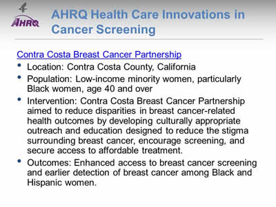
AHRQ Health Care Innovations in Cancer Screening
Contra Costa Breast Cancer Partnership
- Location: Contra Costa County, California.
- Population: Low-income minority women, particularly Black women, age 40 and over.
- Intervention: Contra Costa Breast Cancer Partnership aimed to reduce disparities in breast cancer-related health outcomes by developing culturally appropriate outreach and education designed to reduce the stigma surrounding breast cancer, encourage screening, and secure access to affordable treatment.
- Outcomes: Enhanced access to breast cancer screening and earlier detection of breast cancer among Black and Hispanic women.
Slide 42
National Healthcare Quality and Disparities Report Chartbook on Health Care for Blacks
Part 2: Trends in Priorities of the Heckler Report
Care for Cardiovascular Diseases
- Thirty years ago, the Heckler Report found that:
- Cardiovascular disease (CVD) was a major cause of death in Blacks, and the rate was higher than in Whites.
- There appeared to be a strong inverse relationship between socioeconomic status (SES) and hypertension in Blacks, similar to that found for Hispanics and Whites.
- Diabetes mellitus was a major problem in Blacks.
- The generally higher prevalence of obesity, noninsulin-dependent diabetes, hypertension, high low-density lipoprotein (LDL) cholesterol and low high-density lipoprotein (HDL) cholesterol levels in Blacks might be expected to increase their CVD risk.
Slide 43
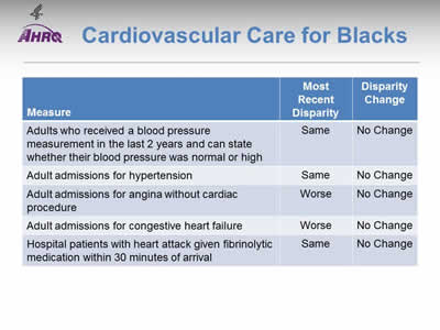
Cardiovascular Care for Blacks
| Measure | Most Recent Disparity | Disparity Change |
|---|---|---|
| Adults who received a blood pressure measurement in the last 2 years and can state whether their blood pressure was normal or high | Same | No Change |
| Adult admissions for hypertension | Same | No Change |
| Adult admissions for angina without cardiac procedure | Worse | No Change |
| Adult admissions for congestive heart failure | Worse | No Change |
| Hospital patients with heart attack given fibrinolytic medication within 30 minutes of arrival | Same | No Change |
Note:
- Trends: Most measures of cardiovascular care for Blacks were improving.
- Groups With Disparities:
- The rates between Blacks and Whites were similar for those who received their blood pressure measurement and for hypertension admissions. These disparities did not change over time.
- Blacks had higher rates of admission than Whites for angina and congestive heart failure and these disparities did not change over time.
- Blacks and Whites had similar rates of receipt of fibrinolytic medication for heart attack and these disparities did not change over time.
Slide 44
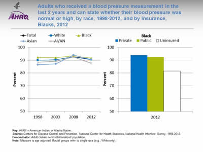
Adults who received a blood pressure measurement in the last 2 years and can state whether their blood pressure was normal or high, by race, 1998-2012, and by insurance, Blacks, 2012
Image: Charts show adults who received a blood pressure measurement in the last 2 years and can state whether their blood pressure was normal or high, by race, 1998-2012, and by insurance, Blacks, 2012:
Left Chart:
| Race | 1998 | 2003 | 2008 | 2012 |
|---|---|---|---|---|
| Total | 90.1 | 90.4 | 92.9 | 90.6 |
| Black | 92.2 | 92.0 | 93.4 | 91.6 |
| White | 90.1 | 90.3 | 92.7 | 90.4 |
| AI/AN | 88.5 | 89.1 | 92.6 | 87.7 |
| Asian | 86.4 | 87.1 | 94.1 | 90.6 |
Right Chart (Insurance, Blacks, 2012):
- Private - 93.9.
- Public - 92.7.
- Uninsured - 81.5.
Key: AI/AN = American Indian or Alaska Native.
Source: Centers for Disease Control and Prevention, National Center for Health Statistics, National Health Interview Survey, 1998-2012.
Denominator: Adult civilian noninstitutionalized population.
Note: Measure is age adjusted. Racial groups refer to single race (e.g., White only).
- Importance: Early detection and treatment of high blood pressure can prevent heart failure, kidney failure, and stroke. Because high blood pressure typically causes no symptoms, screening is essential.
- Trends: From 1998 to 2012, the percentage of adults who received a blood pressure measurement in the last 2 years and can state whether their blood pressure was normal or high did not change overall or for any racial/ethnic group.
- Groups With Disparities:
- In 2 of 4 years, Black adults were more likely than Whites to receive a blood pressure measurement. In 2 of 4 years, Asian adults were less likely than Whites to receive a blood pressure measurement.
- In 2012, uninsured Black adults (81.5%) were less likely than Black adults with private insurance (93.9%) to receive a blood pressure measurement.
Slide 45
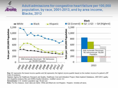
Adult admissions for congestive heart failure per 100,000 population, by race, 2001-2013, and by area income, Blacks, 2013
Image: Charts show adult admissions for congestive heart failure per 100,000 population, by race, 2001-2013, and by area income, Blacks, 2013:
Left Chart:
| Year | White | Black | Hispanic |
|---|---|---|---|
| 2001 | 445.4 | 1169.8 | 519.5 |
| 2002 | 444.1 | 1121.8 | 653.0 |
| 2003 | 399.5 | 927.8 | 662.2 |
| 2004 | 400.9 | 1009.3 | 629.9 |
| 2005 | 392.8 | 912.4 | 538.0 |
| 2006 | 373.0 | 927.5 | 465.9 |
| 2007 | 350.8 | 890.2 | 437.1 |
| 2008 | 339.9 | 824.6 | 362.8 |
| 2009 | 329.7 | 799.3 | 360.2 |
| 2010 | 306.3 | 771.4 | 372.7 |
| 2011 | 301.1 | 730.5 | 359.2 |
| 2012 | 283.2 | 662.2 | 298.9 |
| 2013 | 282.5 | 726.2 | 356.7 |
Right Chart (Income, Blacks, 2013):
- Q1 (Lowest) - 851.1.
- Q2 - 707.
- Q3 - 581.4.
- Q4 (Highest) - 544.7.
2008 Achievable Benchmark: 182 Admissions per 100,000 Population.
Key: Q1 represents the lowest income quartile and Q4 represents the highest income quartile based on the median income of a patient's ZIP Code of residence.
Source: Agency for Healthcare Research and Quality, Healthcare Cost and Utilization Project, State Inpatient Databases, 2001‐2013 quality and disparities analysis files and AHRQ Quality Indicators, modified version 4.4.
Denominator: U.S. resident population age 18 and over.
Note: For this measure, lower rates are better. White and Black are non-Hispanic. Hispanic includes all races.
- Importance: Racial disparities in care for congestive heart failure have been observed.
- Trends: From 2002 to 2013, the rate of admission for congestive heart failure among adults decreased significantly for all racial/ethnic groups.
- Groups With Disparities:
- In all years, compared with Whites, Blacks had higher rates of admission for congestive heart failure. In 10 of 12 years, the rates of admission for congestive heart failure were higher among Hispanics compared with Whites.
- In 2013, poor (851.1 per 100,000) and low-income (707.0 per 100,000) Black adults had higher rates of admission for congestive heart failure compared with Black adults with high income (544.7 per 100,000).
- Achievable Benchmark:
- The 2008 top 4 State achievable benchmark for adult congestive heart failure admissions was 182 admissions per 100,000 population. The top 4 States that contributed to the achievable benchmark are Colorado, Utah, Vermont, and Wyoming.
- At current rates of improvement, it would take the overall rate 10 years to achieve the benchmark, Blacks could achieve the benchmark in 15 years, Whites could achieve it in 7 years, and Hispanics would need 6 years to achieve the benchmark.
Slide 46
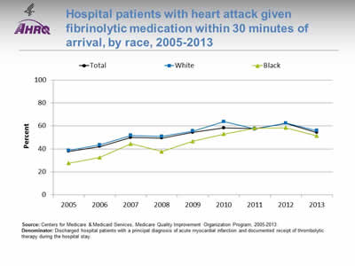
Hospital patients with heart attack given fibrinolytic medication within 30 minutes of arrival, by race, 2005-2013
Image: Chart shows hospital patients with heart attack given fibrinolytic medication within 30 minutes of arrival, by race, 2005-2013:
| Race | 2005 | 2006 | 2007 | 2008 | 2009 | 2010 | 2011 | 2012 | 2013 |
|---|---|---|---|---|---|---|---|---|---|
| Total | 37.9 | 42.1 | 50.0 | 49.4 | 54.4 | 58.4 | 57.9 | 62.3 | 54.3 |
| White | 38.7 | 43.6 | 51.8 | 51.0 | 55.7 | 63.8 | 57.3 | 62.5 | 55.9 |
| Black | 27.7 | 32.6 | 44.5 | 37.8 | 46.8 | 53.0 | 58.2 | 58.5 | 51.4 |
Source: Centers for Medicare & Medicaid Services, Medicare Quality Improvement Organization Program, 2005-2013.
Denominator: Discharged hospital patients with a principal diagnosis of acute myocardial infarction and documented receipt of thrombolytic therapy during the hospital stay.
Note:
- Importance: Some heart attacks are caused by blood clots. Early actions, such as fibrinolytic medication, may open blockages caused by blood clots, reduce heart muscle damage, and save lives. To be effective, these actions need to be performed quickly after the start of a heart attack.
- Trends: From 2005 to 2013, the percentage of patients who received timely fibrinolytic medication improved overall (27.7% to 51.4%).
- Groups With Disparities: In 6 of 9 years, the percentage of patients who received timely fibrinolytic medication was lower for Blacks than for Whites.
Slide 47
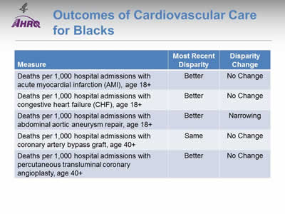
Outcomes of Cardiovascular Care for Blacks
| Measure | Most Recent Disparity | Disparity Change |
|---|---|---|
| Deaths per 1,000 hospital admissions with acute myocardial infarction (AMI), age 18+ | Better | No Change |
| Deaths per 1,000 hospital admissions with congestive heart failure (CHF), age 18+ | Better | No Change |
| Deaths per 1,000 hospital admissions with abdominal aortic aneurysm repair, age 18+ | Better | Narrowing |
| Deaths per 1,000 hospital admissions with coronary artery bypass graft, age 40+ | Same | No Change |
| Deaths per 1,000 hospital admissions with percutaneous transluminal coronary angioplasty, age 40+ | Better | No Change |
Note:
- Trends: Most measures of cardiovascular-related deaths among Blacks were improving.
- Groups With Disparities:
- The death rates for Blacks were better compared with Whites when hospitalized for:
- Acute myocardial infarction.
- Congestive heart failure.
- Abdominal aortic aneurysm repair.
- Percutaneous transluminal coronary angioplasty.
- The death rates for Blacks and Whites were similar for hospital admissions with coronary artery bypass graft. This disparity did not change over time.
- The disparities between Blacks and Whites did not change over time for all measures except deaths per 1,000 hospital admissions for abdominal aortic aneurysm repair, which narrowed.
- The death rates for Blacks were better compared with Whites when hospitalized for:
Slide 48
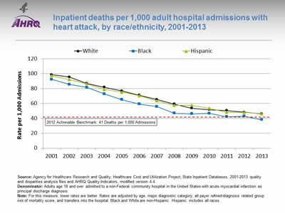
Inpatient deaths per 1,000 adult hospital admissions with heart attack, by race/ethnicity, 2001-2013
Image: Chart shows inpatient deaths per 1,000 adult hospital admissions with heart attack, by race/ethnicity, 2001-2013:
| Year | White | Black | Hispanic |
|---|---|---|---|
| 2001 | 98.7 | 92.2 | 97.2 |
| 2002 | 95.5 | 85.5 | 92.0 |
| 2003 | 86.9 | 81.6 | 86.6 |
| 2004 | 81.8 | 72.9 | 78.8 |
| 2005 | 76.9 | 65.2 | 75.2 |
| 2006 | 71.2 | 59.2 | 70.4 |
| 2007 | 65.4 | 55.8 | 63.6 |
| 2008 | 59.1 | 46.8 | 57.6 |
| 2009 | 53.7 | 46.1 | 57.5 |
| 2010 | 51.7 | 46.7 | 53.6 |
| 2011 | 50.5 | 42.1 | 48.1 |
| 2012 | 48.3 | 43.0 | 48.0 |
| 2013 | 46.1 | 38.3 | 46.4 |
2012 Achievable Benchmark: 41 Deaths per 1,000 Admissions.
Source: Agency for Healthcare Research and Quality, Healthcare Cost and Utilization Project, State Inpatient Databases, 2001‐2013 quality and disparities analysis files and AHRQ Quality Indicators, modified version 4.4.
Denominator: Adults age 18 and over admitted to a non-Federal community hospital in the United States with acute myocardial infarction as principal discharge diagnosis.
Note: For this measure, lower rates are better. Rates are adjusted by age, major diagnostic category, all payer refined-diagnosis related group risk of mortality score, and transfers into the hospital. Black and White are non-Hispanic. Hispanic includes all races.
- Importance: Racial disparities in heart attack care have been observed.
- Trends: From 2001 to 2013, the risk-adjusted inpatient mortality rate for hospital admissions with heart attack decreased significantly overall (data not shown) and for all racial/ethnic groups.
- Groups With Disparities: In 9 of 12 years, Black patients had lower inpatient mortality rates than Whites for hospital admissions with heart attack.
- Achievable Benchmark:
- The 2008 top 4 State achievable benchmark for inpatient heart attack mortality was 48 deaths per 1,000 admissions. By 2012, this benchmark had been attained overall and for all racial/ethnic groups.
- Because the 2008 benchmark was achieved by the total population, a new 2012 top 4 State achievable benchmark was set at 41 deaths per 1,000 admissions. The top 4 States that contributed to the achievable benchmark are Alaska, Arizona, Michigan, and Rhode Island.
- Blacks have already achieved the benchmark. At current rates of improvement, Whites could achieve the benchmark in a year and Hispanics in less than a year.
Slide 49
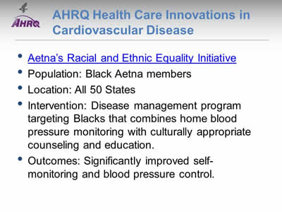
AHRQ Health Care Innovations in Cardiovascular Disease
Aetna's Racial and Ethnic Equality Initiative
- Population: Black Aetna members.
- Location: All 50 States.
- Intervention: Disease management program targeting Blacks that combines home blood pressure monitoring with culturally appropriate counseling and education.
- Outcomes: Significantly improved self-monitoring and blood pressure control.
Slide 50
National Healthcare Quality and Disparities Report Chartbook on Health Care for Blacks
Part 2: Trends in Priorities of the Heckler Report
Care for Substance Use Disorders
Note:
- Thirty years ago, the Heckler Report found that:
- Mortality statistics for the United States did not identify Blacks separately, and until 1976, most other common measures of alcohol-related problems such as arrest and hospital discharge rates did not provide a Black identifier. The 1979 National Institute on Alcohol Abuse and Alcoholism National Survey indicated that based on self-reported data, Black American males age 18 and over had higher levels of heavy drinking and higher rates of alcohol-related problems than nonminorities.
- Results from the 1983 single-room occupancy hotels study of drug abuse in New York City suggested that Blacks had higher rates of drug use than Whites for marijuana, cocaine, heroin, and illicit methadone.
- Lung and esophageal cancer morbidity and mortality rates, known to be related to smoking, were lower for Blacks than for Whites.
Slide 51
Care for Substance Use Disorders for Blacks
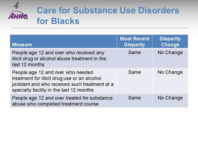
| Measure | Most Recent Disparity | Disparity Change |
|---|---|---|
| People age 12 and over who received any illicit drug or alcohol abuse treatment in the last 12 months | Same | No Change |
| People age 12 and over who needed treatment for illicit drug use or an alcohol problem and who received such treatment at a specialty facility in the last 12 months | Same | No Change |
| People age 12 and over treated for substance abuse who completed treatment course | Same | No Change |
Note:
- Trends: No measure of care for substance use disorders was improving for Blacks.
- Groups With Disparities: Blacks and Whites had similarly low rates of treatment for substance use disorders.
Slide 52
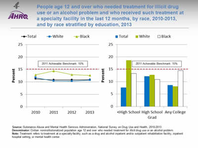
People age 12 and over who needed treatment for illicit drug use or an alcohol problem and who received such treatment at a specialty facility in the last 12 months, by race, 2010-2013, and by race stratified by education, 2013
Image: Charts show people age 12 and over who needed treatment for illicit drug use or an alcohol problem and who received such treatment at a specialty facility in the last 12 months, by race, 2010-2013, and by race stratified by education, 2013:
Left Chart:
| Race | 2010 | 2011 | 2012 | 2013 |
|---|---|---|---|---|
| Total | 11.2 | 10.8 | 10.8 | 10.9 |
| White | 11.7 | 10.4 | 10.3 | 10.7 |
| Black | 12.8 | 14.4 | 12.9 | 12.6 |
Right Chart:
| Education | Total | White | Black |
|---|---|---|---|
| < High School | 7.6 | 18.6 | 13.3 |
| High School Grad | 12.2 | 12.8 | 10.9 |
| Any College | 8.6 | 8.1 | 14.5 |
2011 Achievable Benchmark: 15%.
Source: Substance Abuse and Mental Health Services Administration, National Survey on Drug Use and Health, 2010-2013.
Denominator: Civilian noninstitutionalized population age 12 and over who needed treatment for illicit drug use or an alcohol problem.
Note: Treatment refers to treatment at a specialty facility, such as a drug and alcohol inpatient and/or outpatient rehabilitation facility, inpatient hospital setting, or mental health center.
- Overall Rate: In 2013, only 10.9% of people age 12 and over who needed treatment for illicit drug use or an alcohol problem received such treatment at a specialty facility in the last 12 months.
- Groups With Disparities: From 2010 to 2013, there were no statistically significant differences by race. In 2013, there was no statistically significant difference between Blacks and Whites at any educational level.
- Achievable Benchmark:
- The 2011 top 6 State achievable benchmark was 15%. The top 6 States that contributed to the achievable benchmark are Alabama, Alaska, Delaware, Maryland, Oregon, and Utah.
- The total population, Blacks, and Whites are making no progress toward the benchmark.
Slide 53
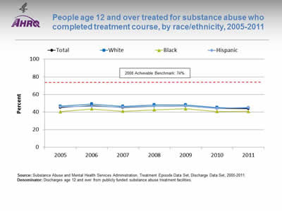
People age 12 and over treated for substance abuse who completed treatment course, by race/ethnicity, 2005-2011
Image: Chart shows people age 12 and over treated for substance abuse who completed treatment course, by race/ethnicity, 2005-2011:
| Race/Ethnicity | 2005 | 2006 | 2007 | 2008 | 2009 | 2010 | 2011 |
|---|---|---|---|---|---|---|---|
| Total | 45.0 | 47.5 | 45.1 | 46.6 | 46.7 | 44.1 | 43.7 |
| Hispanic | 46.0 | 46.7 | 45.8 | 46.5 | 47.1 | 44.4 | 45.3 |
| White | 46.7 | 49.2 | 46.6 | 48.3 | 48.3 | 45.3 | 44.5 |
| Black | 40.4 | 43.6 | 41.0 | 42.5 | 43.8 | 40.6 | 40.7 |
2008 Achievable Benchmark: 74%.
Source: Substance Abuse and Mental Health Services Administration, Treatment Episode Data Set, Discharge Data Set, 2005-2011.
Denominator: Discharges age 12 and over from publicly funded substance abuse treatment facilities.
Note:
- Overall Rate: In 2011, 43.7% of people age 12 and over treated for substance abuse completed their treatment course.
- Groups With Disparities:
- In 4 of 7 years, Blacks who were treated for substance abuse were significantly less likely than Whites to complete treatment.
- There were no statistically significant differences in treatment completion between Blacks and Whites in the 3 most recent years, 2009-2011.
- Achievable Benchmark:
- The 2008 top 5 State achievable benchmark was 74%. The top 5 States that contributed to the achievable benchmark are Colorado, Connecticut, District of Columbia, Mississippi, and Texas.
- No group showed progress toward the benchmark.
Slide 54
National Healthcare Quality and Disparities Report Chartbook on Health Care for Blacks
Part 2: Trends in Priorities of the Heckler Report
Care for Diabetes
Note:
- Thirty years ago, the Heckler Report found:
- Prevalence of diabetes was 33% higher in the Black population than in the White population. Diabetes prevalence for Black females was 50% greater than for White females.
- Although diabetes accounts for less than 2 percent of male excess deaths and 5 percent of female excess deaths (to age 70), it is a major risk factor for heart disease and leads to other serious consequences, including amputation and blindness, if uncontrolled.
Slide 55
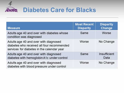
Diabetes Care for Blacks
| Measure | Most Recent Disparity | Disparity Change |
|---|---|---|
| Adults age 40 and over with diabetes whose condition was diagnosed | Same | Worse |
| Adults age 40 and over with diagnosed diabetes who received all four recommended services for diabetes in the calendar year | Worse | No Change |
| Adults age 40 and over with diagnosed diabetes with hemoglobin A1c under control | Same | Insufficient Data |
| Adults age 40 and over with diagnosed diabetes with blood pressure under control | Worse | No Change |
Note:
- Trends: Measures of diabetes care were not improving for Blacks.
- Groups With Disparities:
- After diagnosis, Blacks were less likely than Whites to receive recommended services for diabetes and this disparity was not changing over time.
- Blacks diagnosed with diabetes were less likely than Whites to have their hemoglobin A1c and blood pressure under control and this disparity was not changing over time.
Slide 56
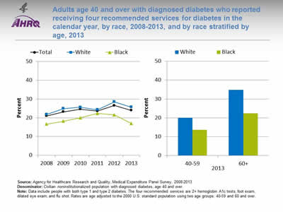
Adults age 40 and over with diagnosed diabetes who reported receiving four recommended services for diabetes in the calendar year, by race, 2008-2013, and by race stratified by age, 2013
Image: Charts show adults age 40 and over with diagnosed diabetes who reported receiving four recommended services for diabetes in the calendar year, by race, 2008-2013, and by race stratified by age, 2013:
Left Chart:
| Race | 2008 | 2009 | 2010 | 2011 | 2012 | 2013 |
|---|---|---|---|---|---|---|
| Total | 21.0 | 23.2 | 24.6 | 23.6 | 26.6 | 24.0 |
| White | 21.8 | 24.9 | 25.6 | 24.3 | 28.5 | 25.7 |
| Black | 16.6 | 18.2 | 20.0 | 22.3 | 21.5 | 17.0 |
Right Chart:
| Age | Black | White |
|---|---|---|
| 40-59 | 13.7 | 20 |
| 60+ | 22.3 | 34.9 |
Source: Agency for Healthcare Research and Quality, Medical Expenditure Panel Survey, 2008-2013.
Denominator: Civilian noninstitutionalized population with diagnosed diabetes, age 40 and over.
Note: Data include people with both type 1 and type 2 diabetes. The four recommended services are 2+ hemoglobin A1c tests, foot exam, dilated eye exam, and flu shot. Rates are age adjusted to the 2000 U.S. standard population using two age groups: 40-59 and 60 and over.
- Importance:
- Regular hemoglobin A1c (HbA1c) tests, foot exams, dilated eye exams, and flu shots help people keep their diabetes under control and avoid diabetic complications.
- A composite measure is used to track the national rate of receipt of all four of these recommended annual diabetes interventions.
- Trends:
- From 2008 to 2013, among adults age 40 and over with diagnosed diabetes, there were no statistically significant improvements overall or among any racial groups.
- Groups With Disparities:
- In 2013, overall, Blacks were less likely than Whites to receive the recommended services. Among adults age 60 and over, Blacks were also less likely than Whites to receive the recommended services.
- In 2013, among Black adults, those ages 40-59 were less likely than those age 60 and over to receive the recommended services (13.7% compared with 22.3%).
Slide 57
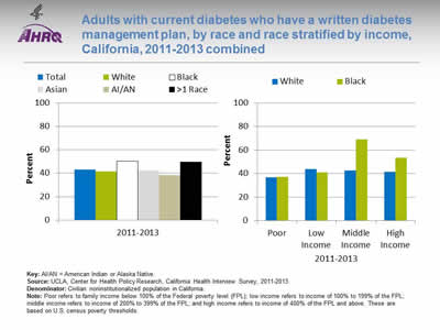
Adults with current diabetes who have a written diabetes management plan, by race and race stratified by income, California, 2011-2013 combined
Image: Charts show adults with current diabetes who have a written diabetes management plan, by race and race stratified by income, California, 2011-2013 combined:
Left Chart:
| Total | White | Black | Asian | AI/AN | >1 Race |
|---|---|---|---|---|---|
| 43.2 | 41.7 | 50.4 | 42.3 | 38.3 | 49.6 |
Right Chart:
| Income | Black | White |
|---|---|---|
| Poor | 37 | 36.7 |
| Low Income | 41.1 | 43.6 |
| Middle Income | 69.1 | 42.5 |
| High Income | 53.4 | 41.6 |
Key: AI/AN = American Indian or Alaska Native.
Source: UCLA, Center for Health Policy Research, California Health Interview Survey, 2011-2013.
Denominator: Civilian noninstitutionalized population in California.
Note: Poor refers to family income below 100% of the Federal poverty level (FPL); low income refers to income of 100% to 199% of the FPL; middle income refers to income of 200% to 399% of the FPL; and high income refers to income of 400% of the FPL and above. These are based on U.S. census poverty thresholds.
- Importance:
- A successful partnership for diabetes care requires providers to educate patients about daily management of their diabetes. Therefore, providers should develop a written diabetes management plan, especially for patients with a history of uncontrolled diabetes.
- National data on diabetes management and outcomes for some underserved populations are not available from the national data sources in the QDR. These populations include people with limited English proficiency; individuals who speak a language other than English at home; and Black subpopulations. To address some of these data gaps, we show additional data from the California Health Interview Survey.
- Overall Rate: Only 43% of Californians with current diabetes had a written diabetes management plan in 2011-2013.
- Groups With Disparities: Among Black Californians with diabetes, those who were poor were less likely than those with middle and high income to have a written diabetes management plan.
Slide 58
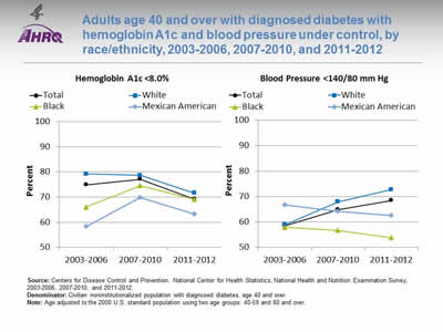
Adults age 40 and over with diagnosed diabetes with hemoglobin A1c and blood pressure under control, by race/ethnicity, 2003-2006, 2007-2010, and 2011-2012
Image: Charts show adults age 40 and over with diagnosed diabetes with hemoglobin A1c and blood pressure under control, by race/ethnicity, 2003-2006, 2007-2010, and 2011-2012:
Left Graph (Hemoglobin A1c):
| Race/Ethnicity | 2003-2006 | 2007-2010 | 2011-2012 |
|---|---|---|---|
| Total | 74.9 | 77.1 | 69.2 |
| Mexican American | 58.3 | 69.9 | 63.3 |
| Black | 66.0 | 74.5 | 69.1 |
| White | 79.2 | 78.6 | 71.6 |
Right Graph (Blood Pressure):
| Race/Ethnicity | 2003-2006 | 2007-2010 | 2011-2012 |
|---|---|---|---|
| Total | 58.5 | 64.9 | 68.5 |
| Mexican American | 66.8 | 64.2 | 62.5 |
| Black | 57.9 | 56.7 | 53.8 |
| White | 58.9 | 67.9 | 72.8 |
Source: Centers for Disease Control and Prevention, National Center for Health Statistics, National Health and Nutrition Examination Survey, 2003-2006, 2007-2010, and 2011-2012.
Denominator: Civilian noninstitutionalized population with diagnosed diabetes, age 40 and over.
Note: Age adjusted to the 2000 U.S. standard population using two age groups: 40-59 and 60 and over.
- Importance: People diagnosed with diabetes are often at higher risk for cardiovascular conditions, such as high blood pressure. Having these conditions in combination with diagnosed diabetes increases the likelihood of complications, such as heart and kidney diseases, blindness, nerve damage, and stroke. Patients who manage their diagnosed diabetes and maintain an HbA1c level <8% and blood pressure <140/80 mm Hg can decrease these risks.
- Overall Rate: In 2011-2012, among adults age 40 and over with diagnosed diabetes, 69.2% achieved HbA1c less than 8% and 68.5% achieved blood pressure less than 140/80 mm Hg.
- Groups With Disparities:
- In 2003-2006, Blacks and Mexican Americans were less likely than Whites to have their HbA1c under control. Differences in 2007-2010 and 2011-2012 were not statistically significant.
- In 2007-2010 and 2011-2012, Blacks were less likely than Whites to have their blood pressure under control.
Slide 59
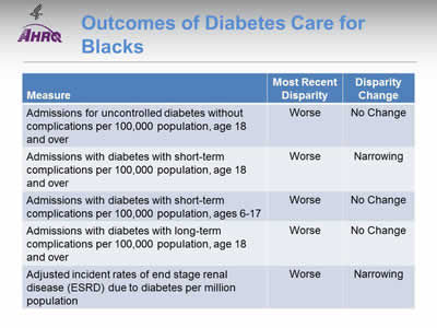
Outcomes of Diabetes Care for Blacks
| Measure | Most Recent Disparity | Disparity Change |
|---|---|---|
| Admissions for uncontrolled diabetes without complications per 100,000 population, age 18 and over | Worse | No Change |
| Admissions with diabetes with short-term complications per 100,000 population, age 18 and over | Worse | Narrowing |
| Admissions with diabetes with short-term complications per 100,000 population, ages 6-17 | Worse | No Change |
| Admissions with diabetes with long-term complications per 100,000 population, age 18 and over | Worse | No Change |
| Adjusted incident rates of end stage renal disease (ESRD) due to diabetes per million population | Worse | Narrowing |
Note:
- Trends: Less than half of outcomes of diabetes care for Blacks were improving.
- Groups With Disparities:
- Blacks had higher rates of admission than Whites for uncontrolled diabetes and for long-term complications of diabetes. These disparities did not change over time.
- Black adults had higher rates of admission than Whites for admission for short-term complications of diabetes but the disparity was narrowing over time.
- Black children had higher rates of admission for short-term complications than White children and this disparity was not changing over time.
- Blacks had higher rates of ESRD due to diabetes than Whites and this disparity was narrowing over time.
Slide 60
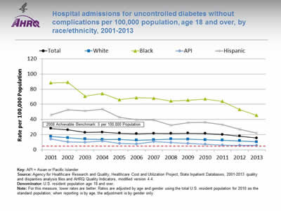
Hospital admissions for uncontrolled diabetes without complications per 100,000 population, age 18 and over, by race/ethnicity, 2001-2013
Image: Chart shows hospital admissions for uncontrolled diabetes without complications per 100,000 population, age 18 and over, by race/ethnicity, 2001-2013:
| Race/Ethnicity | 2001 | 2002 | 2003 | 2004 | 2005 | 2006 | 2007 | 2008 | 2009 | 2010 | 2011 | 2012 | 2013 |
|---|---|---|---|---|---|---|---|---|---|---|---|---|---|
| Total | 27.9 | 26.2 | 22.8 | 23.1 | 21.8 | 21.1 | 21.7 | 21.4 | 21.7 | 21.4 | 20.1 | 17.9 | 15.4 |
| White | 17.6 | 15.8 | 14.0 | 13.5 | 13.6 | 12.6 | 13.2 | 14.1 | 14.0 | 13.1 | 12.4 | 11.7 | 10.3 |
| Black | 88.3 | 89.1 | 70.6 | 74.2 | 66.1 | 68.7 | 68.1 | 64.4 | 65.5 | 66.9 | 64.0 | 53.1 | 45.3 |
| API | 14.2 | 10.4 | 9.9 | 11.3 | 8.3 | 7.7 | 10.6 | 9.6 | 8.2 | 7.3 | 6.2 | 5.5 | 5.9 |
| Hispanic | 46.0 | 52.9 | 51.1 | 53.8 | 42.9 | 39.8 | 39.3 | 32.2 | 35.8 | 36.4 | 33.1 | 26.7 | 21.7 |
2008 Achievable Benchmark: 5 per 100,000 Population.
Key: API = Asian or Pacific Islander.
Source: Agency for Healthcare Research and Quality, Healthcare Cost and Utilization Project, State Inpatient Databases, 2001‐2013 quality and disparities analysis files and AHRQ Quality Indicators, modified version 4.4.
Denominator: U.S. resident population age 18 and over.
Note: For this measure, lower rates are better. Rates are adjusted by age and gender using the total U.S. resident population for 2010 as the standard population; when reporting is by age, the adjustment is by gender only.
- Importance:
- Individuals who do not achieve good control of their diabetes may develop symptoms that require correction through hospitalization.
- Admission rates for uncontrolled diabetes may be reduced by better outpatient treatment and patients' tighter adherence to the recommended diet and medication.
- Trends:
- The rate of hospital admissions for uncontrolled diabetes without complications per 100,000 population decreased from 27.2 in 2001 to 15.4 in 2013.
- From 2001 to 2013, the rate of hospital admissions per 100,000 population decreased for all populations:
- For Blacks, from 88.3 to 45.3.
- For Whites, from 17.6 to 10.3.
- For APIs, from 14.2 to 5.9.
- For Hispanics, from 46.0 to 21.7.
- Groups With Disparities: In all years, the rate of hospital admissions for uncontrolled diabetes was higher for Blacks and Hispanics compared with Whites.
- Achievable Benchmark:
- The 2008 top 4 State achievable benchmark was 5 admissions per 100,000 population age 18 and over. The top 4 States that contributed to the achievable benchmark are Colorado, Hawaii, Utah, and Vermont.
- At the current rate, the benchmark could not be met for the total population for approximately 16 years.
- At the current rates, both Whites and Blacks would need 15 years to reach the benchmark. Hispanics could reach the benchmark in less than 8 years and APIs in less than 3 years.
Slide 61
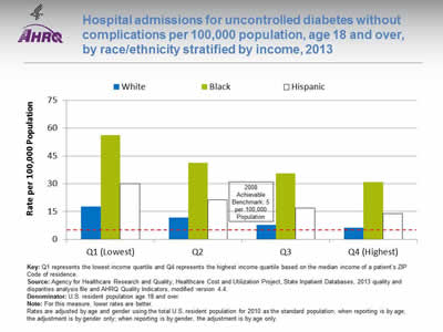
Hospital admissions for uncontrolled diabetes without complications per 100,000 population, age 18 and over, by race/ethnicity stratified by income, 2013
Image: Chart shows hospital admissions for uncontrolled diabetes without complications per 100,000 population, age 18 and over, by race/ethnicity stratified by income, 2013:
| Quartile | White | Black | Hispanic |
|---|---|---|---|
| Q1 (Lowest) | 17.7 | 56.2 | 30 |
| Q2 | 11.8 | 41.4 | 21.3 |
| Q3 | 7.9 | 35.7 | 16.8 |
| Q4 (Highest) | 6.3 | 30.9 | 13.9 |
2008 Achievable Benchmark: 5 per 100,000 Population.
Key: Q1 represents the lowest income quartile and Q4 represents the highest income quartile based on the median income of a patient's ZIP Code of residence.
Source: Agency for Healthcare Research and Quality, Healthcare Cost and Utilization Project, State Inpatient Databases, 2013 quality and disparities analysis file and AHRQ Quality Indicators, modified version 4.4.
Denominator: U.S. resident population age 18 and over.
Note: For this measure, lower rates are better.
Rates are adjusted by age and gender using the total U.S. resident population for 2010 as the standard population; when reporting is by age, the adjustment is by gender only; when reporting is by gender, the adjustment is by age only.
- Importance:
- Individuals who do not achieve good control of their diabetes may develop symptoms that require correction through hospitalization.
- Admission rates for uncontrolled diabetes may be reduced by better outpatient treatment and patients' tighter adherence to the recommended diet and medication.
- Groups With Disparities: The rate of hospital admissions for uncontrolled diabetes was higher for Blacks in the highest income quartile compared with Whites in the lowest income quartile.
- Achievable Benchmark:
- The 2008 top 4 State achievable benchmark was 5 admissions per 100,000 population age 18 and over. The top 4 States that contributed to the achievable benchmark are Colorado, Hawaii, Utah, and Vermont.
- No group has reached the benchmark.
Slide 62
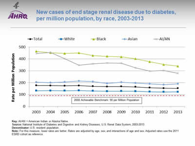
New cases of end stage renal disease due to diabetes, per million population, by race, 2003-2013
Image: Chart shows new cases of end stage renal disease due to diabetes, per million population, by race, 2003-2013:
| Race | 2003 | 2004 | 2005 | 2006 | 2007 | 2008 | 2009 | 2010 | 2011 | 2012 | 2013 |
|---|---|---|---|---|---|---|---|---|---|---|---|
| Total | 176.4 | 175.8 | 174.1 | 175.9 | 169.8 | 167.4 | 167.7 | 164.4 | 157.5 | 153.4 | 152.4 |
| Black | 464.2 | 452.5 | 446.5 | 450.6 | 428.6 | 422.2 | 417.7 | 401.4 | 376.5 | 352.6 | 338.9 |
| White | 132.0 | 133.3 | 132.2 | 134.0 | 130.1 | 128.0 | 128.8 | 127.7 | 123.4 | 121.7 | 122.6 |
| AI/AN | 445.8 | 454.6 | 401.6 | 347.0 | 358.4 | 365.3 | 363.5 | 324.5 | 297.1 | 303.8 | 278.5 |
| Asian | 203.6 | 200.9 | 205.7 | 215.1 | 208.5 | 194.3 | 204.6 | 197.5 | 190.5 | 183.3 | 190.9 |
2008 Achievable Benchmark: 90 per Million Population.
Key: AI/AN = American Indian or Alaska Native.
Source: National Institute of Diabetes and Digestive and Kidney Diseases, U.S. Renal Data System, 2003-2013.
Denominator: U.S. resident population.
Note: For this measure, lower rates are better. Rates are adjusted by age, sex, and interactions of age and sex. Adjusted rates use the 2011 ESRD cohort as reference.
- Importance: Diabetes is the most common cause of kidney failure. Keeping blood glucose levels under control can prevent or slow the progression of kidney disease. When kidney disease is detected early, medication can slow the disease's progress; when detected late, it commonly progresses to end stage renal disease requiring dialysis or kidney transplantation. While some cases of kidney failure due to diabetes cannot be avoided, other cases reflect inadequate control of blood glucose or delayed detection and treatment of early kidney disease due to diabetes.
- Trends: From 2003 to 2013, the overall rate of new cases of ESRD due to diabetes decreased for Blacks.
- Groups With Disparities: In all years, Blacks had higher rates than Whites.
- Achievable Benchmark:
- The 2008 top 5 State achievable benchmark was 90 per million population. The top 5 States that contributed to the achievable benchmark are Alaska, Maine, New Hampshire, Rhode Island, and Vermont.
- At current rates of change, the benchmark would not be achieved overall or by any racial group for decades.
Slide 63
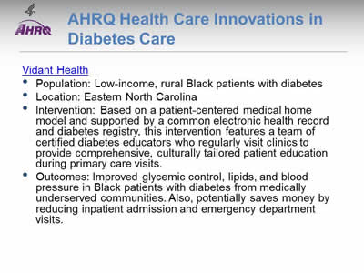
AHRQ Health Care Innovations in Diabetes Care
- Population: Low-income, rural Black patients with diabetes.
- Location: Eastern North Carolina.
- Intervention: Based on a patient-centered medical home model and supported by a common electronic health record and diabetes registry, this intervention features a team of certified diabetes educators who regularly visit clinics to provide comprehensive, culturally tailored patient education during primary care visits.
- Outcomes: Improved glycemic control, lipids, and blood pressure in Black patients with diabetes from medically underserved communities. Also, potentially saves money by reducing inpatient admission and emergency department visits.
Slide 64
National Healthcare Quality and Disparities Report Chartbook on Health Care for Blacks
Part 2: Trends in Priorities of the Heckler Report
Suicide Prevention and Mental Health Care
Slide 65
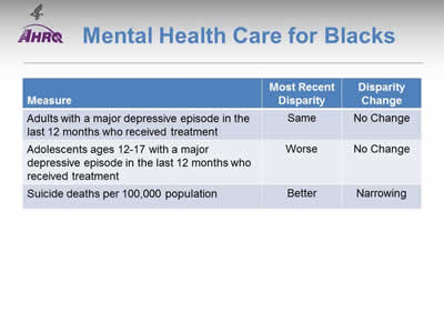
Mental Health Care for Blacks
| Measure | Most Recent Disparity | Disparity Change |
|---|---|---|
| Adults with a major depressive episode in the last 12 months who received treatment | Same | No Change |
| Adolescents ages 12-17 with a major depressive episode in the last 12 months who received treatment | Worse | No Change |
| Suicide deaths per 100,000 population | Better | Narrowing |
Note:
- Trends: The percentage of adults with major depressive episode who received treatment improved.
- Groups With Disparities:
- The percentage of adults who received treatment for depression was the same for Blacks and Whites and this disparity did not change over time.
- The percentage of adolescents who received treatment for depression was lower for Blacks than for Whites and this disparity did not change over time.
- Blacks had a lower suicide death rate than Whites but this disparity is narrowing as Black suicide deaths increased.
Slide 66
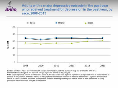
Adults with a major depressive episode in the past year who received treatment for depression in the past year, by race, 2008-2013
Image: Chart shows adults with a major depressive episode in the past year who received treatment for depression in the past year, by race, 2008-2013:
| Race | 2008 | 2009 | 2010 | 2011 | 2012 | 2013 |
|---|---|---|---|---|---|---|
| Total | 68.3 | 64.4 | 68.2 | 68.1 | 68.0 | 68.6 |
| White | 70.4 | 66.1 | 70.8 | 70.9 | 69.3 | 70.2 |
| Black | 56.0 | 53.1 | 55.7 | 54.9 | 61.0 | 62.3 |
Source: Substance Abuse and Mental Health Services Administration, National Survey on Drug Use and Health, 2008-2013.
Denominator: Adults age 18 and over with a major depressive episode in the past year.
Note: Major depressive episode is defined as a period of at least 2 weeks when a person experienced a depressed mood or loss of interest or pleasure in daily activities and had a majority of the symptoms of depression described in the fourth edition of the Diagnostic and Statistical Manual of Mental Disorders. Treatment for depression is defined as seeing or talking to a medical doctor or other professional or using prescription medication in the past year for depression.
- Importance: The United States Preventive Services Task Force (USPSTF) recommends screening for depression in the general adult population, including pregnant and postpartum women. Screening should be implemented with adequate systems in place to ensure accurate diagnosis, effective treatment, and appropriate followup (USPSTF, 2016).
- Overall Rate: In 2013, 68.6% of adults with a major depressive episode received treatment for depression.
- Groups With Disparities: From 2008 to 2012, Black adults with depression were less likely than White adults to receive treatment. In 2013, this disparity was no longer statistically significant.
Slide 67
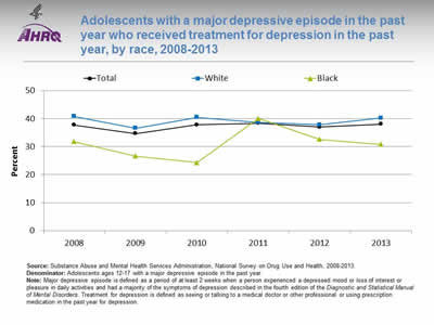
Adolescents with a major depressive episode in the past year who received treatment for depression in the past year, by race, 2008-2013
Image: Chart shows adolescents with a major depressive episode in the past year who received treatment for depression in the past year, by race, 2008-2013:
| Race | 2008 | 2009 | 2010 | 2011 | 2012 | 2013 |
|---|---|---|---|---|---|---|
| Total | 37.7 | 34.7 | 37.8 | 38.4 | 37.0 | 38.1 |
| White | 40.8 | 36.6 | 40.5 | 38.7 | 37.8 | 40.2 |
| Black | 31.8 | 26.6 | 24.3 | 40.1 | 32.6 | 30.8 |
Source: Substance Abuse and Mental Health Services Administration, National Survey on Drug Use and Health, 2008-2013.
Denominator: Adolescents ages 12-17 with a major depressive episode in the past year.
Note: Major depressive episode is defined as a period of at least 2 weeks when a person experienced a depressed mood or loss of interest or pleasure in daily activities and had a majority of the symptoms of depression described in the fourth edition of the Diagnostic and Statistical Manual of Mental Disorders. Treatment for depression is defined as seeing or talking to a medical doctor or other professional or using prescription medication in the past year for depression.
- Importance:
- Outpatient mental health treatment and psychotropic medication use in children and adolescents increased in the United States between 1996-1998 and 2010-2012. Although youths with less severe or no impairment accounted for most of the absolute increase in service use, youths with more severe impairment had the greatest relative increase in use, yet less than half accessed services in 2010-2012 (Olfson, et al., 2015).
- The United States Preventive Services Task Force (USPSTF) recommends screening of adolescents ages 12-18 years for major depressive disorder when systems are in place to ensure accurate diagnosis, psychotherapy (cognitive-behavioral or interpersonal), and followup (USPSTF, 2015).
- Overall Rate: In 2013, 38.1% of adolescents with a major depressive episode (MDE) received treatment for depression.
- Trends: From 2008 to 2013, there were no statistically significant changes over time overall, for Blacks, or for Whites in the percentage of adolescents receiving treatment for depression.
- Groups With Disparities: In all years except 2011 and 2012, Black adolescents were less likely to receive needed treatment for MDE than Whites. In 2013, 30.8% of Black adolescents with MDE received treatment for depression compared with 40.2% for Whites.
Slide 68
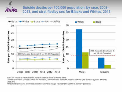
Suicide deaths per 100,000 population, by race, 2008-2013, and stratified by sex for Blacks and Whites, 2013
Image: Charts show suicide deaths per 100,000 population, by race, 2008-2013, and stratified by sex for Blacks and Whites, 2013:
Left Chart:
| Race | 2008 | 2009 | 2010 | 2011 | 2012 | 2013 |
|---|---|---|---|---|---|---|
| Total | 14.0 | 14.2 | 14.6 | 14.9 | 15.2 | 15.2 |
| White | 15.7 | 15.9 | 16.4 | 16.8 | 17.1 | 17.2 |
| Black | 6.3 | 6.2 | 6.2 | 6.4 | 6.7 | 6.5 |
| API | 6.7 | 7.1 | 7.6 | 7.2 | 7.6 | 7.1 |
| AI/AN | 12.2 | 12.1 | 13.1 | 12.8 | 13.1 | 14.1 |
Right Chart:
| Race | Males | Females |
|---|---|---|
| White | 27.3 | 7.6 |
| Black | 11.2 | 2.4 |
2008 Achievable Benchmark: 9 per 100,000 Population.
Key: API = Asian or Pacific Islander; AI/AN = American Indian or Alaska Native.
Source: Centers for Disease Control and Prevention, National Center for Health Statistics, National Vital Statistics System—Mortality, 2008-2013.
Note: For this measure, lower rates are better. Estimates are age adjusted to the 2000 U.S. standard population.
- Importance: According to the Centers for Disease Control and Prevention (Xu, et al., 2014), the rate for the top 10 leading causes of death has decreased or held steady, except the 10th leading cause of death in the United States, suicide. Rates of attempted suicide vary considerably among demographic groups. The economic cost of suicide death in the United States was estimated in 2010 to be more than $44 billion annually.
- Overall Rate: In 2013, the overall suicide death rate was 15.2 per 100,000 population age 12 and over.
- Trends: From 2008 to 2013, suicide death rates worsened for the total population, Whites, Asians and Pacific Islanders (APIs), and American Indians and Alaska Natives (AI/ANs), but not for Blacks.
- Groups With Disparities:
- From 2008 to 2013, Blacks, APIs, and AI/ANs had lower suicide death rates than Whites.
- In 2013, males had higher suicide death rates compared with females. White females had a higher rate than Black females and White males had a higher rate than Black males.
- Achievable Benchmark:
- The 2008 top 5 State achievable benchmark was 9 suicide deaths per 100,000 population. The top 5 States that contributed to the achievable benchmark are Connecticut, District of Columbia, Massachusetts, New Jersey, and New York.
- APIs and Blacks have achieved the benchmark.
- The total population, AI/ANs, and Whites are moving away from the benchmark.
Slide 69
National Healthcare Quality and Disparities Report Chartbook on Health Care for Blacks
Part 2: Trends in Priorities of the Heckler Report
Infant Mortality and Maternity Care
Note:
- Thirty years ago, the Heckler Report found that:
- A smaller percentage of Black women than White women begin prenatal care in the first trimester of pregnancy (63% versus 76% in 1980), a factor related to the high Black infant mortality rate.
- Although Blacks shared in the decline in infant mortality, a significant disparity remained, with Black rates being essentially twice those of Whites, 20.0 versus 10.5 in 1983.
- Among White babies, 5.6% had low birth weight compared with 12.4% of Black babies.
- After adjusting for education, marital status, trimester of first care, parity, and age, Black women still had twice the risk of low birth weight babies compared with White women.
Slide 70
Heckler Infant Mortality and Maternity Care Findings
- The neonatal mortality rate for Blacks in 1981 was 13.4 per 1,000 live births, almost twice the rate for Whites (7.1). The postneonatal mortality rate for Blacks was 6.6, almost twice the 3.4 rate for Whites. In 1983, 11,060 Black babies died before 1 year of age.
- Black women are much more likely to have a teenage birth, an out-of-wedlock birth, or a high-parity birth, all of which are more likely to be unintended and associated with adverse perinatal outcomes.
- In 1982, 61% of Black mothers received care in the first trimester compared with 79% of White mothers. Black mothers were twice as likely as White mothers (10% versus 5%) to receive either no care or care beginning in the third trimester of pregnancy.
- It is also possible that there is a biologic role influencing birth weight that gives a different meaning to low birth weight for Blacks than for Whites. This issue deserves research attention. It is clear, unfortunately, that normal weight Black babies have far higher rates of neonatal mortality.
Slide 71
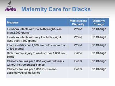
Maternity Care for Blacks
| Measure | Most Recent Disparity | Disparity Change |
|---|---|---|
| Live-born infants with low birth weight (less than 2,500 grams) | Worse | No Change |
| Live-born infants with very low birth weight (less than 1,500 grams) | Worse | No Change |
| Infant mortality per 1,000 live births (more than 2,499 grams) | Worse | No Change |
| Birth trauma—injury to newborn per 1,000 live births | Same | No Change |
| Obstetric trauma per 1,000 vaginal deliveries without instrument assistance | Better | No Change |
| Obstetric trauma per 1,000 instrument-assisted vaginal deliveries | Better | No Change |
Note:
- Trends:
- Low birth weight, infant mortality, birth trauma, and obstetric trauma rates were all improving over time.
- Groups With Disparities:
- Blacks had lower rates of obstetric trauma than Whites.
- Blacks had higher rates of low birth weight and infant mortality and these disparities were not changing over time.
Slide 72
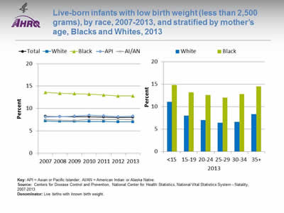
Live-born infants with low birth weight (less than 2,500 grams), by race, 2007-2013, and stratified by mother's age, Blacks and Whites, 2013
Image: Charts show live-born infants with low birth weight (less than 2,500 grams), by race, 2007-2013, and stratified by mother's age, Blacks and Whites, 2013:
Left Chart:
| Race | 2007 | 2008 | 2009 | 2010 | 2011 | 2012 | 2013 |
|---|---|---|---|---|---|---|---|
| Total | 8.2 | 8.2 | 8.2 | 8.2 | 8.1 | 8.0 | 8.0 |
| AI/AN | 7.5 | 7.4 | 7.3 | 7.6 | 7.5 | 7.6 | 7.5 |
| API | 8.1 | 8.2 | 8.3 | 8.5 | 8.4 | 8.2 | 8.3 |
| Black | 13.6 | 13.4 | 13.3 | 13.2 | 13.0 | 12.8 | 12.8 |
| White | 7.2 | 7.1 | 7.1 | 7.1 | 7.1 | 7.0 | 7.0 |
Right Chart:
| Age | Black | White |
|---|---|---|
| <15 | 14.8 | 11.1 |
| 15-19 | 13.2 | 8.0 |
| 20-24 | 12.6 | 7.0 |
| 25-29 | 12.0 | 6.4 |
| 30-34 | 12.8 | 6.6 |
| 35+ | 14.5 | 8.3 |
Key: API = Asian or Pacific Islander; AI/AN = American Indian or Alaska Native.
Source: Centers for Disease Control and Prevention, National Center for Health Statistics, National Vital Statistics System—Natality, 2007-2013.
Denominator: Live births with known birth weight.
Note:
- Importance: In 2012, Black mothers were 2.3 times as likely as White mothers to delay prenatal care to the third trimester or to not receive prenatal care at all (10.0% compared with 4.3%). Adequate prenatal care can help ensure that babies are born full term and at a healthy weight. Low birth weight can put infants at risk of various complications and death.
- Trends: From 2007 to 2013, the percentage of live-born infants with low birth weight decreased among Blacks but did not change overall or for other racial groups.
- Groups With Disparities:
- In all years, Black infants were more likely than White infants to be low birth weight.
- Among all maternal age groups, Black infants were more likely than White infants to be low birth weight.
Slide 73
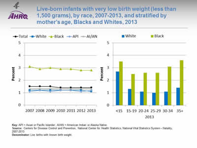
Live-born infants with very low birth weight (less than 1,500 grams), by race, 2007-2013, and stratified by mother's age, Blacks and Whites, 2013
Image: Charts show live-born infants with very low birth weight (less than 1,500 grams), by race, 2007-2013, and stratified by mother's age, Blacks and Whites, 2013:
Left Chart:
| Race | 2007 | 2008 | 2009 | 2010 | 2011 | 2012 | 2013 |
|---|---|---|---|---|---|---|---|
| Total | 1.5 | 1.5 | 1.5 | 1.4 | 1.4 | 1.4 | 1.4 |
| AI/AN | 1.3 | 1.3 | 1.3 | 1.3 | 1.3 | 1.3 | 1.3 |
| API | 1.1 | 1.2 | 1.1 | 1.2 | 1.2 | 1.1 | 1.2 |
| Black | 3.1 | 2.9 | 3 | 2.9 | 2.9 | 2.8 | 2.8 |
| White | 1.2 | 1.2 | 1.2 | 1.2 | 1.2 | 1.2 | 1.1 |
Right Chart:
| Age | Black | White |
|---|---|---|
| <15 | 3.5 | 2.7 |
| 15-19 | 2.5 | 1.3 |
| 20-24 | 2.6 | 1.1 |
| 25-29 | 2.6 | 1.0 |
| 30-34 | 3.1 | 1.1 |
| 35+ | 3.6 | 1.4 |
Key: API = Asian or Pacific Islander; AI/AN = American Indian or Alaska Native.
Source: Centers for Disease Control and Prevention, National Center for Health Statistics, National Vital Statistics System—Natality, 2007-2013.
Denominator: Live births with known birth weight.
Note:
- Trends: From 2007 to 2013, the percentage of live-born infants with very low birth weight decreased overall and among Blacks but did not change among other racial groups.
- Groups With Disparities:
- In all years, Black infants were more likely than White infants to have very low birth weight.
- Among all maternal age groups, Black infants were more likely than White infants to have very low birth weight.
Slide 74
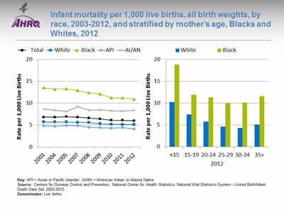
Infant mortality per 1,000 live births, all birth weights, by race, 2003-2012, and stratified by mother's age, Blacks and Whites, 2012
Image: Charts show infant mortality per 1,000 live births, all birth weights, by race, 2003-2012, and stratified by mother's age, Blacks and Whites, 2012:
Left Chart:
| Race | 2003 | 2004 | 2005 | 2007 | 2008 | 2009 | 2010 | 2011 | 2012 |
|---|---|---|---|---|---|---|---|---|---|
| Total | 6.8 | 6.8 | 6.9 | 6.8 | 6.6 | 6.4 | 6.1 | 6.1 | 6.0 |
| AI/AN | 8.7 | 8.4 | 8.1 | 9.2 | 8.4 | 8.5 | 8.3 | 8.2 | 8.4 |
| API | 4.8 | 4.7 | 4.9 | 4.8 | 4.5 | 4.4 | 4.3 | 4.4 | 4.1 |
| Black | 13.5 | 13.2 | 13.3 | 12.9 | 12.4 | 12.1 | 11.2 | 11.2 | 10.9 |
| White | 5.7 | 5.7 | 5.7 | 5.6 | 5.6 | 5.3 | 5.2 | 5.1 | 5.1 |
Right Chart:
| Age | Black | White |
|---|---|---|
| <15 | 18.8 | 10.2 |
| 15-19 | 11.9 | 7.4 |
| 20-24 | 11.3 | 5.8 |
| 25-29 | 10.0 | 4.6 |
| 30-34 | 10.1 | 4.3 |
| 35+ | 11.6 | 5.1 |
Key: API = Asian or Pacific Islander; AI/AN = American Indian or Alaska Native.
Source: Centers for Disease Control and Prevention, National Center for Health Statistics, National Vital Statistics System—Linked Birth/Infant Death Data Set, 2003-2012.
Denominator: Live births.
Note:
- Importance:
- Blacks have 2.2 times the infant mortality rate of Whites (Mathews, et al., 2015).
- Black infants (260.7 per 100,000 live births) are 3.5 times as likely to die as White infants (74.4 per 100,000 live births) due to complications related to low birth weight (Mathews, et al., 2015).
- Blacks had more than twice the rate of sudden unexpected infant death as Whites (171.8 compared with 84.4 per 100,000 live births) (CDC, no date).
- Trends:
- From 2003 to 2012, the overall rate decreased from 6.8 per 1,000 live births to 6.0.
- The rate of infant mortality per 1,000 live births decreased overall and among all racial groups.
- Groups With Disparities:
- In all years, mortality was significantly higher among Black infants than White infants.
- In 2012, mortality was significantly higher among Black infants than White infants for all maternal age groups.
Slide 75
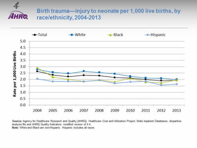
Birth trauma—injury to neonate per 1,000 live births, by race/ethnicity, 2004-2013
Image: Chart shows birth trauma—injury to neonate per 1,000 live births, by race/ethnicity, 2004-2013:
| Year | Total | White | Black | Hispanic |
|---|---|---|---|---|
| 2004 | 2.64 | 2.79 | 2.92 | 2.05 |
| 2005 | 2.36 | 2.57 | 2.20 | 1.85 |
| 2006 | 2.23 | 2.47 | 2.01 | 1.85 |
| 2007 | 2.33 | 2.65 | 1.86 | 1.84 |
| 2008 | 2.30 | 2.55 | 1.97 | 1.94 |
| 2009 | 2.16 | 2.45 | 1.82 | 1.70 |
| 2010 | 2.12 | 2.25 | 2.09 | 1.82 |
| 2011 | 2.00 | 2.12 | 1.80 | 1.87 |
| 2012 | 1.91 | 2.09 | 1.74 | 1.56 |
| 2013 | 1.93 | 2.00 | 1.97 | 1.64 |
Source: Agency for Healthcare Research and Quality (AHRQ), Healthcare Cost and Utilization Project, State Inpatient Databases, disparities analysis file and AHRQ Quality Indicators, modified version of 4.4.
Note: White and Black are non-Hispanic. Hispanic includes all races.
- Trends:
- From 2004 to 2013, birth trauma-neonatal injury rates fell from 2.6 per 1,000 live births in 2004 to 1.9 per 1,000 live births in 2013.
- Between 2004 and 2012, birth trauma-neonatal injury rates fell for all racial/ethnic groups. Blacks decreased from 2.9 in 2004 to 2.0 in 2013.
- Groups With Disparities:
- In 2013, White and Black neonates both experienced an injury rate of 2.0 per 1,000 live births compared with 1.6 per 1,000 live births for Hispanic neonates.
Slide 76
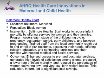
AHRQ Health Care Innovations in Maternal and Child Health
- Location: Baltimore, Maryland
- Population: Black women
- Intervention: Baltimore Healthy Start works to reduce infant mortality by offering services for women and their families. Program covers each stage of the childbearing cycle: pregnancy, postpartum period, early childhood, and between pregnancies. Trained staff from the local community reach out to and enroll at-risk residents, assessing their needs, offering relevant education, and connecting enrollees and their families with needed medical and social services.
- Outcomes: Enhanced access to pre- and postnatal services, generated high levels of satisfaction among clients, produced a lower rate of infant mortality, and reduced the percentage of women delivering low- and very low–birth weight babies. This reduction, in turn, led to significant cost savings.
Slide 77
References
- Arias E. United States life tables, 2011. Natl Vital Stat Rep 2015;64(11). http://www.cdc.gov/nchs/data/nvsr/nvsr64/nvsr64_11.pdf (1.5 MB).
- Centers for Disease Control and Prevention. Health Disparities in HIV/AIDS, Viral Hepatitis, STDs, and TB. Last updated March 2014. http://www.cdc.gov/nchhstp/healthdisparities/AfricanAmericans.html
- DeNavas-Walt C, Proctor BD. Income and poverty in the United States: 2014. Current Population Reports, P60-252. Washington, DC: U.S. Government Printing Office; 2015. http://www.census.gov/content/dam/Census/library/publications/2015/demo/p60-252.pdf (2.25 MB).
- Fairlie, RW, Robb AM. Policy Brief #12. The causes of racial disparities in business performance. In: Race and entrepreneurial success: Black-, Asian-, and White-owned businesses in the United States. Cambridge, MA: MIT Press; 2008. http://www.npc.umich.edu/publications/policy_briefs/brief12/
- Hobbs F, Stoops N, U.S. Census Bureau, Census 2000 Special Reports, Series CENSR-4, Demographic trends in the 20th century, Washington, DC: U.S. Government Printing Office; 2002.
- Lofquist D, Lugaila T, O'Connell M, et al. Households and families: 2010. 2010 Census Briefs. Suitland, MD: U.S. Census Bureau; April 2012. Publication No. C2010BR-14. https://www.census.gov/prod/cen2010/briefs/c2010br-14.pdf (2.4 MB).
- Peters A. Black Business Trends in the United States. Conference on Negritude, Ethnicity and Afro Cultures in the Americas. Miami, FL: Florida International University, 26 February 1987. https://www.sec.gov/news/speech/1987/022687peters.pdf (527 KB).
- Probst JC, Samuels ME, Jespersen KP, et al. Minorities in rural America: an overview of population characteristics. (Prepared under Grant No. 6 U1C RH 00045-01 with the Federal Office of Rural Health Policy, Health Resources and Services Administration). Columbia, SC: South Carolina Rural Health Research Center, Norman J. Arnold School of Public Health, University of South Carolina; 2002. http://rhr.sph.sc.edu/report/MinoritiesInRuralAmerica.pdf (494 KB).
- U.S. Bureau of the Census. 1980 Census of population. Volume 1. Characteristics of the population. Chapter B. General population characteristics. Part 1. United States summary. Washington, DC: Government Printing Office; May 1983. Publication No. PC80-1-B1. http://www2.census.gov/prod2/decennial/documents/1980/1980censusofpopu8011u_bw.pdf (21.239 MB).
Slide 78
References
- U.S. Bureau of the Census. Household and family characteristics: March 1980. Current Population Reports, Series P-20, No. 366. Washington, DC: U.S. Government Printing Office; 1981. https://www.census.gov/hhes/families/files/scanned/P20-366.pdf (13.645 MB).
- U.S. Bureau of the Census. Money income of households, families, and persons in the United States: 1980. Current Population Reports, P60-132. Washington, DC: U.S. Government Printing Office; 1982.
- U.S. Census Bureau. 2007 Survey of Business Owners summaries of findings. https://www.census.gov/programs-surveys/sbo.html
- U.S. Census Bureau. Current Population Survey, Annual Social and Economic Supplement, 2010. Table 4. Black alone population. Released June 2011. https://www.census.gov/programs-surveys/cps.html
- U.S. Census Bureau. Facts for Features. Black (African-American) History Month: February 2012. Released January 4, 2012. Publication No. CB12-FF.01. https://www.census.gov/newsroom/releases/archives/facts_for_features_special_editions/cb12-ff01.html
- U.S. Census Bureau. Statistical abstract of the United States. Released 1999. Section 4. http://www.census.gov/prod/99pubs/99statab/sec04.pdf (407 KB).
- Centers for Disease Control and Prevention. Sudden Unexpected Infant Death and Sudden Infant Death Syndrome. Data and Statistics. http://www.cdc.gov/sids/data.htm
- Heckler M; Task Force on Black and Minority Health. Report of the Secretary's Task Force on Black and Minority Health. Washington, DC: U.S. Department of Health and Human Services; 1985. https://collections.nlm.nih.gov/catalog/nlm:nlmuid-8602912-mvset
- Mathews TJ, MacDorman MF, Thoma ME. Infant mortality statistics from the 2013 period linked birth/infant death data set. Natl Vital Stat Rep 2015 Aug 6;64(9). http://www.cdc.gov/nchs/data/nvsr/nvsr64/nvsr64_09.pdf (994 KB).
- Olfson M, Druss BG, Marcus SC. Trends in mental health care among children and adolescents. New Engl J Med 2015;372(21):2029-38.
- U.S. Preventive Services Task Force. Depression in adults: screening. January 2016. https://www.uspreventiveservicestaskforce.org/uspstf/document/RecommendationStatementFinal/depression-in-adults-screening
- Xu JQ, Kochanek KD, Murphy SL, et al. Mortality in the United States, 2012. NCHS Data Brief No. 168. Hyattsville, MD: National Center for Health Statistics; 2014. http://www.cdc.gov/nchs/data/databriefs/db168.pdf (554 KB).
Part 3: Trends in Access and Priorities of the National Quality Strategy
Slide 79

National Healthcare Quality and Disparities Report Chartbook on Health Care for Blacks
Part 3: Trends in Access and Priorities of the National Quality Strategy
Slide 80
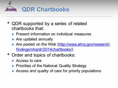
QDR Chartbooks
- QDR supported by a series of related chartbooks that:
- Present information on individual measures.
- Are updated annually.
- Are posted on the Web (https://archive.ahrq.gov/research/findings/nhqrdr/2014chartbooks/index.html)
- Order and topics of chartbooks:
- Access to care.
- Priorities of the National Quality Strategy.
- Access and quality of care for priority populations.
Note:
- Information on individual measures is available through chartbooks posted on the Web (https://archive.ahrq.gov/research/findings/nhqrdr/2014chartbooks/index.html).
Slide 81
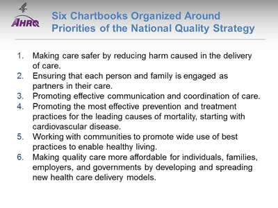
Six Chartbooks Organized Around Priorities of the National Quality Strategy
- Making care safer by reducing harm caused in the delivery of care.
- Ensuring that each person and family is engaged as partners in their care.
- Promoting effective communication and coordination of care.
- Promoting the most effective prevention and treatment practices for the leading causes of mortality, starting with cardiovascular disease.
- Working with communities to promote wide use of best practices to enable healthy living.
- Making quality care more affordable for individuals, families, employers, and governments by developing and spreading new health care delivery models.
Slide 82
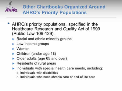
Other Chartbooks Organized Around AHRQ's Priority Populations
- AHRQ's priority populations, specified in the Healthcare Research and Quality Act of 1999 (Public Law 106-129):
- Racial and ethnic minority groups.
- Low-income groups.
- Women.
- Children (under age 18).
- Older adults (age 65 and over).
- Residents of rural areas.
- Individuals with special health care needs, including:
- Individuals with disabilities.
- Individuals who need chronic care or end-of-life care.
Slide 83

National Healthcare Quality and Disparities Report Chartbook on Health Care for Blacks
Part 3: Trends in Access and Priorities of the National Quality Strategy
Access to Health Care
Slide 84
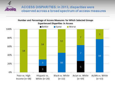
ACCESS DISPARITIES: In 2013, disparities were observed across a broad spectrum of access measures
Image: Chart shows Number and Percentage of Access Measures for Which Selected Groups Experienced Disparities in Access:
| Poor vs. High Income (n=18) | Hispanic vs. White (n=20) | Black vs. White (n=22) | Asian vs. White (n=19) | AI/AN vs. White (n=13) | |
|---|---|---|---|---|---|
| Better | 3 | 5 | |||
| Same | 0 | 3 | 10 | 7 | 10 |
| Worse | 18 | 14 | 12 | 7 | 3 |
| Total | 18 | 20 | 22 | 19 | 13 |
Key: AI/AN = American Indian or Alaska Native; n = number of measures.
Note: Poor indicates family income less than the Federal poverty level; high income indicates family income four times the Federal poverty level or greater. Numbers of measures differ across groups because of sample size limitations. Measures that achieve an overall performance level of 95% or better are not reported in the QDR and are not included in these analyses. Because disparities are typically eliminated when overall performance reaches 95%, our analyses may overstate the percentage of measures exhibiting disparities.
The relative difference between a selected group and its reference group is used to assess disparities.
- Better = Population had better access to care than reference group. Differences are statistically significant, are equal to or larger than 10%, and favor the selected group.
- Same = Population and reference group had about the same access to care. Differences are not statistically significant or are smaller than 10%.
- Worse = Population had worse access to care than reference group. Differences are statistically significant, are equal to or larger than 10%, and favor the reference group.
Example: Compared with Whites, Blacks had worse access to care on 12 of the 22 access measures, similar access on 10 measures, and better access on no measures.
- Groups With Disparities:
- People in poor households experienced the largest number of disparities, followed by Hispanics and Blacks.
- In 2013, people in poor households had worse access to care than people in high-income households on all access measures (green).
- Blacks had worse access to care than Whites for about half of access measures.
- Hispanics had worse access to care than Whites for more than two-thirds of access measures.
- Asians and American Indians and Alaska Natives had worse access to care than Whites for about one-third of access measures.
Slide 85
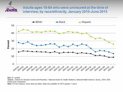
Adults ages 18-64 who were uninsured at the time of interview, by race/ethnicity, January 2010-June 2015
Image: Chart shows adults ages 18-64 who were uninsured at the time of interview, by race/ethnicity, January 2010-June 2015:
| Quarter | Hispanic | White | Black |
|---|---|---|---|
| 2010 Q1 | 42.4 | 15.6 | 27.9 |
| 2010 Q2 | 44.9 | 17 | 26.5 |
| 2010 Q3 | 44.1 | 16.7 | 28.6 |
| 2010 Q4 | 41.5 | 16.1 | 25.6 |
| 2011 Q1 | 42 | 16.1 | 23.9 |
| 2011 Q2 | 41.4 | 15.8 | 24.2 |
| 2011 Q3 | 42.6 | 15.7 | 25 |
| 2011 Q4 | 42.7 | 14.8 | 26.2 |
| 2012 Q1 | 42.6 | 16 | 26 |
| 2012 Q2 | 39.7 | 14.2 | 21.9 |
| 2012 Q3 | 40.5 | 15.1 | 24.1 |
| 2012 Q4 | 42.2 | 15.1 | 22.6 |
| 2013 Q1 | 41.4 | 15.2 | 25.5 |
| 2013 Q2 | 41.3 | 13.9 | 23.6 |
| 2013 Q3 | 39.5 | 14.7 | 25.9 |
| 2013 Q4 | 40.3 | 14 | 24.6 |
| 2014 Q1 | 35.7 | 13.5 | 20.2 |
| 2014 Q2 | 33.2 | 11.1 | 15.9 |
| 2014 Q3 | 34 | 11.4 | 17.5 |
| 2014 Q4 | 31.8 | 10.5 | 17.2 |
| 2015 Q1 | 28.3 | 8.7 | 15.6 |
| 2015 Q2 | 26.1 | 8.8 | 13.5 |
Key: Q = quarter.
Source: Centers for Disease Control and Prevention, National Center for Health Statistics, National Health Interview Survey, 2010 -2015, Family Core Component.
Note: For this measure, lower rates are better. Data only available for 2015 quarters 1 and 2.
- Trends: All racial/ethnic groups displayed a decrease from 2013 Q4 to 2015 Q2:
- White: 14.0% to 8.8%
- Black: 24.6% to 13.5%
- Hispanic: 40.3% to 26.1%
- Groups With Disparities: Black adults ages 18-64 were significantly more likely than Whites to be uninsured from January 2010 to June 2015. The percentage peaked in the third quarter of 2010 at 28.6%, then significantly decreased to 13.5% for the second quarter of 2015.
Slide 86
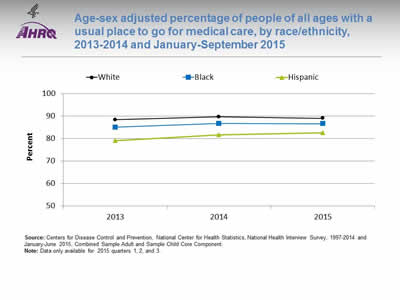
Age-sex adjusted percentage of people of all ages with a usual place to go for medical care, by race/ethnicity, 2013-2014 and January-September 2015
Image: Chart shows age-sex adjusted percentage of people of all ages with a usual place to go for medical care, by race/ethnicity, 2013-2014 and January-September 2015:
| Race/Ethnicity | 2013 | 2014 | 2015 |
|---|---|---|---|
| White | 88.3 | 89.6 | 89 |
| Black | 85 | 86.7 | 86.6 |
| Hispanic | 79 | 81.7 | 82.6 |
Source: Centers for Disease Control and Prevention, National Center for Health Statistics, National Health Interview Survey, 1997-2014 and January-June 2015, Combined Sample Adult and Sample Child Core Component.
Note: Data only available for 2015 quarters 1, 2, and 3.
- Groups With Disparities:
- From January to June 2015, after adjustment for age and sex, the percentage of people with a usual place to go for medical care was 82.6% for Hispanics, 89.0% for Whites, and 86.6% for Blacks.
- In all 3 years, Blacks were less likely to have a usual place to go for medical care compared with Whites.
Slide 87
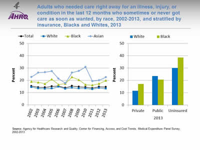
Adults who needed care right away for an illness, injury, or condition in the last 12 months who sometimes or never got care as soon as wanted, by race, 2002-2013, and stratified by insurance, Blacks and Whites, 2013
Image: Charts show adults who needed care right away for an illness, injury, or condition in the last 12 months who sometimes or never got care as soon as wanted, by race, 2002-2013, and stratified by insurance, Blacks and Whites, 2013:
Left Chart:
| Race | 2002 | 2003 | 2004 | 2005 | 2006 | 2007 | 2008 | 2009 | 2010 | 2011 | 2012 | 2013 |
|---|---|---|---|---|---|---|---|---|---|---|---|---|
| Total | 15.3 | 14.3 | 14.2 | 15.1 | 15.3 | 13.9 | 15.4 | 14.7 | 14.4 | 13.6 | 14.7 | 14.6 |
| Black | 19 | 18.4 | 17.2 | 20.9 | 16.5 | 17.4 | 22.7 | 20.4 | 16.4 | 16.1 | 17.3 | 19.8 |
| White | 14.5 | 13.4 | 13.1 | 13.4 | 14.7 | 13.1 | 14 | 13.4 | 13.4 | 12.8 | 13.8 | 13.2 |
| Asian | 22.7 | 26.3 | 26.7 | 27.4 | 21.3 | 17.6 | 26.3 | 27.7 | 30.8 | 19.4 | 20.1 | 22.6 |
Right Chart:
| Insurance | White | Black |
|---|---|---|
| Private | 11.6 | 17.1 |
| Public | 23.6 | 20.7 |
| Uninsured | 30.1 | 38.5 |
Source: Agency for Healthcare Research and Quality, Center for Financing, Access, and Cost Trends, Medical Expenditure Panel Survey, 2002-2013.
Note:
- Trends: From 2002 to 2013, there were no statistically significant changes overall or for any racial group in the percentage of adults who needed care right away who sometimes or never got care as soon as wanted.
- Groups With Disparities:
- In 2013, the percentage of Blacks who needed care right away who sometimes or never got care as soon as wanted was significantly higher than the percentage of Whites who sometimes or never received care as soon as wanted.
- Among those with private insurance, the percentage who sometimes or never got care as soon as wanted was significantly higher for Blacks than for Whites.
Slide 88
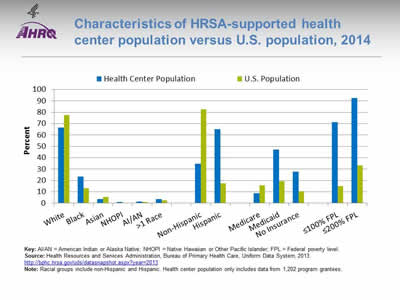
Characteristics of HRSA-supported health center population versus U.S. population, 2014
Image: Chart shows characteristics of HRSA-supported health center population versus U.S. population, 2014:
| Characteristics | Health Center Population | U.S. Population |
|---|---|---|
| White | 66.6 | 77.7 |
| Black | 23.4 | 13.2 |
| Asian | 3.8 | 5.4 |
| NHOPI | 1.2 | 0.2 |
| AI/AN | 1.3 | 1.2 |
| >1 Race | 3.7 | 2.5 |
| Non-Hispanic | 34.9 | 82.6 |
| Hispanic | 65.1 | 17.4 |
| Medicare | 8.6 | 15.6 |
| Medicaid | 47.3 | 19.5 |
| No Insurance | 27.9 | 10.4 |
| ≤100% FPL | 71.2 | 14.8 |
| ≤200% FPL | 92.4 | 33.4 |
Key: AI/AN = American Indian or Alaska Native; NHOPI = Native Hawaiian or Other Pacific Islander; FPL = Federal poverty level.
Source: Health Resources and Services Administration, Bureau of Primary Health Care, Uniform Data System, 2013. http://bphc.hrsa.gov/uds/datasnapshot.aspx?year=2013
Note: Racial groups include non-Hispanic and Hispanic. Health center population only includes data from 1,202 program grantees.
- Groups With Disparities:
- In 2014, 71.2% of the health center population was at or below the Federal poverty level compared with 14.8% of the U.S. population. The health center population also had higher percentages of uninsurance (27.9%) and Medicaid enrollment (47.3%) than the U.S. population (10.4% and 19.5%, respectively).
- In 2014, the percentage of the health center population who was Black was nearly one-quarter (23.4%), nearly twice as much as the percentage in the U.S. population (13.2%). Slightly less than two-thirds (65.1%) of the health center population was Hispanic, which was much higher than the percentage in the U.S. population (17.4%).
Slide 89

National Healthcare Quality and Disparities Report Chartbook on Health Care for Blacks
Part 3: Trends in Access and Priorities of the National Quality Strategy
National Quality Strategy Priorities
Slide 90
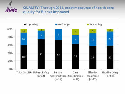
QUALITY: Through 2013, most measures of health care quality for Blacks improved
Image: Chart shows shows measures of health care quality for Blacks:
| NQS Priority | Worsening | No Change | Improving |
|---|---|---|---|
| Total (n=179) | 16 | 57 | 106 |
| Patient Safety (n=23) | 1 | 5 | 17 |
| Person-Centered Care (n=18) | 5 | 13 | |
| Care Coordination (n=19) | 3 | 4 | 12 |
| Effective Treatment (n=47) | 5 | 15 | 27 |
| Healthy Living (n=64) | 4 | 23 | 37 |
Key: n = number of measures.
Improving = Quality is going in a positive direction at an average annual rate greater than 1% per year.
No Change = Quality is not changing or is changing at an average annual rate less than 1% per year.
Worsening = Quality is going in a negative direction at an average annual rate greater than 1% per year.
- Quality of care for Blacks:
- Improved for 59% (106 of 179) of the measures.
- Worsened for 9% (16 of 179) of the measures.
- Did not change for 32% (57 of 179) of the measures.
- Among the NQS priorities, quality of care for Blacks:
- Improved for 74% (17 of 23) of Patient Safety measures and did not change for 22% (5 of 23).
- Improved for 72% (13 of 18) of Person-Centered Care measures and did not change for 28% (5 of 18).
- Improved for 63% (12 of 19) of Care Coordination measures and did not change for 21% (4 of 19).
- Improved for 57% (27 of 47) of Effective Treatment measures and did not change for 32% (15 of 47).
- Improved for 58% (37 of 64) of Healthy Living measures and did not change for 36% (23 of 64).
- There are insufficient numbers of reliable measures of Care Affordability to summarize in this way.
Slide 91
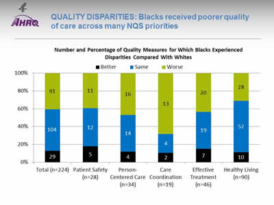
QUALITY DISPARITIES: Blacks received poorer quality of care across many NQS priorities
Image: Chart shows Number and Percentage of Quality Measures for Which Blacks Experienced Disparities Compared With Whites:
| Total (n=224) |
Patient Safety (n=28) |
Person-Centered Care (n=34) |
Care Coordination (n=19) |
Effective Treatment (n=46) |
Healthy Living (n=90) |
|
|---|---|---|---|---|---|---|
| Better | 29 | 5 | 4 | 2 | 7 | 10 |
| Same | 104 | 12 | 14 | 4 | 19 | 52 |
| Worse | 91 | 11 | 16 | 13 | 20 | 28 |
| Total | 224 | 28 | 34 | 19 | 46 | 90 |
Key: n = number of measures.
Note: For most measures, data from 2013 are shown. Measures that achieve an overall performance level of 95% or better are not reported in the QDR and are not included in these analyses. Because disparities are typically eliminated when overall performance reaches 95%, our analyses may overstate the percentage of measures exhibiting disparities.
The relative difference between a selected group and its reference group is used to assess disparities.
- Better = Population received better quality of care than reference group. Differences are statistically significant, are equal to or larger than 10%, and favor the selected group.
- Same = Population and reference group received about the same quality of care. Differences are not statistically significant or are smaller than 10%.
- Worse = Population received worse quality of care than reference group. Differences are statistically significant, equal to or larger than 10%, and favor the reference group.
- Groups With Disparities:
- Blacks received worse care for about 70% of Care Coordination measures.
- Blacks received worse care for nearly 50% of Person-Centered Care measures.
- Blacks received worse care for about 40% of measures of Patient Safety and Effective Treatment and almost one-third of Healthy Living measures.
Slide 92
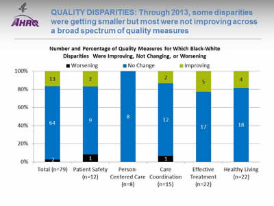
QUALITY DISPARITIES: Through 2013, some disparities were getting smaller but most were not improving across a broad spectrum of quality measures
Image: Chart shows Chart shows Number and Percentage of Quality Measures for Which Black-White Disparities Were Improving, Not Changing, or Worsening:
| Total (n=79) |
Patient Safety (n=12) |
Person-Centered Care (n=8) |
Care Coordination (n=15) |
Effective Treatment (n=22) |
Healthy Living (n=22) |
|
|---|---|---|---|---|---|---|
| Worsening | 2 | 1 | 1 | |||
| No Change | 64 | 9 | 8 | 12 | 17 | 18 |
| Improving | 13 | 2 | 2 | 5 | 4 | |
| Total | 12 | 8 | 15 | 22 | 22 |
Key: n = number of measures.
Note: For the majority of measures, trend data are available from 2001-2002 to 2013.
For each measure with Black-White disparities in the baseline year, average annual percentage changes were calculated for select populations and reference groups. Measures are aligned so that positive rates indicate improvement in access to care.
Differences in rates between groups were used to assess trends in disparities.
- Worsening = Disparities are getting larger. Differences in rates between groups are statistically significant and reference group rates exceed population rates by at least 1% per year.
- No Change = Disparities are not changing. Differences in rates between groups are not statistically significant or differ by less than 1% per year.
- Improving = Disparities are getting smaller. Differences in rates between groups are statistically significant and population rates exceed reference group rates by at least 1% per year.
- Disparity Trends:
- Through 2013, most Black-White disparities in quality of care in the baseline year showed no significant change over time (blue), neither getting smaller nor larger.
- When changes in disparities occurred, measures of disparities were more likely to show improvement (green) than decline (black).
Slide 93
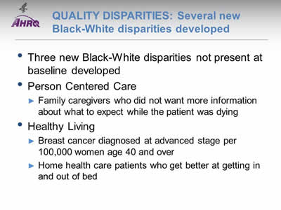
QUALITY DISPARITIES: Several new Black-White disparities developed
- Three new Black-White disparities not present at baseline developed.
- Person Centered Care
- Family caregivers who did not want more information about what to expect while the patient was dying.
- Healthy Living
- Breast cancer diagnosed at advanced stage per 100,000 women age 40 and over.
- Home health care patients who get better at getting in and out of bed.
Slide 94
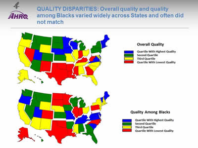
QUALITY DISPARITIES: Overall quality and quality among Blacks varied widely across States and often did not match
Image: Two maps of the United States are color-coded by state to compare overall quality and quality among Blacks.
Source: Agency for Healthcare Research and Quality, 2014 State Snapshots.
Note: An overall quality score is computed for each State based on the number of quality measures that are above, at, or below the average across all States; States are ranked and quartiles are shown in the top map. A quality score for Blacks is computed in a similar manner but only using data for Blacks. Go to State Snapshots at http://nhqrnet.ahrq.gov/inhqrdr/state/select for more detailed methods.
- Geographic Disparities:
- There was significant variation in overall quality among States. States in the New England, Middle Atlantic, West North Central, and Mountain census divisions tended to have higher overall quality (blue and green) while States in the South census region tended to have lower quality (yellow and red).
- There was also significant variation among States in quality for Blacks. Blacks tended to receive higher quality care in States in the South Atlantic and East South Central census divisions (blue and green) and lower quality care in States in the New England, Middle Atlantic, and West South Central census divisions (yellow and red).
- The variation in State performance on overall quality and among specific priority populations may point to differential strategies for improvement. States with high overall quality but poor quality for Blacks might target this population for support; States with low overall quality and high quality for Blacks might seek to improve care for everyone.
- The State Snapshots tool (http://nhqrnet.ahrq.gov/inhqrdr/state/select), part of the QDR Web site, focuses on variation across States and helps State health leaders, researchers, and consumers understand the status of health care in individual States and the District of Columbia. It is based on more than 100 QDR measures for which State estimates are possible.
Slide 95

National Healthcare Quality and Disparities Report Chartbook on Health Care for Blacks
Part 3: Trends in Access and Priorities of the National Quality Strategy
NQS Priority: Patient Safety
Note:
- Patient Safety is the first of six National Quality Strategy (NQS) Priorities to be covered by this chartbook. The other five Priorities are Person- and Family-Centered Care, Care Coordination, Effective Treatment, Healthy Living, and Care Affordability.
Slide 96
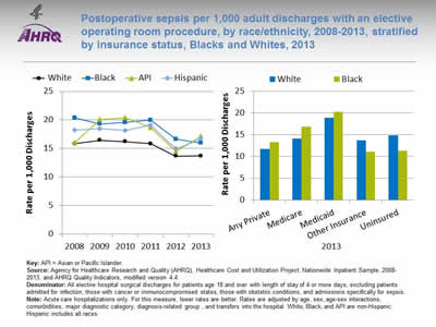
Postoperative sepsis per 1,000 adult discharges with an elective operating room procedure, by race/ethnicity, 2008-2013, stratified by insurance status, Blacks and Whites, 2013
Image: Charts show postoperative sepsis per 1,000 adult discharges with an elective operating room procedure, by race/ethnicity, 2008-2013, stratified by insurance status, Blacks and Whites, 2013:
Left Chart:
| Year | White | API | Hispanic | Black |
|---|---|---|---|---|
| 2008 | 15.85 | 16.05 | 18.22 | 20.38 |
| 2009 | 16.43 | 20.11 | 18.47 | 19.30 |
| 2010 | 16.21 | 20.41 | 18.15 | 19.57 |
| 2011 | 15.86 | 18.71 | 19.11 | 19.97 |
| 2012 | 13.65 | 14.52 | 14.94 | 16.63 |
| 2013 | 13.70 | 17.17 | 16.76 | 15.98 |
Right Chart:
| Race | Any Private | Medicare | Medicaid | Other Insurance | Uninsured |
|---|---|---|---|---|---|
| White | 11.7 | 14.2 | 19.0 | 13.7 | 14.9 |
| Black | 13.3 | 16.9 | 20.3 | 11.1 | 11.3 |
Key: API = Asian or Pacific Islander.
Source: Agency for Healthcare Research and Quality (AHRQ), Healthcare Cost and Utilization Project, Nationwide Inpatient Sample, 2008-2013, and AHRQ Quality Indicators, modified version 4.4.
Denominator: All elective hospital surgical discharges for patients age 18 and over with length of stay of 4 or more days, excluding patients admitted for infection, those with cancer or immunocompromised states, those with obstetric conditions, and admissions specifically for sepsis.
Note: Acute care hospitalizations only. For this measure, lower rates are better. Rates are adjusted by age, sex, age-sex interactions, comorbidities, major diagnostic category, diagnosis-related group , and transfers into the hospital. White, Black, and API are non-Hispanic. Hispanic includes all races.
- Overall Rate: In 2013, the postoperative sepsis rate was 14.3 per 1,000 adult discharges with an elective operating room procedure (data not shown).
- Trends: From 2008 to 2013, there were no statistically significant changes overall or for any racial/ethnic group in the rate of postoperative sepsis.
- Groups With Disparities:
- In all years, Hispanic patients and Black patients had higher rates of postoperative sepsis than their White counterparts.
- In 2013, among Medicare patients, the rate of postoperative sepsis was higher for Blacks than for Whites. Black-White differences in other insurance groups were not statistically significant.
Slide 97
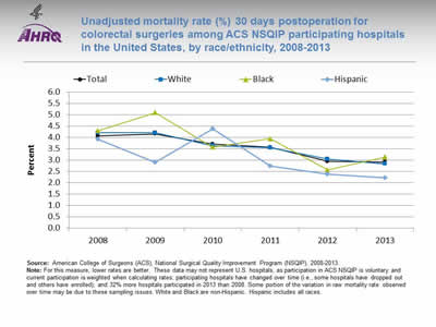
Unadjusted mortality rate (%) 30 days postoperation for colorectal surgeries among ACS NSQIP participating hospitals in the United States, by race/ethnicity, 2008-2013
Image: Chart shows unadjusted mortality rate (%) 30 days postoperation for colorectal surgeries among ACS NSQIP participating hospitals in the United States, by race/ethnicity, 2008-2013:
| Race/Ethnicity | 2008 | 2009 | 2010 | 2011 | 2012 | 2013 |
|---|---|---|---|---|---|---|
| Hispanic | 3.93 | 2.91 | 4.39 | 2.75 | 2.38 | 2.22 |
| Black | 4.30 | 5.10 | 3.58 | 3.95 | 2.57 | 3.14 |
| White | 4.21 | 4.21 | 3.64 | 3.55 | 3.05 | 2.84 |
| Total | 4.07 | 4.16 | 3.71 | 3.57 | 2.95 | 2.92 |
Source: American College of Surgeons (ACS), National Surgical Quality Improvement Program (NSQIP), 2008-2013.
Note: For this measure, lower rates are better. These data may not represent U.S. hospitals, as participation in ACS NSQIP is voluntary and current participation is weighted when calculating rates; participating hospitals have changed over time (i.e., some hospitals have dropped out and others have enrolled); and 32% more hospitals participated in 2013 than 2008. Some portion of the variation in raw mortality rate observed over time may be due to these sampling issues. White and Black are non-Hispanic. Hispanic includes all races.
- Importance: Colon and rectal procedures are ranked among the most harmful procedures, with high rates of postoperative complications, which are often a result of nonadherence to best practices.
- Overall Rate: In 2013, the unadjusted rate of 30-day postoperative mortality for colorectal surgeries was 2.9% among ACS-NSQIP participating hospitals in the United States.
- Trend: From 2008 to 2013, rates decreased by 44% among Hispanics, 27% among Blacks, and 33% among Whites.
- Groups With Disparities:
- In 2013, 30-day postoperative mortality rates were higher for Blacks (3.1%) compared with Whites (2.8%).
- In 4 of 5 years, Blacks had higher rates compared with Whites.
Slide 98
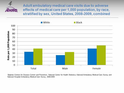
Adult ambulatory medical care visits due to adverse effects of medical care per 1,000 population, by race, stratified by sex, United States, 2008-2009, combined
Image: Chart shows adult ambulatory medical care visits due to adverse effects of medical care per 1,000 population, by race, stratified by sex, United States, 2008-2009, combined:
| Sex | White | Black |
|---|---|---|
| Total | 33.6 | 42.1 |
| Male | 25.1 | 33.2 |
| Female | 42 | 49.8 |
Source: Centers for Disease Control and Prevention, National Center for Health Statistics, National Ambulatory Medical Care Survey and National Hospital Ambulatory Medical Care Survey, 2008-2009.
Note:
- Importance:
- Adverse effects of medical care can arise from medical and surgical procedures as well as from adverse drug reactions. Although patient safety initiatives focus mainly on inpatient hospital events, adverse effects of medical care are much more commonly treated at visits to outpatient settings, with more than 12 million such visits occurring annually. Providers treating adverse events in outpatient settings may include office-based physicians, hospital outpatient departments, and hospital emergency departments.
- Events treated in ambulatory settings may be less severe than those occurring in inpatient settings. Some adverse events, such as known side effects of appropriately prescribed medications, may be unavoidable, while others may be considered medical errors. Although the measure here does not distinguish between the two types of events, it provides an overall sense of the burden these events place on the population.
- Overall Rate: In 2008-2009, the rate of ambulatory care visits for adverse effects of medical care was 33.2 per 1,000 population (data not shown).
- Groups With Disparities: In 2008-2009, there were no statistically significant differences between Blacks and Whites in rates of ambulatory care visits for adverse effects of medical care.
Slide 99
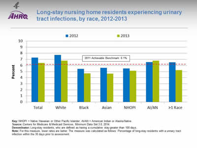
Long-stay nursing home residents experiencing urinary tract infections, by race, 2012-2013
Image: Chart shows long-stay nursing home residents experiencing urinary tract infections, by race, 2012-2013:
| Race | 2012 | 2013 |
|---|---|---|
| Total | 7.3 | 6.4 |
| White | 7.7 | 6.8 |
| Black | 5.5 | 4.7 |
| Asian | 5.6 | 4.7 |
| NHOPI | 5.5 | 5.2 |
| AI/AN | 6.6 | 6.8 |
| >1 Race | 6.5 | 5.2 |
2011 Achievable Benchmark: 6.1%.
Key: NHOPI = Native Hawaiian or Other Pacific Islander; AI/AN = American Indian or Alaska Native.
Source: Centers for Medicare & Medicaid Services, Minimum Data Set 3.0, 2014.
Denominator: Long-stay residents, who are defined as having a cumulative stay greater than 100 days.
Note: For this measure, lower rates are better. The measure was calculated as follows: Percentage of long-stay residents with a urinary tract infection within the 30 days prior to assessment.
- Importance: Urinary tract infections (UTIs) can spread and become more serious or cause further complications, such as delirium.
- Overall Rate: In 2013, the percentage of long-stay nursing home residents with a UTI was 6.4%.
- Groups With Disparities: In 2013, Black, Asian, and Native Hawaiian and Other Pacific Islander (NHOPI) nursing home residents had lower rates of UTIs compared with White residents.
- Achievable Benchmark:
- In 2011, the top 5 State achievable benchmark for UTIs was 6.1%. The States that contributed to the achievable benchmark are Connecticut, Hawaii, Minnesota, North Dakota, and Pennsylvania.
- In both 2012 and 2013, Blacks, Asians, and NHOPIs all achieved the 2011 benchmark of 6.1%, with Blacks and Asians having the best rate among all racial groups (4.7%) in 2013.
Slide 100
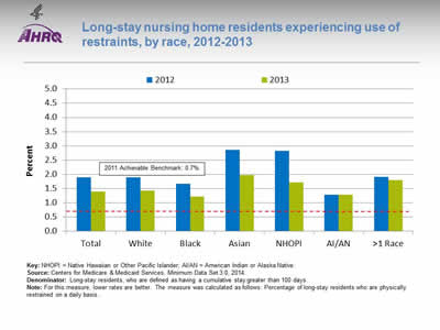
Long-stay nursing home residents experiencing use of restraints, by race, 2012-2013
Image: Chart shows long-stay nursing home residents experiencing use of restraints, by race, 2012-2013:
| Race | 2012 | 2013 |
|---|---|---|
| Total | 1.9 | 1.4 |
| White | 1.9 | 1.4 |
| Black | 1.7 | 1.2 |
| Asian | 2.9 | 2.0 |
| NHOPI | 2.8 | 1.7 |
| AI/AN | 1.3 | 1.3 |
| >1 Race | 1.9 | 1.8 |
2011 Achievable Benchmark: 0.7%.
Key: NHOPI = Native Hawaiian or Other Pacific Islander; AI/AN = American Indian or Alaska Native.
Source: Centers for Medicare & Medicaid Services, Minimum Data Set 3.0, 2014.
Denominator: Long-stay residents, who are defined as having a cumulative stay greater than 100 days.
Note: For this measure, lower rates are better. The measure was calculated as follows: Percentage of long-stay residents who are physically restrained on a daily basis.
- Importance: Residents who are restrained can become weak, lose their ability to go to the bathroom by themselves, and develop pressure ulcers or other medical conditions.
- Overall Rate: In 2013, the percentage of long-stay nursing home residents who were physically restrained was 1.4%.
- Groups With Disparities: In 2013, the percentage of nursing home residents with restraints was higher for Asians (2.0%) than for Whites (1.4%). The percentage was lower for Blacks (1.2%), who had the lowest percentage among all racial groups.
- Achievable Benchmark:
- In 2011, the top 5 State achievable benchmark for restraint use was 0.7%. The States that contributed to the achievable benchmark are Kansas, Maine, Nebraska, New Hampshire, and Vermont.
- By 2013, no group had achieved the benchmark.
Slide 101

National Healthcare Quality and Disparities Report Chartbook on Health Care for Blacks
Part 3: Trends in Access and Priorities of the National Quality Strategy
NQS Priority: Person- and Family-Centered Care
Slide 102
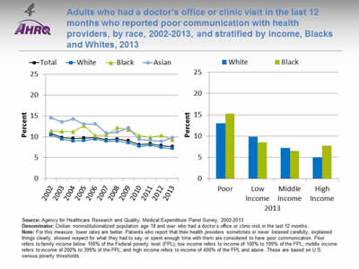
Adults who had a doctor's office or clinic visit in the last 12 months who reported poor communication with health providers, by race, 2002-2013, and stratified by income, Blacks and Whites, 2013
Image: Charts show adults who had a doctor's office or clinic visit in the last 12 months who reported poor communication with health providers, by race, 2002-2013, and stratified by income, Blacks and Whites, 2013:
Left Chart:
| Race | 2002 | 2003 | 2004 | 2005 | 2006 | 2007 | 2008 | 2009 | 2010 | 2011 | 2012 | 2013 |
|---|---|---|---|---|---|---|---|---|---|---|---|---|
| Total | 10.8 | 9.8 | 9.6 | 9.7 | 9.8 | 9.3 | 9.5 | 9.0 | 8.1 | 8.3 | 7.9 | 7.6 |
| White | 10.4 | 9.4 | 9.0 | 9.1 | 9.5 | 9.0 | 9.0 | 8.5 | 7.7 | 8.0 | 7.4 | 7.2 |
| Black | 11.4 | 11.3 | 11.3 | 12.7 | 10.3 | 10.4 | 12.2 | 11.7 | 10.3 | 9.9 | 10.3 | 9.2 |
| Asian | 14.5 | 13.5 | 14.3 | 13.0 | 13.1 | 10.9 | 11.1 | 12.1 | 9.3 | 9.1 | 8.9 | 9.7 |
Right Chart:
| Income | Black | White |
|---|---|---|
| Poor | 15.3 | 13.0 |
| Low Income | 8.6 | 9.8 |
| Middle Income | 6.5 | 7.2 |
| High Income | 7.7 | 5.1 |
Source: Agency for Healthcare Research and Quality, Medical Expenditure Panel Survey, 2002-2013.
Denominator: Civilian noninstitutionalized population age 18 and over who had a doctor's office or clinic visit in the last 12 months.
Note: For this measure, lower rates are better. Patients who report that their health providers sometimes or never listened carefully, explained things clearly, showed respect for what they had to say, or spent enough time with them are considered to have poor communication. Poor refers to family income below 100% of the Federal poverty level (FPL); low income refers to income of 100% to 199% of the FPL; middle income refers to income of 200% to 399% of the FPL; and high income refers to income of 400% of the FPL and above. These are based on U.S. census poverty thresholds.
- Importance: Optimal health care requires good communication between patients and providers, yet barriers to provider-patient communication are common. To provide all patients with the best possible care, providers need to understand patients' diverse health care needs and preferences and communicate clearly with patients about their care.
- Trends: From 2002 to 2013, the percentage of adults who reported poor communication with health providers significantly decreased overall and for Blacks, Whites and Asians.
- Groups With Disparities:
- In all years except 2006, Blacks were significantly more likely than Whites to have poor communication with their health providers.
- In 2013, high-income Blacks were more likely than high-income Whites to have poor communication with their health providers. Differences among other income groups were not statistically significant.
Slide 103
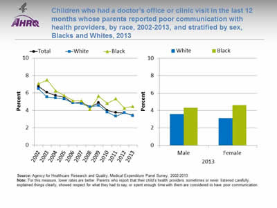
Children who had a doctor's office or clinic visit in the last 12 months whose parents reported poor communication with health providers, by race, 2002-2013, and stratified by sex, Blacks and Whites, 2013
Image: Charts show children who had a doctor's office or clinic visit in the last 12 months whose parents reported poor communication with health providers, by race, 2002-2013, and stratified by sex, Blacks and Whites, 2013:
Left Chart:
| Race | 2002 | 2003 | 2004 | 2005 | 2006 | 2007 | 2008 | 2009 | 2010 | 2011 | 2012 | 2013 |
|---|---|---|---|---|---|---|---|---|---|---|---|---|
| Total | 6.7 | 6.1 | 5.7 | 5.5 | 4.8 | 4.9 | 4.4 | 4.9 | 4.0 | 3.8 | 3.7 | 3.4 |
| White | 6.5 | 5.5 | 5.4 | 5.3 | 4.9 | 4.8 | 4.4 | 4.6 | 3.8 | 3.3 | 3.7 | 3.4 |
| Black | 7.1 | 7.5 | 6.3 | 5.7 | 5.1 | 5.1 | 4.1 | 5.6 | 4.8 | 5.3 | 4.3 | 4.5 |
Right Chart:
| Sex | Black | White |
|---|---|---|
| Male | 4.3 | 3.6 |
| Female | 4.6 | 3.1 |
Source: Agency for Healthcare Research and Quality, Medical Expenditure Panel Survey, 2002-2013.
Note: For this measure, lower rates are better. Parents who report that their child's health providers sometimes or never listened carefully, explained things clearly, showed respect for what they had to say, or spent enough time with them are considered to have poor communication.
- Trends: From 2002 to 2013, the percentage of children whose parents reported poor communication with health providers significantly decreased for Whites and Blacks.
- Groups With Disparities:
- In 2013, parents of Black children were significantly more likely to report poor communication compared with parents of White children.
- Parents of Black girls were significantly more likely to report poor communication compared with parents of White girls. Differences among boys were not statistically significant.
Slide 104
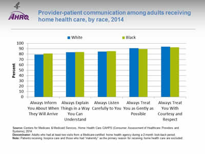
Provider-patient communication among adults receiving home health care, by race, 2014
Image: Chart shows provider-patient communication among adults receiving home health care, by race, 2014:
| Race | Always Inform You About When They Will Arrive | Always Explain Things in a Way You Can Understand | Always Listen Carefully to You | Always Treat You as Gently as Possible | Always Treat You With Courtesy and Respect |
|---|---|---|---|---|---|
| Black | 81.2 | 84.1 | 85.6 | 89.6 | 92.9 |
| White | 79.2 | 83.5 | 84.7 | 91.0 | 94.1 |
Source: Centers for Medicare & Medicaid Services, Home Health Care CAHPS (Consumer Assessment of Healthcare Providers and Systems), 2014.
Denominator: Adults who had at least two visits from a Medicare-certified home health agency during a 2-month look-back period.
Note: Patients receiving hospice care and those who had "maternity" as the primary reason for receiving home health care are excluded.
- Importance: Communication between providers and patients is an important element of patient outcomes. The Consumer Assessment of Healthcare Providers and Systems (CAHPS®) Home Health Care Survey (Home Health Care CAHPS Survey) was designed to measure the experiences of people receiving home health care from Medicare-certified home health care agencies. In April 2012, the Centers for Medicare & Medicaid Services began publicly reporting results from this survey on Home Health Compare to create incentives for home health agencies to improve quality of care and to provide patients with information to help them choose home health care providers.
- Overall Rate: In 2014, among adult home health care patients, about 80% reported that home health care providers always informed them about when they would arrive, always explained things in a way they could understand, and always listened carefully to them. About 90% reported that home health care providers always treated them as gently as possible and with courtesy and respect (data not shown).
- Groups With Disparities: In 2014, among home health care patients:
- Blacks were less likely than Whites to always be treated as gently as possible.
- Blacks were less likely to always be treated with courtesy and respect.
Slide 105
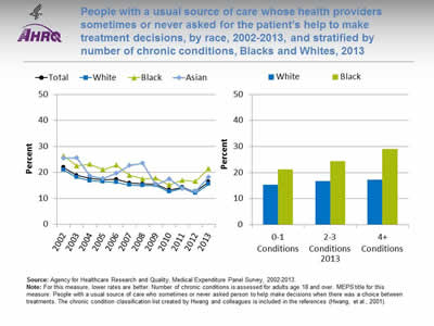
People with a usual source of care whose health providers sometimes or never asked for the patient's help to make treatment decisions, by race, 2002-2013, and stratified by number of chronic conditions, Blacks and Whites, 2013
Image: Charts show people with a usual source of care whose health providers sometimes or never asked for the patient's help to make treatment decisions, by race, 2002-2013, and stratified by number of chronic conditions:
Left Chart:
| Race | 2002 | 2003 | 2004 | 2005 | 2006 | 2007 | 2008 | 2009 | 2010 | 2011 | 2012 | 2013 |
|---|---|---|---|---|---|---|---|---|---|---|---|---|
| Total | 21.9 | 18.9 | 17.7 | 17.2 | 17.3 | 15.9 | 15.6 | 15.4 | 13.2 | 14.3 | 12.7 | 16.4 |
| White | 21.0 | 18.1 | 16.8 | 16.4 | 16.2 | 15.1 | 15.0 | 15.0 | 12.6 | 13.9 | 12.0 | 15.5 |
| Black | 26.4 | 22.5 | 23.2 | 21.1 | 22.8 | 18.9 | 17.5 | 17.7 | 15.1 | 17.0 | 16.5 | 21.5 |
| Asian | 25.5 | 25.6 | 18.7 | 17.6 | 19.7 | 22.7 | 23.6 | 15.2 | 17.5 | 13.7 | 12.7 | 18.1 |
Right Chart:
| Chronic Conditions | Black | White |
|---|---|---|
| 0-1 Conditions | 21.2 | 15.4 |
| 2-3 Conditions | 24.3 | 16.7 |
| 4+ Conditions | 29.0 | 17.2 |
Source: Agency for Healthcare Research and Quality, Medical Expenditure Panel Survey, 2002-2013.
Note: For this measure, lower rates are better. Number of chronic conditions is assessed for adults age 18 and over. MEPS title for this measure: People with a usual source of care who sometimes or never asked person to help make decisions when there was a choice between treatments. The chronic condition classification list created by Hwang and colleagues is included in the references (Hwang, et al., 2001).
- Importance: The increasing prevalence of chronic diseases has placed more responsibility on patients, since conditions such as diabetes and hypertension require self-management. Patients need to be provided with information that allows them to make educated decisions and feel engaged in their treatment. Treatment plans also need to incorporate their values and preferences.
- Trends:
- From 2008 to 2013, the percentage of people whose providers sometimes or never asked for their help with treatment decisions decreased overall from 21.9% to 16.4%.
- Improvement was observed for Whites, Blacks, and Asians.
- Groups With Disparities:
- In all years except 2008, Blacks were significantly more likely to have a usual source of care who sometimes or never asked them to help make treatment decisions.
- In 2013, among all groups defined by number of chronic conditions, the percentage of people whose providers sometimes or never asked for their help with treatment decisions was higher for Blacks than for Whites.
Slide 106
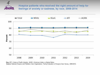
Hospice patients who received the right amount of help for feelings of anxiety or sadness, by race, 2008-2014
Image: Chart shows hospice patients who received the right amount of help for feelings of anxiety or sadness, by race, 2008-2014:
| Race | 2008 | 2009 | 2010 | 2011 | 2012 | 2013 | 2014 |
|---|---|---|---|---|---|---|---|
| Total | 90.3 | 90.6 | 90.5 | 90.5 | 90.6 | 90.6 | 90.7 |
| AI/AN | 85 | 88.5 | 86.4 | 84.2 | 86.3 | 83.9 | 87.3 |
| API | 81.1 | 79.5 | 79.4 | 76.4 | 81.4 | 80.3 | 80.2 |
| Black | 86.1 | 85.1 | 85.8 | 86 | 84.3 | 85 | 85.4 |
| White | 91.1 | 91.5 | 91.3 | 91 | 91.4 | 91.4 | 91.4 |
Key: API = Asian or Pacific Islander; AI/AN = American Indian or Alaska Native.
Source: National Hospice and Palliative Care Organization, Family Evaluation of Hospice Care Survey, 2008-2014.
Note:
- Importance: Hospice care includes practical, psychosocial, and spiritual support for the patient and family.
- Overall Rate: In 2014, 90.7% of hospice patients received the right amount of help for feelings of anxiety or sadness.
- Trends: From 2008 to 2014, there were no statistically significant changes in the percentage of hospice patients who received the right amount of help for feelings of anxiety or sadness overall or for any racial groups.
- Groups With Disparities: In 2014, compared with Whites, Blacks (85.4%), Asians and Pacific Islanders (APIs) (80.2%), and American Indians and Alaska Natives (AI/ANs) (87.3%) were significantly less likely to receive the right amount of help for feelings of anxiety or sadness.
Slide 107

Hospice patients who received care consistent with their stated end-of-life wishes, by race, 2008-2014
Image: Chart shows hospice patients who received care consistent with their stated end-of-life wishes, by race, 2008-2014:
| Race | 2008 | 2009 | 2010 | 2011 | 2012 | 2013 | 2014 |
|---|---|---|---|---|---|---|---|
| Total | 94.2 | 94.6 | 94.4 | 94.6 | 94.8 | 94.8 | 94.8 |
| White | 94.7 | 95.0 | 94.8 | 95.2 | 95.3 | 95.4 | 95.6 |
| Black | 87.6 | 89.1 | 89.9 | 89.0 | 89.3 | 89.4 | 89.1 |
| API | 87.1 | 83.0 | 90.6 | 86.2 | 85.9 | 85.8 | 85.8 |
| AI/AN | 90.2 | 89.9 | 85.6 | 88.5 | 89.5 | 88.5 | 89.1 |
Key: API = Asian or Pacific Islander; AI/AN = American Indian or Alaska Native.
Source: National Hospice and Palliative Care Organization, Family Evaluation of Hospice Care Survey, 2008-2014.
Note:
- Importance: The goal of end-of-life care is to achieve a "good death," defined by the Institute of Medicine as "free from avoidable distress and suffering for patients, families, and caregivers; in general accord with the patients' and families' wishes; and reasonably consistent with clinical, cultural, and ethical standards" (Field & Cassell, 1997).
- Overall Rate: In 2014, the percentage of hospice patients who received care consistent with their stated end-of-life wishes was 94.8%.
- Trends: From 2008 to 2014, the percentage of hospice patients who received care consistent with their stated end-of-life wishes improved overall and for White hospice patients. There were no statistically significant changes among Black, API, or AI/AN hospice patients.
- Groups With Disparities: In 2014, Black, API, and AI/AN hospice patients were significantly less likely than White hospice patients to receive care consistent with their stated end-of-life wishes.
Slide 108
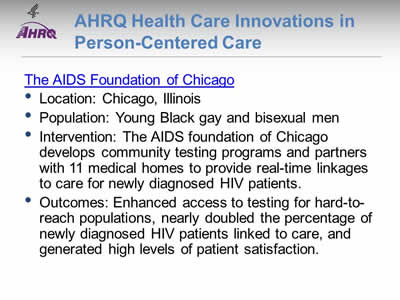
AHRQ Health Care Innovations in Person-Centered Care
The AIDS Foundation of Chicago
- Location: Chicago, Illinois.
- Population: Young Black gay and bisexual men.
- Intervention: The AIDS foundation of Chicago develops community testing programs and partners with 11 medical homes to provide real-time linkages to care for newly diagnosed HIV patients.
- Outcomes: Enhanced access to testing for hard-to-reach populations, nearly doubled the percentage of newly diagnosed HIV patients linked to care, and generated high levels of patient satisfaction.
Slide 109

National Healthcare Quality and Disparities Report Chartbook on Health Care for Blacks
Part 3: Trends in Access and Priorities of the National Quality Strategy
NQS Priority: Care Coordination
Slide 110
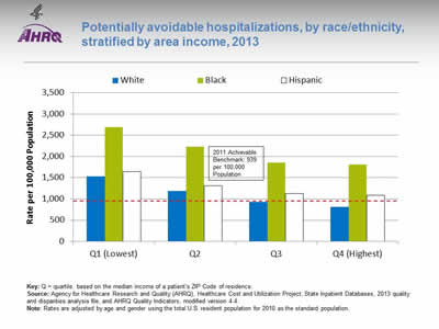
Potentially avoidable hospitalizations, by race/ethnicity, stratified by area income, 2013
Image: Chart shows potentially avoidable hospitalizations, by race/ethnicity, stratified by area income, 2013:
| Quartile | White | Black | Hispanic |
|---|---|---|---|
| Q1 (Lowest) | 1536.3 | 2695.9 | 1641.5 |
| Q2 | 1187.6 | 2230.4 | 1309 |
| Q3 | 930.3 | 1855 | 1131.4 |
| Q4 (Highest) | 815.2 | 1810.9 | 1085 |
2011 Achievable Benchmark: 939 per 100,000 Population.
Key: Q = quartile. based on the median income of a patient's ZIP Code of residence.
Source: Agency for Healthcare Research and Quality (AHRQ), Healthcare Cost and Utilization Project, State Inpatient Databases, 2013 quality and disparities analysis file, and AHRQ Quality Indicators, modified version 4.4.
Note: Rates are adjusted by age and gender using the total U.S. resident population for 2010 as the standard population.
- Groups With Disparities: In 2013, in all income groups, rates of potentially avoidable hospitalizations were higher for Blacks than for Whites. Rates for Whites in the lowest income quartile were lower than the rates for Blacks in the highest income quartile.
- Achievable Benchmark:
- In 2011, the top 4 State achievable benchmark for all potentially avoidable hospitalizations was 939 per 100,000 population. The States that contributed to the achievable benchmark are Hawaii, Oregon, Utah, and Washington.
- Whites in the two highest income quartiles have already achieved the benchmark. No other groups have achieved the benchmark.
Slide 111
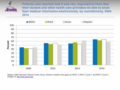
Patients who reported that it was very important to them that their doctors and other health care providers be able to share their medical information electronically, by race/ethnicity, 2008-2014
Image: Chart shows patients who reported that it was very important to them that their doctors and other health care providers be able to share their medical information electronically, by race/ethnicity, 2008-2014:
| Race | 2008 | 2012 | 2013 | 2014 |
|---|---|---|---|---|
| White | 44.4 | 55.2 | 54.3 | 64.8 |
| Black | 42.2 | 52.7 | 57 | 62.1 |
| Asian | 41.7 | 55.3 | 52.9 | 64.9 |
| Hispanic | 44.9 | 51.9 | 62.2 | 58.3 |
Source: Health Information National Trends Survey. Iterations included in this graph are HINTS 3, HINTS 4 Cycle 1, and HINTS 4 Cycle 2. Available at http://hints.cancer.gov/.
Note:
- Trends: From 2008 to 2014, the percentage of Black, White, Asian, and Hispanic patients who reported that it was very important that their doctors and other health care providers be able to share their medical information electronically increased significantly.
- Groups With Disparities: In 2014, there were no statistically significant differences between Blacks and Whites in the percentage who reported that it was very important that their doctors and other health care providers be able to share their medical information electronically.
Slide 112
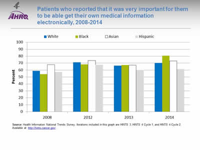
Patients who reported that it was very important for them to be able get their own medical information electronically, 2008-2014
Image: Chart shows patients who reported that it was very important for them to be able get their own medical information electronically, 2008-2014:
| Race | 2008 | 2012 | 2013 | 2014 |
|---|---|---|---|---|
| White | 58.8 | 71.1 | 66.4 | 70.3 |
| Black | 54.1 | 68.1 | 67.2 | 80.9 |
| Asian | 67.6 | 73.8 | 67.2 | 73 |
| Hispanic | 57.1 | 67.6 | 60.2 | 61.2 |
Source: Health Information National Trends Survey. Iterations included in this graph are HINTS 3, HINTS 4 Cycle 1, and HINTS 4 Cycle 2. Available at http://hints.cancer.gov/.
Note:
- Trends: From 2008 to 2014, the percentage of Black patients who reported that it was very important to be able to get their medical information electronically increased from 54.1% to 80.9%; for Whites, the percentage increased from 58.8% to 70.3%.
- Groups With Disparities: In 2014, the percentage of patients who reported that it was very important to be able to get their medical information electronically was 80.9% for Blacks, 70.3% for Whites, 73.0% for Asians, and 61.2% for Hispanics.
Slide 113
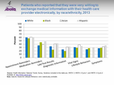
Patients who reported that they were very willing to exchange medical information with their health care provider electronically, by race/ethnicity, 2013
Image: Chart shows patients who reported that they were very willing to exchange medical information with their health care provider electronically, by race/ethnicity, 2013:
| Type of Information | White | Black | Asian | Hispanic |
|---|---|---|---|---|
| Appointment Reminders | 60.2 | 57.4 | 61 | 59.8 |
| Medication Reminders | 36.4 | 45.8 | 39.1 | 48.4 |
| Lab/Test Results | 33.5 | 23.8 | 40.8 | 42.4 |
| Diagnostic Information | 24.2 | 19.3 | 31.4 | 32.6 |
| Vital Signs | 30.9 | 29.2 | 38.5 | 34.4 |
| Lifestyle Behaviors | 24.6 | 28.1 | 30.6 | |
| Symptoms | 27.8 | 29.3 | 32.6 | 36.6 |
Source: Health Information National Trends Survey. Iterations included in this table are; HINTS 3, HINTS 4 Cycle 1, and HINTS 4 Cycle 2. Available at http://hints.cancer.gov/.
Note: Data for Asians for Lifestyle Behaviors were statistically unreliable.
- Groups With Disparities:
- The percentage of patients very willing to exchange appointment reminders electronically was higher for Whites (60.2%) and Asians (61.0%) than for Blacks (57.4%) and Hispanics (59.8%).
- The percentage of patients very willing to exchange medication reminders electronically was higher for Blacks (45.8%) and Hispanics (48.4%) than for Whites (36.4%) and Asians (39.1%).
- The percentage of patients very willing to exchange lab/test results electronically was lower for Blacks (23.8%) than for Whites (33.5%), Asians (40.8%), and Hispanics (42.4%).
- The percentage of patients very willing to exchange diagnostic information (e.g., medical illnesses) electronically was lower for Blacks (19.3%) than for Whites (24.2%), Asians (31.4%), and Hispanics (32.6%).
- The percentage of patients very willing to exchange vital signs (e.g., heart rate, blood pressure, glucose levels) electronically was lower for Blacks (29.2%) and Whites (30.9%) than for Asians (38.5%) and Hispanics (34.4%).
- The percentage of patients very willing to exchange lifestyle behaviors (e.g., physical activity, food intake, sleep patterns) electronically was higher for Blacks (28.1%) and Hispanics (30.6%) than for Whites (24.6%).
- The percentage of patients very willing to exchange symptoms (e.g., nausea, pain, dizziness) electronically was higher for Hispanics (36.6%) and Asians (32.6%) than for Blacks (29.3%) and Whites (27.8%).
Slide 114
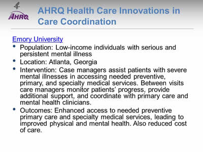
AHRQ Health Care Innovations in Care Coordination
- Population: Low-income individuals with serious and persistent mental illness.
- Location: Atlanta, Georgia.
- Intervention: Case managers assist patients with severe mental illnesses in accessing needed preventive, primary, and specialty medical services. Between visits care managers monitor patients' progress, provide additional support, and coordinate with primary care and mental health clinicians.
- Outcomes: Enhanced access to needed preventive primary care and specialty medical services, leading to improved physical and mental health. Also reduced cost of care.
Slide 115

National Healthcare Quality and Disparities Report Chartbook on Health Care for Blacks
Part 3: Trends in Access and Priorities of the National Quality Strategy
NQS Priority: Effective Treatment
Note:
- Most measures of Effective Treatment tracked in the QDR relate to priorities of the Heckler Report. Here, we illustrate effective treatment of conditions tracked in the QDR that were not priorities in the Heckler Report:
- Chronic kidney diseases.
- Musculoskeletal diseases.
- Respiratory diseases.
Slide 116
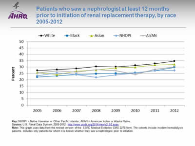
Patients who saw a nephrologist at least 12 months prior to initiation of renal replacement therapy, by race 2005-2012
Image: Chart shows patients who saw a nephrologist at least 12 months prior to initiation of renal replacement therapy, by race 2005-2012:
| Race | 2005 | 2006 | 2007 | 2008 | 2009 | 2010 | 2011 | 2012 |
|---|---|---|---|---|---|---|---|---|
| White | 27.3 | 28.0 | 28.8 | 30.4 | 30.2 | 31.3 | 32.7 | 34.7 |
| Black | 22.2 | 23.1 | 24.1 | 24.7 | 25.0 | 25.5 | 27.2 | 29.7 |
| Asian | 25.8 | 24.0 | 26.7 | 27.7 | 29.3 | 29.9 | 31.6 | 32.1 |
| AI/AN | 25.4 | 27.0 | 26 | 27.9 | 27.2 | 24.2 | 28.3 | 30.1 |
| NHOPI | 23.2 | 25.4 | 24 | 22.0 | 23.8 | 25.3 | 27.1 | 27.4 |
Key: NHOPI = Native Hawaiian or Other Pacific Islander; AI/AN = American Indian or Alaska Native.
Source: U.S. Renal Data System, 2005-2012. http://www.usrds.org/2014/view/v2_02.aspx.
Note: This graph uses data from the newest version of the ESRD Medical Evidence CMS 2278 form. The cohorts include incident hemodialysis patients. Includes only patients for whom it is known whether they saw a nephrologist prior to initiation.
- Importance:
- Early referral to a nephrologist is important for patients with progressive chronic kidney disease who are approaching kidney failure.
- Patients who begin nephrology care more than a year before kidney failure are less likely to begin dialysis with a catheter, experience infections related to vascular access, or die during the months after dialysis initiation (USRDS, 2013).
- Groups With Disparities: From 2009 to 2012, the percentage of end stage renal disease (ESRD) patients who began nephrology care at least 12 months prior to initiation of renal replacement therapy was higher for White and Asian patients than for Black, Native Hawaiian and Other Pacific Islander, and American Indian and Alaska Native patients.
Slide 117
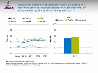
Adults with chronic joint symptoms who have ever seen a doctor or other health professional for joint symptoms, by race, 2009-2013, and by insurance, Blacks, 2013
Image: Charts show adults with chronic joint symptoms who have ever seen a doctor or other health professional for joint symptoms, by race, 2009-2013, and by insurance, Blacks, 2013:
Left Chart:
| Race | 2009 | 2010 | 2011 | 2012 | 2013 |
|---|---|---|---|---|---|
| Total | 70.5 | 69.1 | 72.1 | 72.1 | 72.0 |
| Black | 75.1 | 74.8 | 73.6 | 77.1 | 74.2 |
| White | 70.2 | 68.5 | 72.0 | 71.9 | 72.3 |
| AI/AN | 57.5 | 72.8 | 73.4 | 74.6 | 71.5 |
| Asian | 62.4 | 60.1 | 64.7 | 60.2 | 61.4 |
| >1 Race | 70.8 | 71.4 | 74.3 | 77.0 | 72.1 |
Right Chart (Insurance, Blacks, 2013):
- Private - 76.
- Public - 78.7.
- Uninsured - 55.9.
Key: AI/AN = American Indian or Alaska Native.
Source: Centers for Disease Control and Prevention, National Center for Health Statistics, National Health Interview Survey, 2009-2013.
Note: Racial groups refer to single race (e.g., White only).
- Overall: In 2013, 72% of adults with chronic joint symptoms reported seeing a doctor or other health professional for joint symptoms.
- Trends: There were no statistically significant improvements overall or among any racial group.
- Groups With Disparities:
- In 3 of 5 years, Blacks were more likely than Whites to report seeing a doctor or other health professional for joint symptoms.
- In 3 of 5 years, Asians were less likely than Whites to report seeing a doctor or other health professional for joint symptoms.
- In 2013, uninsured Blacks (55.9%) were less likely than privately insured Blacks (76%) to report seeing a doctor or other health professional for joint symptoms.
Slide 118
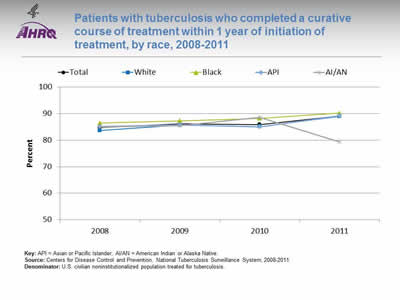
Patients with tuberculosis who completed a curative course of treatment within 1 year of initiation of treatment, by race, 2008-2011
Image: Chart shows patients with tuberculosis who completed a curative course of treatment within 1 year of initiation of treatment, by race, 2008-2011:
| Race | 2008 | 2009 | 2010 | 2011 |
|---|---|---|---|---|
| Total | 84.7 | 86.1 | 85.9 | 89.1 |
| Black | 86.4 | 87.3 | 88.2 | 90.2 |
| White | 83.6 | 85.6 | 85.1 | 88.9 |
| API | 85.1 | 85.7 | 85.0 | 89.2 |
| AI/AN | 85.0 | 85.4 | 88.5 | 79.3 |
Key: API = Asian or Pacific Islander; AI/AN = American Indian or Alaska Native.
Source: Centers for Disease Control and Prevention, National Tuberculosis Surveillance System, 2008-2011.
Denominator: U.S. civilian noninstitutionalized population treated for tuberculosis.
Note:
- Overall: In 2011, 89.1% patients with tuberculosis completed a curative course of treatment within 1 year of initiation of treatment.
- Trends: From 2008 to 2011, there were improvements overall (84.7% to 89.1%) and among Blacks (86.4% to 90.2%) and Whites (83.6% to 88.9%) in the percentage of patients with tuberculosis who completed a curative course of treatment within 1 year of initiation of treatment.
- Groups With Disparities:
- In 2 of 4 years, Blacks were more likely than Whites to have completed a curative course of treatment within 1 year of initiation.
- In 2011, AI/ANs (79.3%) were less likely than Whites (88.9%) to have completed a curative course of treatment within 1 year of initiation.
Slide 119
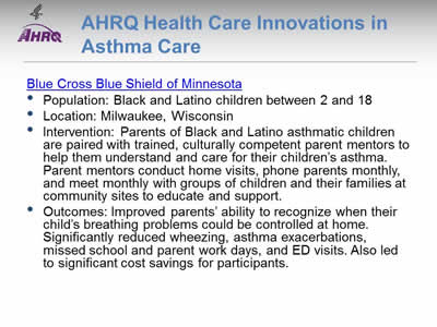
AHRQ Health Care Innovations in Asthma Care
Blue Cross Blue Shield of Minnesota
- Population: Black and Latino children between 2 and 18.
- Location: Milwaukee, Wisconsin.
- Intervention: Parents of Black and Latino asthmatic children are paired with trained, culturally competent parent mentors to help them understand and care for their children's asthma. Parent mentors conduct home visits, phone parents monthly, and meet monthly with groups of children and their families at community sites to educate and support.
- Outcomes: Improved parents' ability to recognize when their child's breathing problems could be controlled at home. Significantly reduced wheezing, asthma exacerbations, missed school and parent work days, and ED visits. Also led to significant cost savings for participants.
Slide 120

National Healthcare Quality and Disparities Report Chartbook on Health Care for Blacks
Part 3: Trends in Access and Priorities of the National Quality Strategy
NQS Priority: Healthy Living
Slide 121
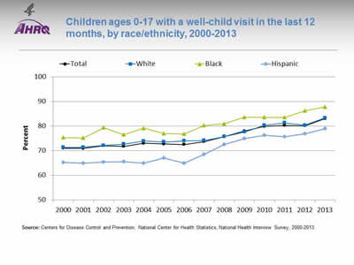
Children ages 0-17 with a well-child visit in the last 12 months, by race/ethnicity, 2000-2013
Image: Chart shows children ages 0-17 with a well-child visit in the last 12 months, by race/ethnicity, 2000-2013:
| Year | Total | White | Black | Hispanic |
|---|---|---|---|---|
| 2000 | 71.0 | 71.3 | 75.4 | 65.3 |
| 2001 | 71.0 | 71.4 | 75.2 | 64.9 |
| 2002 | 72.1 | 72.1 | 79.4 | 65.4 |
| 2003 | 71.8 | 72.7 | 76.5 | 65.6 |
| 2004 | 73.0 | 73.9 | 79.2 | 64.9 |
| 2005 | 72.8 | 73.6 | 77.0 | 67.1 |
| 2006 | 72.5 | 74.0 | 76.9 | 64.9 |
| 2007 | 73.7 | 74.1 | 80.3 | 68.5 |
| 2008 | 75.8 | 75.7 | 81.0 | 72.6 |
| 2009 | 78.0 | 77.6 | 83.6 | 74.9 |
| 2010 | 79.9 | 80.4 | 83.5 | 76.3 |
| 2011 | 80.3 | 81.3 | 83.6 | 75.8 |
| 2012 | 80.2 | 80.3 | 86.3 | 76.8 |
| 2013 | 83.0 | 83.3 | 87.8 | 79.0 |
Source: Centers for Disease Control and Prevention, National Center for Health Statistics, National Health Interview Survey, 2000-2013.
Note:
- Trends:
- Overall, the percentage of children ages 0-17 years who had a well-child visit (as distinct from a symptom-driven visit) in the last 12 months increased from 71% in 2000 to 83% in 2013.
- From 2000 to 2013, the percentage of children who had a well-child visit increased significantly for Whites (71.3% to 83.3%), Blacks (75.4% to 87.8%), and Hispanics (65.3% to 79.0%).
- Groups With Disparities:
- In all years, Hispanic children were less likely than White children to have had a well-child visit.
- In 12 of 14 years, Black children were less likely than White children to have had a well-child visit.
Slide 122

Prevention: Receipt of Recommended Vaccinations by Young Children
The U.S. Surgeon General, Dr. Vivek H. Murthy, and Elmo want everyone to stay healthy and get vaccinated!
Slide 123
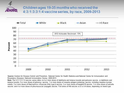
Children ages 19-35 months who received the 4:3:1:3:3:1:4 vaccine series, by race, 2009-2013
Image: Chart shows children ages 19-35 months who received the 4:3:1:3:3:1:4 vaccine series, by race, 2009-2013:
| Race | 2009 | 2010 | 2011 | 2012 | 2013 |
|---|---|---|---|---|---|
| Total | 44.3 | 56.6 | 68.5 | 68.4 | 70.4 |
| Asian | 43.1 | 60.6 | 65.9 | 71.7 | 72.8 |
| Black | 40.0 | 53.7 | 63.8 | 64.8 | 65.1 |
| White | 45.7 | 56.6 | 69.5 | 69.0 | 71.3 |
| >1 Race | 40.6 | 59.8 | 70.0 | 70.4 | 72.4 |
2012 Achievable Benchmark: 72%.
Source: Centers for Disease Control and Prevention, National Center for Health Statistics and National Center for Immunization and Respiratory Diseases, National Immunization Survey, 2009-2013.
Note: The 4:3:1:3:3:1:4 vaccine series refers to 4 or more doses of diphtheria and tetanus toxoids and pertussis vaccine, or diphtheria and tetanus toxoids; 3 or more doses of poliovirus vaccine; 1 or more doses of measles antigen-containing vaccine, including measles-mumps-rubella; 3 or more doses of Haemophilus influenzae (Hib) type b vaccine; 3 or more doses of hepatitis B vaccine; 1 or more doses of varicella vaccine; and 4 or more doses of pneumococcal conjugate vaccine. Full series of Hib vaccine is ≥3 or ≥4 doses, depending on brand type.
- Trends:
- From 2009 to 2013, the percentage of children ages 19-35 months who received the 4:3:1:3:3:1:4 vaccination series improved from 44.3% to 70.4%.
- From 2009 to 2013, the percentage of children who received all recommended vaccinations improved for Blacks (40.0% to 65.1%), Asians (43.1% to 72.8%), multiple-race children (40.6% to 72.4%), and Whites (45.7% to 71.3%).
- Groups With Disparities: In 4 of 5 years, Black children were less likely than White children to receive all recommended vaccines.
- Achievable Benchmark:
- The 2012 top 5 State achievable benchmark was 72%. The top 5 States that contributed to the achievable benchmark are Louisiana, Maryland, Massachusetts, New Hampshire, and Ohio.
- Black children could achieve the benchmark within a year. White children could achieve the benchmark in less than a year. Asian and multiple-race children have already achieved the benchmark.
Slide 124
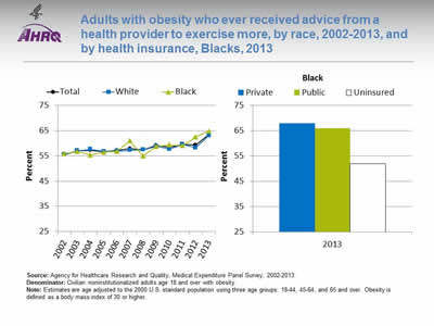
Adults with obesity who ever received advice from a health provider to exercise more, by race, 2002-2013, and by health insurance, Blacks, 2013
Image: Charts show adults with obesity who ever received advice from a health provider to exercise more, by race, 2002-2013, and by health insurance, Blacks, 2013:
Left Chart:
| Race | 2002 | 2003 | 2004 | 2005 | 2006 | 2007 | 2008 | 2009 | 2010 | 2011 | 2012 | 2013 |
|---|---|---|---|---|---|---|---|---|---|---|---|---|
| Total | 55.6 | 57.0 | 57.2 | 56.7 | 57.1 | 57.9 | 57.4 | 59.1 | 58.4 | 59.6 | 59.3 | 63.5 |
| White | 55.4 | 57.1 | 57.6 | 56.8 | 56.9 | 57.2 | 57.4 | 58.7 | 57.7 | 59.5 | 58.2 | 63 |
| Black | 55.9 | 56.7 | 55.3 | 56.4 | 56.8 | 61.0 | 55.0 | 58.8 | 59.4 | 59.0 | 62.5 | 64.8 |
Right Chart (Health insurance, Blacks, 2013):
- Private - 67.8.
- Public - 66.
- Uninsured - 51.9.
Source: Agency for Healthcare Research and Quality, Medical Expenditure Panel Survey, 2002-2013.
Denominator: Civilian noninstitutionalized adults age 18 and over with obesity.
Note: Estimates are age adjusted to the 2000 U.S. standard population using three age groups: 18-44, 45-64, and 65 and over. Obesity is defined as a body mass index of 30 or higher.
- Overall Rate: In 2013, overall, 63.5% of adults with obesity had ever received advice from a health provider to exercise more.
- Trends: From 2002 to 2013, the percentage of obese adults who ever received advice from a health provider to exercise more improved for Blacks (from 55.9% to 64.8%).
- Groups With Disparities:
- In 11 of 12 years, there were no statistically significant differences between Whites and Blacks in the percentage of adults with obesity who ever received advice from a health provider to exercise more. In 2012, the percentage of Black adults with obesity who received advice to exercise (62.5%) was higher compared with White adults with obesity (58.2%).
- In 2013, among Black adults with obesity, the percentage who ever received advice from a health provider to exercise more was lower for those without insurance (51.9%) compared with those with private insurance (67.8%).
Slide 125
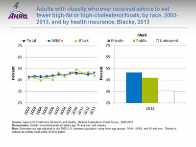
Adults with obesity who ever received advice to eat fewer high-fat or high-cholesterol foods, by race, 2002-2013, and by health insurance, Blacks, 2013
Image: Charts show adults with obesity who ever received advice to eat fewer high-fat or high-cholesterol foods, by race, 2002-2013, and by health insurance, Blacks, 2013:
Left Chart:
| Race | 2002 | 2003 | 2004 | 2005 | 2006 | 2007 | 2008 | 2009 | 2010 | 2011 | 2012 | 2013 |
|---|---|---|---|---|---|---|---|---|---|---|---|---|
| Total | 47.7 | 48.3 | 47.4 | 48.1 | 48.5 | 50.0 | 49.2 | 51.3 | 51.4 | 50.6 | 50.2 | 51.3 |
| White | 47.6 | 48.5 | 48.3 | 48.6 | 49.0 | 49.5 | 49.1 | 51.0 | 50.3 | 50.6 | 49.4 | 51.4 |
| Black | 46.8 | 47.3 | 44.8 | 47.3 | 45.4 | 51.7 | 48.3 | 50.5 | 54.5 | 51.1 | 52.3 | 49.3 |
Right Chart (Health insurance, Blacks, 2013):
- Private - 51.6.
- Public - 47.
- Uninsured - 35.4.
Source: Agency for Healthcare Research and Quality, Medical Expenditure Panel Survey, 2002-2012.
Denominator: Civilian noninstitutionalized adults age 18 and over with obesity.
Note: Estimates are age adjusted to the 2000 U.S. standard population using three age groups: 18-44, 45-64, and 65 and over. Obesity is defined as a body mass index of 30 or higher.
- Overall Rate: In 2013, overall, 51.3% of adults with obesity had ever received advice from a health provider about eating fewer high-fat or high-cholesterol foods.
- Trends: From 2002 to 2013, the percentage of adults with obesity who ever received advice about healthy eating improved for Blacks (from 46.8% to 49.3%).
- Groups With Disparities:
- There were no statistically significant differences between Whites and Blacks in the percentage of adults with obesity who ever received advice about healthy eating.
- In 2013, among Black adults with obesity, the percentage who ever received advice about healthy eating was lower for those without insurance (35.4%) compared with those with private insurance (51.6%).
Slide 126

AHRQ Health Care Innovations in Healthy Eating
- Location: Columbia, South Carolina.
- Population: Black women.
- Intervention: Using culturally tailored materials and techniques, primary care physicians and nurses engage patients in motivational counseling and goal setting. Health educators provide additional support and counseling during monthly calls.
- Outcomes: Reduced dietary fat intake and increased leisure time physical activity.
Slide 127
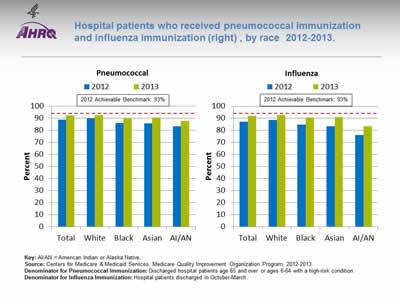
Hospital patients who received pneumococcal immunization and influenza immunization, by race 2012-2013.
Image: Charts show hospital patients who received pneumococcal immunization and influenza immunization:
Left Chart (Pneumococcal):
| Race | 2012 | 2013 |
|---|---|---|
| Total | 89 | 92.2 |
| White | 90 | 92.8 |
| Black | 86.1 | 90.3 |
| Asian | 85.7 | 90.5 |
| AI/AN | 83.5 | 87.9 |
Right Chart (Influenza):
| Race | 2012 | 2013 |
|---|---|---|
| Total | 87.2 | 92.2 |
| White | 88.6 | 92.8 |
| Black | 84.9 | 90.7 |
| Asian | 83.3 | 90.8 |
| AI/AN | 76.3 | 83.4 |
2012 Achievable Benchmark: 93%.
Key: AI/AN = American Indian or Alaska Native.
Source: Centers for Medicare & Medicaid Services, Medicare Quality Improvement Organization Program, 2012-2013.
Denominator for Pneumococcal Immunization: Discharged hospital patients age 65 and over or ages 6-64 with a high-risk condition.
Denominator for Influenza Immunization: Hospital patients discharged in October-March.
Note:
- Importance: Hospitals are important sites for ensuring that people receive needed immunizations, including pneumococcal and influenza immunizations.
- Pneumococcal Immunization:
- Overall Rate: In 2013, 92.2% of hospital patients received pneumococcal immunization.
- Groups With Disparities: In both years, the percentage of hospital patients who received pneumococcal immunization was lower among Blacks, Asians, and AI/ANs compared with Whites.
- Achievable Benchmark: The 2012 top 5 State achievable benchmark was 93%. The top 5 States that contributed to the achievable benchmark are Delaware, Florida, Ohio, South Carolina, and West Virginia. All groups were below the benchmark.
- Influenza Immunization:
- Overall Rate: In 2013, 92.2% of hospital patients received influenza immunization.
- Groups With Disparities: In both years, the percentage of hospital patients who received pneumococcal immunization was lower among Blacks, Asians, and AI/ANs compared with Whites.
- Achievable Benchmark: The 2012 top 5 State achievable benchmark was 93%. The top 5 States that contributed to the achievable benchmark are Delaware, Maryland, New Hampshire, South Carolina, and West Virginia. All groups were below the benchmark except for Whites are close to the benchmark.
Slide 128
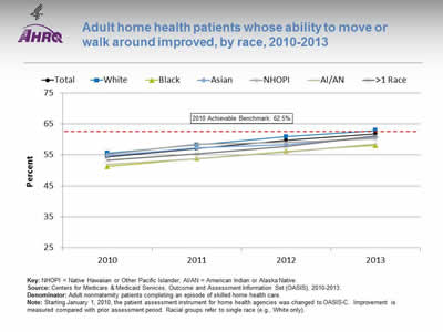
Adult home health patients whose ability to move or walk around improved, by race, 2010-2013
Image: Chart shows adult home health patients whose ability to move or walk around improved, by race, 2010-2013:
| Race | 2010 | 2011 | 2012 | 2013 |
|---|---|---|---|---|
| Total | 54.4 | 57 | 59.7 | 61.8 |
| White | 55.6 | 58.2 | 60.9 | 62.9 |
| Black | 51.2 | 53.8 | 56.2 | 58.1 |
| Asian | 54.7 | 57.3 | 58.3 | 60.7 |
| NHOPI | 55.2 | 58.4 | 59 | 60.3 |
| AI/AN | 51.9 | 53.7 | 55.9 | 58.5 |
| >1 Race | 53.3 | 55.3 | 57.8 | 61.1 |
2010 Achievable Benchmark: 62.5%.
Key: NHOPI = Native Hawaiian or Other Pacific Islander; AI/AN = American Indian or Alaska Native.
Source: Centers for Medicare & Medicaid Services, Outcome and Assessment Information Set (OASIS), 2010-2013.
Denominator: Adult nonmaternity patients completing an episode of skilled home health care.
Note: Starting January 1, 2010, the patient assessment instrument for home health agencies was changed to OASIS-C. Improvement is measured compared with prior assessment period. Racial groups refer to single race (e.g., White only).
- Importance: Many patients who receive home health care are recovering from an injury or illness and may have difficulty walking or moving around safely. Maintaining and improving functional status, such as patients' ability to ambulate, improves quality of life and allows them to stay at home as long as possible. Getting better at walking or moving around may be a sign that their health is improving.
- Overall Rate: In 2013, 61.8% of home health patients showed improvement in walking or moving around.
- Trends: From 2010 to 2013, the percentage of adult home health patients whose ability to move or walk around improved overall and for all racial groups.
- Groups With Disparities: From 2011 to 2013, White home health patients were more likely than Black and AI/AN home health patients to get better at walking or moving around.
- Achievable Benchmark:
- The 2010 top 5 State achievable benchmark was 62.5%. The top 5 States that contributed to the achievable benchmark are Maine, Missouri, New Jersey, South Carolina, and Utah.
- Whites have already achieved the benchmark. At current rates of improvement, the overall, multiple-race, and Asian rates could reach the benchmark within a year. The other racial groups could reach the benchmark within 2 years.
Slide 129
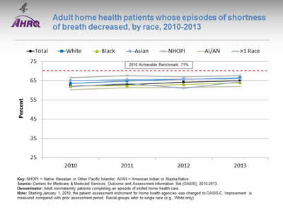
Adult home health patients whose episodes of shortness of breath decreased, by race, 2010-2013
Image: Chart shows adult home health patients whose episodes of shortness of breath decreased, by race, 2010-2013:
| Race | 2010 | 2011 | 2012 | 2013 |
|---|---|---|---|---|
| Total | 62.3 | 63.0 | 64.2 | 65.0 |
| White | 63.6 | 64.8 | 65.7 | 66.5 |
| Black | 62.2 | 62.4 | 63.0 | 63.9 |
| Asian | 65.0 | 65.5 | 65.9 | 66.0 |
| NHOPI | 66.6 | 67.6 | 67.0 | 67.7 |
| AI/AN | 60.3 | 61.4 | 61.6 | 62.1 |
| >1 Race | 61.8 | 63.7 | 61.1 | 64.5 |
2010 Achievable Benchmark: 71%.
Key: NHOPI = Native Hawaiian or Other Pacific Islander; AI/AN = American Indian or Alaska Native.
Source: Centers for Medicare & Medicaid Services, Outcome and Assessment Information Set (OASIS), 2010-2013.
Denominator: Adult nonmaternity patients completing an episode of skilled home health care.
Note: Starting January 1, 2010, the patient assessment instrument for home health agencies was changed to OASIS-C. Improvement is measured compared with prior assessment period. Racial groups refer to single race (e.g., White only).
- Importance: Many patients who receive home health care are recovering from an injury or illness and may have difficulty walking or moving around safely. Maintaining and improving functional status, such as patients' ability to ambulate, improves quality of life and allows them to stay at home as long as possible. Shortness of breath interferes with activities such as walking and is an important health status indicator.
- Overall Rate: In 2013, 65.0% of home health patients had less shortness of breath.
- Trends: From 2010 to 2013, the percentage of adult home health patients whose episodes of shortness of breath decreased improved overall and for AI/ANs, Blacks, and Whites.
- Groups With Disparities: In 2 of 4 years, AI/ANs were less likely than Whites to show improvement in shortness of breath.
- Achievable Benchmark:
- The 2010 top 5 State achievable benchmark was 71%. The top 5 States that contributed to the achievable benchmark are District of Columbia, Hawaii, Maryland, New Jersey, and South Carolina.
- At current rates of improvement, the overall rate could reach the benchmark in 6 years and the racial groups could achieve the benchmark within 9 years.
Slide 130
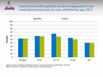
Adult home health patients whose management of oral medications improved, by race, stratified by age, 2013
Image: Chart shows adult home health patients whose management of oral medications improved, by race, stratified by age, 2013:
| Age | Black | White |
|---|---|---|
| All Ages | 52.5 | 52.6 |
| 0-64 | 58.5 | 59.4 |
| 65-74 | 57.7 | 66.1 |
| 75-84 | 49.8 | 54.3 |
| 85+ | 39.8 | 40.5 |
Source: Centers for Medicare & Medicaid Services, Outcome and Assessment Information Set, 2012.
Note: Improvement is measured compared with prior assessment period.
- Importance: Patients who have problems taking their medications as prescribed are at risk for adverse outcomes, including lack of improvement, worsening of disease, serious side effects, and death.
- Overall Rate: In 2013, 52.5% of Black home health patients got better at taking their medications.
- Groups With Disparities: In 2013, Black home health patients in age groups 75-84 (49.8%) and 85 and over (39.8%) were less likely than those ages 0-64 (58.5%) to get better at taking their medications.
Slide 131

National Healthcare Quality and Disparities Report Chartbook on Health Care for Blacks
Part 3: Trends in Access and Priorities of the National Quality Strategy
NQS Priority: Care Affordability
Slide 132
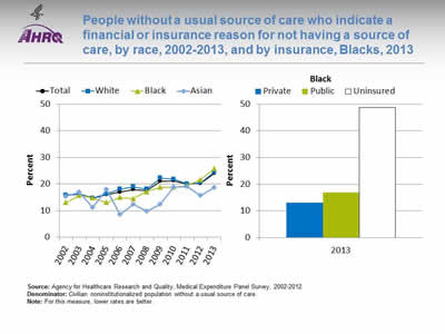
People without a usual source of care who indicate a financial or insurance reason for not having a source of care, by race, 2002-2013, and by insurance, Blacks, 2013
Image: Charts show people without a usual source of care who indicate a financial or insurance reason for not having a source of care, by race, 2002-2013, and by insurance, Blacks, 2013:
Left Chart:
| Race | 2002 | 2003 | 2004 | 2005 | 2006 | 2007 | 2008 | 2009 | 2010 | 2011 | 2012 | 2013 |
|---|---|---|---|---|---|---|---|---|---|---|---|---|
| Total | 15.6 | 16.3 | 14.8 | 16.0 | 17.0 | 18.0 | 17.6 | 21.1 | 21.2 | 19.9 | 20.2 | 24 |
| White | 15.9 | 16.3 | 14.7 | 16.3 | 18.1 | 19.0 | 18.1 | 22.2 | 21.8 | 20.0 | 20.5 | 24.5 |
| Black | 13.1 | 15.7 | 14.8 | 13.0 | 15.0 | 14.6 | 17.1 | 18.8 | 18.8 | 19.5 | 21.7 | 25.8 |
| Asian | 15.4 | 16.9 | 11.1 | 18.0 | 8.5 | 12.5 | 9.7 | 12.5 | 18.8 | 19.1 | 15.6 | 18.6 |
Right Chart (Insurance, Blacks, 2013):
- Private - 13.1.
- Public - 16.9.
- Uninsured - 48.8.
Source: Agency for Healthcare Research and Quality, Medical Expenditure Panel Survey, 2002-2012.
Denominator: Civilian noninstitutionalized population without a usual source of care.
Note: For this measure, lower rates are better.
- Importance: High-quality health care is facilitated by having a regular provider, but some Americans may not be able to afford one.
- Overall Rate: In 2013, 24% of people without a usual source of care indicated a financial or insurance reason for not having a source of care.
- Trends: The percentage worsened overall (15.6% to 24%) and among Blacks (13.1% to 25.8%) and Whites (15.9% to 24.5%).
- Groups With Disparities: In 2013, the percentage of people without a usual source of care who indicated a financial or insurance reason for not having a source of care was higher among uninsured Blacks (48.8%) compared with Blacks with private insurance (13.1%).
Slide 133
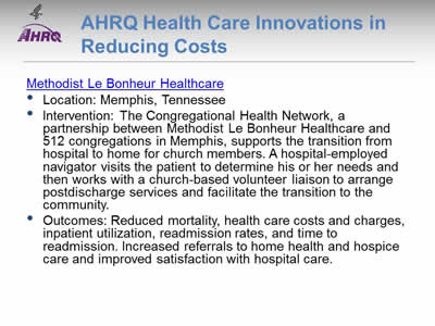
AHRQ Health Care Innovations in Reducing Costs
Methodist Le Bonheur Healthcare
- Location: Memphis, Tennessee.
- Intervention: The Congregational Health Network, a partnership between Methodist Le Bonheur Healthcare and 512 congregations in Memphis, supports the transition from hospital to home for church members. A hospital-employed navigator visits the patient to determine his or her needs and then works with a church-based volunteer liaison to arrange postdischarge services and facilitate the transition to the community.
- Outcomes: Reduced mortality, health care costs and charges, inpatient utilization, readmission rates, and time to readmission. Increased referrals to home health and hospice care and improved satisfaction with hospital care.
Slide 134
References
- Field M, Cassell C, eds. Approaching death: improving care at the end of life. Washington, DC: National Academy Press; 1997. http://www.nap.edu/catalog/5801/approaching-death-improving-care-at-the-end-of-life. Accessed February 9, 2016.
- Hwang W, Weller W, Ireys H, et al. Out-of-pocket medical spending for care of chronic conditions. Health Aff 2001;20(6):267-78. http://content.healthaffairs.org/content/20/6/267.long. Accessed February 9, 2016.
- U.S. Renal Data System. USRDS 2013 annual data report: atlas of chronic kidney disease and end-stage renal disease in the United States. Bethesda, MD: National Institutes of Health, National Institute of Diabetes and Digestive and Kidney Diseases; 2013. http://www.usrds.org/atlas.aspx. Accessed September 19, 2013.


