Explaining Comparisons of Health Care Quality Scores
It is best to keep your actual data displays as uncluttered and simple as possible. However, evidence from cognitive testing of the Agency for Healthcare Research and Quality (AHRQ) Quality Indicators (QIs) suggests that there is some information that needs to accompany the data display.[1] Key topics include the following:
- Explaining why averages are presented.
- Specifying whether a high or low score is more desirable.
- Warning against putting too much emphasis on small differences.
Explaining Why Averages Are Presented
Typically, horizontal bar graphs present the average score either on the top of the bars or in the middle of the bars. In some cases, both a State and National average are presented. But many consumers do not immediately understand why a data display includes an indication of an average score. You can help readers by saying explicitly why you're showing the average score and how they can use that information.
EXAMPLE: Explaining Averages in the Context of a Bar Graph
Title: Model Report for AHRQ Quality Indicators
Sponsor: Agency for Healthcare Research and Quality
URL: http://qualityindicators.ahrq.gov/Downloads/Modules/QI_Reporting/Model_Report_Composite.pdf
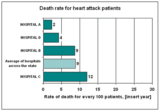
The developers of a model report for the AHRQ Quality Indicators did cognitive testing of a data display that included a note regarding averages right underneath the bar graph. They found that, when this text was added, people understood why the average was there and how to use it.
Death rate for heart attack patients
This graph shows you the percent of patients admitted to each hospital after having a heart attack (called an acute myocardial infarction), who died during their hospital stay. This information is for patients admitted during [insert year].
When you are choosing a hospital, you should look for the hospital that has a lower number of deaths. A lower number is shown by a shorter bar on the graph below.

Average of hospitals across the state: The average rate of patients who died after having a heart attack, in hospitals across your state. This number is included so you have:
- a better idea of what is typical for your state.
- a basis for comparing individual hospitals’ performance.
Specifying Whether a High or Low Score Is More Desirable
Some measurement sets include items where a high score is more desirable as well as items for which a low score is more desirable. Ideally, all your measures would be in the same direction, but sometimes that is just not possible. When you cannot show all measures in the same direction, you need to indicate clearly whether to look for a high or low score to find the best performer.
The example above shows how that can be done with two simple sentences which have been subjected to rigorous cognitive testing:
When you are choosing a hospital, you should look for the hospital that has a lower number of deaths. A lower number is shown by a shorter bar on the graph below.
Warning Against Putting Too Much Emphasis on Small Differences in Scores
It is important to warn consumers not to pay too much attention to very small differences. For example, if one medical group provided timely mammograms to 83 percent of its patients and another provided them to 85 percent, that’s not much of a difference.
When providing absolute data only with no interpretation (e.g., showing the organizations sorted into “relative” categories), it is important to have a caveat in the data displays or offer an overall caveat for the whole report.
There are two options for the caveat:
- The first is to simply say “Do not pay attention to small differences in scores.” The problem is that what is “small” to me may be “large” to you.
- The other option, and one which is also an alternative way to signal “statistically significant” differences, is to specify “Look for differences of n points or more. Smaller differences may not be meaningful.”


