Explain Whether a High or Low Health Care Quality Score Is Better
Ideally, all the measures in a given report would be structured so that people were consistently looking for a high score or a low score as an indicator of good performance. Switching directions can be confusing and create a cognitive burden on users of the information.[1]
But sometimes it is not possible to avoid switching directions. For example, a report on medical groups may include measures one would want to be high, such as patient reports on physician-patient communication, as well as measures that should be low, such as the number of medication errors.
In that situation, you will need to include a statement at the top of a data presentation explicitly saying whether users should look for a high or low score. Don’t assume that it will be self-evident. If you are changing from basketball scores to golf scores midstream, people need help reorienting.
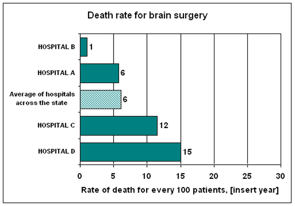
For example, a model report on the AHRQ Quality Indicators shows a bar graph about the death rate for brain surgery. Here’s the introduction to the bar graph:
EXAMPLE: Explain Whether Users Should Look for a High score or Low Score
Sponsor: Agency for Healthcare Research
URL: http://www.qualityindicators.ahrq.gov/Downloads/Modules/QI_Reporting/Model_Report_Composite.pdf

Source: Agency for Healthcare Research and Quality. Hospital Quality Model Report: Composites. 2009. Available at http://www.qualityindicators.ahrq.gov/Downloads/Modules/QI_Reporting/Model_Report_Composite.pdf.


