Scoring Different Kinds of Health Care Quality Measures
The scores you present in your report depend in large part on the kind of measure(s) you are reporting. This page reviews the scoring issues you will face with a variety of measures.
Organization-Level “Yes or No”
The simplest kind of measure involves a “yes or no” question. For example, one of the original measures from The Leapfrog Group asks, “Does your hospital have a computerized order entry system?”
Presenting Organizational Yes or No Scores. In this case, you would simply display “yes” for those hospitals that do have such a system and “no” for those that do not.
Patient-Level “Yes or No”
A “yes or no” question is not as simple when it is a response to a survey or a measure about whether a patient has or has not received a certain health service. For example, a clinical process measure may address whether patients admitted to a hospital with a heart attack received a prescription for a beta blocker when discharged. Since this measure is collected about many individuals, you need to summarize the results. This means that, as with many quality measures, you will generate a rate with a denominator and a numerator. In fact, you actually have two rates: the rate of “yeses” and the rate of “nos.”
Presenting Summarized “Yes” or “No” Scores. The simplest approach is to present only one rate. Typically, only the percentage of “yes” answers is presented. Presenting additional data is likely to complicate the situation and confuse users.
Another option is to present the percentage of “no” answers. This would give the information a negative “frame” rather than a positive one. Some research indicates that a “negative” or “risk-oriented” frame for presenting information is more likely to gain the attention of the reader. Learn more about negative and positive framing.
The choice of reporting only “yes” or “no” answers can be tricky if your measure captures a negative event, such as the percentage of hospital patients who acquired a central line infection during their stay. The “yeses” are likely to be a much smaller number than the “nos.” Do you want to tell people how often this event happened or how often it did not happen? Experience indicates that in this case, saying how often a patient safety event did happen will be easier to understand and more compelling.
Categories of Performance
A more complicated situation arises when the measure gives you more than two categories of performance. The CAHPS Clinician & Group Survey, for example, has many questions whose response options are “always,” “usually,” “sometimes,” and “never.” These questions are framed so that “always” is the most desirable response.
Presenting Multiple Categories of Scores. In social science research, it is not uncommon to find these categories translated into numbers and averaged to provide a single score. For example, “never” may be coded as “0” and “always” as “3.” The ratings of a large number of people would then be averaged to come up with a number like 1.5 or 2.3. However, this is not a statistically sound approach because it assumes that the “distance” between the categories is equal (e.g., years of education), which is not necessarily true for responses to survey questions.
An alternative approach is to present the percentage of respondents who gave each of the answers. However, cognitive testing of this approach indicates that it offers both too much data and not enough information. One solution is to show only the percentage of people who answered “always” or the percentage who answered “never.” Some data are lost with this approach, but the presentation is clearer to users. Perhaps more important, it is easier to detect variations across those being assessed.
EXAMPLE: Displaying Results for One Category Only
Title: Hospital Compare Website
Sponsor: Centers for Medicare & Medicaid Services
URL: https://www.medicare.gov/hospitalcompare/search.html?
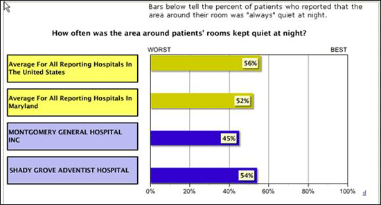
In the Hospital Compare Web site, the Centers for Medicare & Medicaid Services displays only one of several possible responses for the CAHPS Hospital Survey. Here is a bar graph showing the percentage responding “always” when asked how often the area around their rooms was kept quiet at night.

Source: Centers for Medicare & Medicaid Services, Hospital Compare, 2016. Available at: https://www.medicare.gov/hospitalcompare/search.html?.
Also in "Generating Scores that Show Differences in Performance"
- Scoring Different Kinds of Measures
- Making Adjustments to Scores
- Combining Measures Into Composites or Summary Scores
- Framing Scores as Positive or Negative


