Let Consumers Select Measures or Measure Categories To Compare
Over time, more measures are being developed that are appropriate for consumer reporting. These measures assess different entities, address different aspects of quality, and in some cases, are specific to a particular disease or condition or a certain set of treatments (e.g., surgery). This is good news, but it provides a challenge to report designers: How to avoid overwhelming users and help them get the information they want as quickly and easily as possible.
One strategy for making this kind of information manageable for users is organizing it into categories. This means that you have to help people understand the categories, many of which they may not find intuitive. Learn more about organizing measures into categories.
In a Web-based report, you can create an intuitive way for people to look just at the categories they want and the specific measures they want. Ideally, the user of a report card should be able to select a small number of health plans or providers and a manageable set of measures from different categories. This is technically feasible right now. What we don’t yet know is how to present this kind of option in a way that makes sense to someone whose computer literacy is basic rather than advanced. Experimentation and testing will be needed to move successfully in this direction.
In the meantime, this page reviews a couple of well-tested approaches to help users manage what they see.
Lists With Checkboxes or Clickable Links
You can use lists to let people choose the categories they want to see as well as the specific measures in each category.
- If you have so many measures that you have divided them into categories, make sure the user first sees a list of the categories.
- If you have self-explanatory labels for each category, limit your list to those labels. Sometimes, however, you may need a one- or two-sentence description. It is helpful to indicate how many measures are in the category. This is especially important if your description includes the names of some of the measures, so that people do not assume your examples are the only measures available.
- Decide how to let users make their choices.
- Put boxes in front of each category, so individuals can check the category(ies) they want to explore further.
- Make the label for each category a clickable link that either expands text below it on the same page/screen, or takes the user to the material in question on another page, such as those in this Web site. To make sure people know it’s a link, provide a brief instruction and follow accepted conventions for text links (e.g., underlining, changing color).
This process takes the user to a list of the specific measures in one category. Your list of measures should be in plain English, with definitions provided where necessary. Learn more about Describing Measures in User-friendly Ways.
Once users are at the list of measures, you can either use checkboxes for each measure or make the label for each measure a clickable link. Try to limit the number of times people have to make choices. Each time they are faced with another choice, there is the possibility that they will give up because they are bored, get frustrated, or don’t understand the options they are given.
A Chart with Word Icons Linked to Data
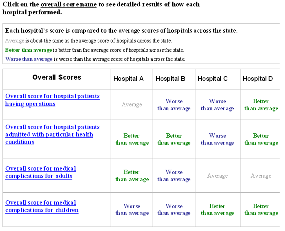
Another option for using Web functionality to help people find the data they want builds on the idea of the word icon chart. Word icon charts are a relatively new but rigorously tested approach to providing comparative data that is purely “relative,” i.e., it includes only information on the relative performance of different entities. (Learn more about Providing Self-Explanatory Symbols.)
This type of chart, whether it uses word icons or other symbols, typically has the entities being compared listed in one direction (columns or rows) and the measures listed in the other direction. This approach allows you to offer two useful layering options:
- You can link the label for each measure to more detailed information on performance for that measure.
- You can allow the user to look at all the measures for a given entity.
EXAMPLE: Offering a Way To Drill Down to Details
Title: Model Report for AHRQ Quality Indicators
Sponsor: Agency for Healthcare Research and Quality
URL: http://www.qualityindicators.ahrq.gov/Downloads/Modules/QI_Reporting/Model_Report_Composite.pdf
A model report for the Agency for Healthcare Research and Quality’s Quality Indicators demonstrates how a table can be designed to help users focus on measures within a performance category.

Source: Agency for Healthcare Research and Quality. Hospital Quality Model Report: Composites. 2009. Available at http://www.qualityindicators.ahrq.gov/Downloads/Modules/QI_Reporting/Model_Report_Composite.pdf.
Also in "Creating Pathways for Users"
- Select Health Plans or Providers To Compare
- Select Measures or Measure Categories To Compare
- Drill Down to Items Included in Composites and Summary Scores


