National Healthcare Quality and Disparities Report
Summary of Trends Across National Quality Strategy Priorities
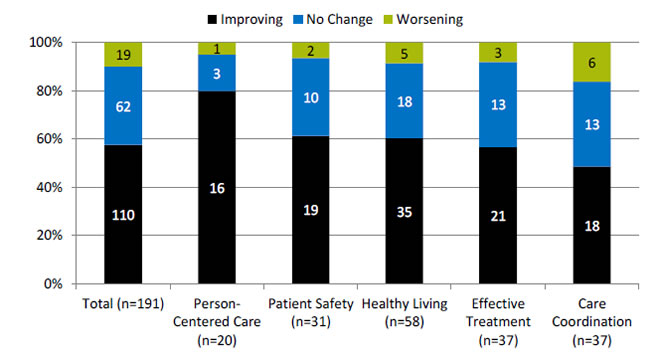
Number and percentage of all quality measures that are improving, not changing, or worsening through 2013, overall and by National Quality Strategy priority

| Quality Measures | Improving | No Change | Worsening |
|---|---|---|---|
| Total (n=191) | 110 | 62 | 19 |
| Person-Centered Care (n=20) | 16 | 3 | 1 |
| Patient Safety (n=31) | 19 | 10 | 2 |
| Healthy Living (n=58) | 35 | 18 | 5 |
| Effective Treatment (n=37) | 21 | 13 | 3 |
| Care Coordination (n=37) | 18 | 13 | 6 |
Key: n = number of measures.
Note: For most measures, trend data are available from 2001-2002 through 2013. For each measure with at least four estimates over time, unweighted log-linear regression is used to calculate average annual percentage change and to assess statistical significance. Measures are aligned so that positive change indicates improved access to care.
- Improving = Rates of change are positive at 1% per year or greater and are statistically significant.
- No Change = Rates of change are less than 1% per year or are not statistically significant.
- Worsening = Rates of change are negative at -1% per year or greater and are statistically significant.
- Through 2013, across a broad spectrum of measures of health care quality, 60% showed improvement (black).
- About 80% of measures of Person-Centered Care improved.
- About 60% of measures of Effective Treatment, Healthy Living, and Patient Safety improved.
- Fewer than half of measures of Care Coordination improved.
- There are insufficient numbers of reliable measures of Care Affordability to summarize this way.
Summary of Quality Disparities
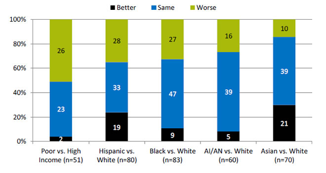
Number and percentage of healthy living measures for which members of selected groups experienced better, same, or worse quality of care compared with reference group

| Quality | Poor vs. High Income (n=51) | Hispanic vs. White (n=80) | Black vs. White (n=83) | AI/AN vs. White (n=60) | Asian vs. White (n=70) |
|---|---|---|---|---|---|
| Better | 2 | 19 | 9 | 5 | 21 |
| Same | 23 | 33 | 47 | 39 | 39 |
| Worse | 26 | 28 | 27 | 16 | 10 |
Key: AI/AN = American Indian and Alaska Native; n = number of measures.
Note: Poor indicates family income less than the Federal poverty level; High Income indicates family income four times the Federal poverty level or greater. Numbers of measures differ across groups because of sample size limitations. For most measures, data from 2012 are shown. The relative difference between a selected group and its reference group is used to assess disparities.
- Better = Selected group received better quality of care than reference group. Differences are statistically significant, are equal to or larger than 10%, and favor the selected group.
- Same = Selected group and reference group received about the same quality of care. Differences are not statistically significant or are smaller than 10%.
- Worse = Selected group received worse quality of care than reference group. Differences are statistically significant, are equal to or larger than 10%, and favor the reference group.
- People in poor households received worse care than people in high-income households for about half of healthy living measures.
- Hispanics, Blacks, and American Indians and Alaska Natives received worse care than Whites for about one-third of health living measures.
Summary of Trends in Disparities
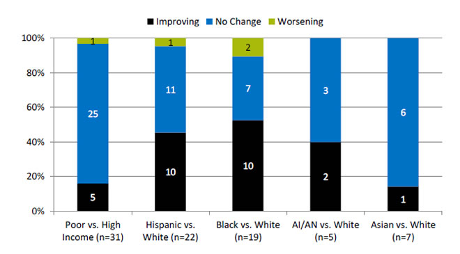
Number and percentage of health living measures with disparity at baseline for which disparities related to race, ethnicity, and income were improving, not changing, or worsening through 2013

| Disparity | Poor vs. High Income (n=31) | Hispanic vs. White (n=22) | Black vs. White (n=19) | AI/AN vs. White (n=5) | Asian vs. White (n=7) |
|---|---|---|---|---|---|
| Worsening | 1 | 1 | 2 | ||
| No Change | 25 | 11 | 7 | 3 | 6 |
| Improving | 5 | 10 | 10 | 2 | 1 |
Key: AI/AN = American Indian and Alaska Native; n = number of measures.
Note: Poor indicates family income less than the Federal poverty level; High Income indicates family income four times the Federal poverty level or greater. Number of measures differs across groups because of sample size limitations. For most measures, trend data are available from 2001-2002 to 2013.
For each measure with a disparity at baseline, average annual percentage changes were calculated for select populations and reference groups. Measures are aligned so that positive rates indicate improvement in care. Differences in rates between groups were used to assess trends in disparities.
- Worsening = Disparities are getting larger. Differences in rates between groups are statistically significant and reference group rates exceed population rates by at least 1% per year.
- No Change = Disparities are not changing. Differences in rates between groups are not statistically significant or differ by less than 1% per year.
- Improving = Disparities are getting smaller. Differences in rates between groups are statistically significant and population rates exceed reference group rates by at least 1% per year.
- Through 2013, about 40% of disparities at baseline for Hispanics and American Indians and Alaska Natives were getting smaller (black).
- More than half of disparities at baseline for Blacks were getting smaller.
- About 15% of disparities at baseline for Asians and people living in poor households were getting smaller.


