Debrief Example Audio Transcript/Facilitator Notes - Implementation Guide
Slide 1: Debrief Example
Hello everyone, I'm Jeff Durney. I'm one of the quality improvement advisers in the AHRQ Safety Program for Ambulatory Surgery, and for the next few minutes I'll be talking to you about how to turn the work you're doing in this program into a quality improvement study for the purposes of an accreditation survey. I know how challenging it can be sometimes to find new and relevant topics for QI studies, and the good news is that the work you do in this program really can lend itself to a meaningful quality improvement study, one that's going to meet the requirements of the major accrediting bodies. You know, many of the centers participating in this program had asked for a simple tool to organize this work into a presentable format that can then be easily shared with surveyors when they're on site for an accreditation survey. The tool we'll review today does just that.
Before I jump into a review of the tool itself, there are just a couple things I'd like you to keep in mind along the way. First, any quality improvement study that you might be thinking about starting in your center can fit into this framework. All the essential study elements can be found in this tool. The specific example that I'm going to share relates to the surgical safety checklist, but if your QI project is focused on infection control or if it's an efficiency study like on-time starts or a patient satisfaction project—really anything—this tool can be used to organize your project. Second, you might be wondering why we decided to share an example of a project related to the post-surgical debrief portion of the checklist. Well, we found that the debrief is one of the most common elements of the checklist that participants in the program like to work on. There are several reasons why this is true. Many places are already doing some form of a debrief, but just want to do it a little better or more consistently. The debrief also doesn't necessarily need to be led by physicians, so the physician engagement barrier is not quite as high as it may be with other elements of the checklist. There are immediate benefits of doing a good debrief, like ensuring that our problems get fixed before they are passed on to the next case, or the facilitation of a much smoother transition between the operating room and the recovery room. The quick wins that you get from doing a good debrief can really help build momentum for implementing other portions of the checklist that might be a little bit more challenging. So, without further ado, let's jump right in and take a look at the tool.
Slide 2: Problem Statement
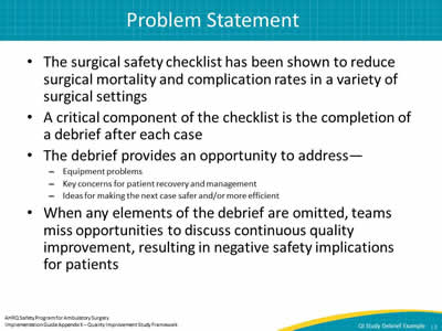
Any good quality improvement project needs to start out with what we call the problem statement. Sometimes this is called the purpose of the study, and what this does is it tells the reader what it is we’re working on. Equally important to what we're working on is why we are choosing to work on this particular project. What the problem statement helps us do is, it makes the study pass what I call the "who cares" test. Anybody looking at the study ought to look at this statement and understand clearly, here's what they're working on and this is why it's important that, in this case, they do a better job with the debrief. You want to highlight on here the consequences of not doing a debrief. Specifically, what are the things that might go wrong if we omit the debrief or we're not consistent about doing it. One thing I want to point out with the problem statement is, we never want to hint at the cause of the problem in the problem statement. Determining cause and addressing different causes, that's going to come later. And the risk of diving into the cause this early in the game is, any speculation about cause at this point is just that, it's speculation. We need to do a thorough diagnostic process before we finally decide on what really is the legitimate cause of this problem. And so, that will come later.
Slide 3: Improvement Team
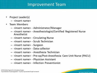
On the next slide, what you want to do here is identify your improvement team. The people that are working on the project are very important, and they need to be strategically selected. The reason why I say this is I like to say that the team members all should have fundamental knowledge of the process that you're addressing. In this case, we're working on a project related to the surgical safety checklist, so it stands to reason anybody touched by the checklist, for example all the folks who work in the OR, ought to be a part of your improvement team working on this. The reason why you want to include all the different roles is that, if you skip a role and you leave somebody out, it's going to be much harder to get buy-in amongst the people who work in that role when you actually roll something out and test it. So, make sure you include everybody and you acknowledge them here on this slide.
Slide 4: Data Description
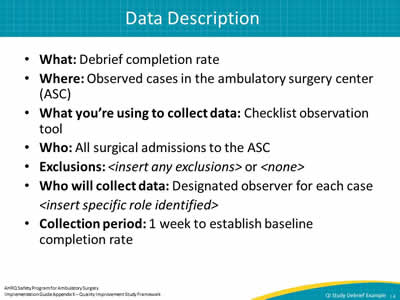
These next few slides are going to talk about data. Now, data is really important to any quality improvement study, and the reason is that you can't improve something that you can't measure. So, you want to make sure that you're tackling something that's measurable, and you want to let people know exactly how you're measuring this process. This first slide, the data description, talks about what I like to call the Ws. The what's, the where's, the who's. What is it that we're collecting? Well, we're going to look at the debrief completion rate, and we're going to observe cases in our ASC to figure that out. And we're going to use the checklist observation tool that we supply as part of this program to actually monitor some cases and see how people are doing with the debrief. You also want to include on here any exclusions of cases. If for some reason you're leaving certain cases out of the equation, you want to make that clear here, and then make it clear who's collecting all the data and for how long. In this case we're going to designate an observer, and we're going to do it for 1 week to establish a baseline collection rate.
Slide 5: Data Collection
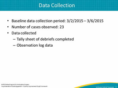
This next slide further elaborates on exactly what it is we’re collecting. Here you can see we're going to collect some baseline data over a narrow 1-week period. In that time period we're observing 23 cases. And how are we actually collecting these data? Well, we're going to keep a tally sheet of the number of debriefs that were completed, and we're going to use that observation log to actually determine if a case does a debrief or doesn't do the debrief.
Slide 6: Data Collection
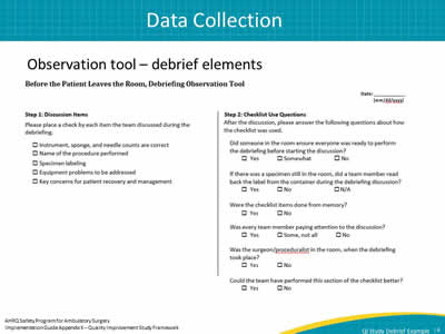
And this next slide is just an example of that data collection tool that we're using, so in this case, the observation tool. Any kind of a tool that you create to collect the data you'd want to include here so people understand exactly how you went about getting the numbers that you're going to present on the next slide.
Slide 7: Baseline Data
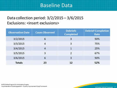
That’s what we have here. We have a display of our baseline data. We watched some cases over the course of a week, and it looks like we're hovering around 52 percent completion rate for our debrief. Now, we need to decide, is this something we're satisfied with or do we want to do better than this? Now, an important thing to point out when we're talking about baseline data is if benchmarking data is available for your particular QI study, this is where you'd want to include it, and you would want to take a look at how you're doing relative to the benchmark and decide if there's room for improvement or if you're doing well enough to move on to something else. Now, in the case of the surgical safety checklist work, there aren't a lot of benchmarks published out there, so the best you can do is benchmark against your current performance. That's what we're going to do in this case. We see that we're at 52 percent, so now we need to start thinking about setting a goal for improvement. That's what we do on this next slide, the goal.
Slide 8: The Goal
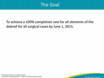
In this case, our goal is to achieve 100 percent completion rate for all elements of the debrief for all surgical cases by June 1 of 2015. Now, a couple of things to point out on here. There's an acronym SMART, S-M-A-R-T, that you can use when determining a goal. You might have heard the expression "Set a SMART goal," well, that's what we're talking about. What SMART stands for, we'll start with S. The S is for specific. The goal needs to be specific. In this case we're keeping it narrow. We're just focusing on the debrief portion of the checklist. We're not looking at all the other aspects of the checklist, just the debrief. The reason you want to keep it small is you want to keep the scope of the project small enough so that you can tackle it, and you're not trying to take on too much with one improvement effort. Then the M in SMART stands for measurable. This comes back to the issue I mentioned before about measurability. You want to make sure that you're working on something that is measurable and you have a measurable goal. In this case, we know that this is measurable. We can very easily measure the completion rate for the debrief. That's the measurability piece. Remember, you can't improve what you can't measure. Then the A in SMART stands for attainable. Can you realistically achieve this goal in the timeframe that you're proposing? Now, in this case we're choosing 100 percent, and that can be somewhat controversial. Some may say, "Well, it's not always possible to achieve 100 percent." But my thinking on this is if you're doing a project that's safety related, anything less than 100 percent on something that's good and anything greater than 0 percent on something that's bad is generally unacceptable. When it's a safety issue we're looking for perfection. That’s why we're setting 100 percent. Keep in mind, for every quality improvement project 100 percent may not always be the smartest goal for you to pick, so you need to put some thought into that. The R in SMART stands for relevant. So, relevant, again, this helps pass the "who cares" test that I talked about earlier. Is this goal aligned with the overall goals of your organization? If it is, then it's a project worth pursuing. If it's not, then you're not going to get that kind of support that you need to turn this into a reality, to see some improvement here. Finally, the T stands for timebound. You want to set a goal that has a narrow timeframe specified because you know how it goes, if you don't set a goal, if you don't have something on the calendar, it's very hard to make a meaningful improvement, and it's very easy to procrastinate. You want make sure you have a goal. In this case we set a goal of June 1.
Slide 9: Data Comparison
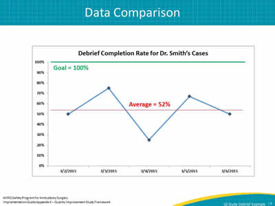
Now we want to start talking about data comparisons, and we want to look at how we're doing relative to our goal. That's what we see on this slide. And one note about creating graphs. What we've heard from many surveyors is that it's important to share your data graphically. Tables are great, but graphs really paint a good, easy-to-understand picture. You can see that right here, our average is hovering around 50 percent. You can see our goal is up there at 100, and so clearly there's room for improvement.
Slide 10: Data Comparison

We also included on the next slide an example of a hand-drawn graph. We put this in here because we want to make it clear that if you're not savvy with graphical software, things like Microsoft Excel that can generate charts and graphs for you, it's not a barrier to doing a QI study. You can hand draw these graphs, and they can tell you just as much information as anything printed with fancy software. I have to give credit to our other quality improvement adviser, Emily George, who just simply sketched this on a dry erase board in one of our conference rooms. Tells the same story as the fancy graph created with Excel, but much easier to create if that's a barrier for you.
Slide 11: Data Comparison

This is just one more way of looking at the data comparison. We can see here that our goal is at 100 percent, we're currently hovering around 50 percent for the debrief completion, and we know we're below our goal by about 48 percent. So, clearly, some work to do here.
Slide 12: Cause of the Problem
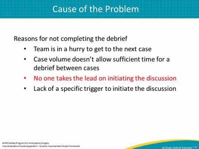
Now, let's start talking about causes of the problem. Notice that we're pretty far into the project at this point. This is slide 12. We've done a real thorough diagnosis, and now we’re ready to start talking about what might be causing us to not do the debrief as consistently as we would like. One thing to point out about causes. How you arrive at these is by talking to the people doing the work. Talk to people on the front lines, find out what it is that's stopping them from doing a debrief. Observe cases just like we did, watch what's going on out there and see what's happening at the time a debrief should be done that's possibly standing in the way of it not being done. Then, when you start thinking about what you want to actually tackle, try to focus on things that you have direct control over. This is a good example, if you look at the first two causes here, they both revolve somewhat around case volume. Now, case volume isn't something we can easily adjust without some ramifications on revenue. We can't just cut back on cases and not take a hit for that financially, so not really a viable option to cut back on the case volume. But if you look at those last two options, somebody taking the lead to initiate the debrief and then a lack of a trigger to initiate discussion, those are things that we can focus on and we can potentially change. The one that's highlighted in red here—let's just say for the sake of this example—that's the first thing we're going to tackle, this idea of nobody taking the lead on the discussion. We’ll see what that shapes up to be for an intervention.
Slide 13: Corrective Actions/Interventions
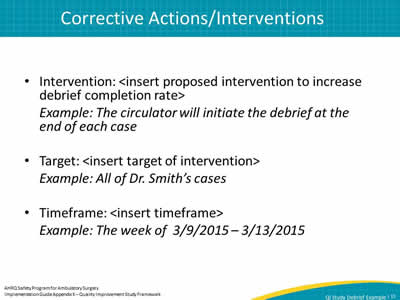
That's exactly what we talk about on this next slide, corrective actions and interventions. This is what we're going to test. This is what we're going to try to address that problem. Let's say in this case that we're going to have the circulator be the one who initiates the debrief at the end of each case. We're just going to assign that role and see if it works. Notice for the target here, we're narrowing the target down to just Dr. Smith's cases. The reason you want to do that is you want to test small. If you test small initially, it makes it much easier to change things along the way if the test isn't working out. And if the test is an utter failure, then you're only going to affect a small volume of the cases coming through your center. If you were to roll this test out to the entire center and it were to fail, you're going to impact all the cases across your entire center for the day. Much bigger problem to deal with. So start small, that's the golden rule in testing. Keep your time frame narrow, too. We picked a week here, but honestly this could be a day, it could be a couple of days. Just one case. Keep it small, and then if things start to work, then you can start spreading further down the line. Keep in mind, too, when you're picking somebody to do your testing for you, make sure that it's somebody who's bought into the process. Let's assume in this case, Dr. Smith is a surgeon who really has bought into this work, and she really wants to help and really is interested in trying this new process. Don't try to pull somebody into testing who's against what it is you're trying to test. That could set you up for failure right from the start. Also, keep in mind you can test using simulation, too. You don't have to test in real cases initially. We talk about that in our Webinar series. You can use a tabletop simulation to test this process as well before you roll out to real cases.
Slide 14: Materials Developed (optional)

The next slide, Materials Developed, this is optional. If you created something to set up this test, to facilitate this test, so if you modified your checklist, if you created scripts or guidelines, promotional materials, anything like that, this is where you would want to put that material. For this test we didn't really create anything, so we're leaving it blank.
Slide 15: Change Data
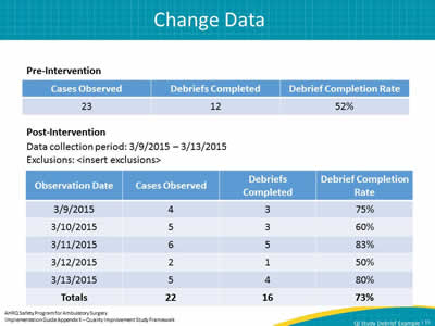
Here we have our change data, and you can see clearly that we started out at 52 percent, and now we're up to about 73 percent after we watched all these cases for the week. That's the data presented in a table format.
Slide 16: Data Comparison
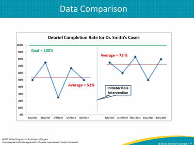
On the next slide we see it graphically presented and we talked about the value of creating some graphs, but again it tells the same story here. We can see that there's some room for improvement.
Slide 17: Data Comparison
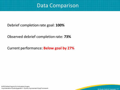
On this slide 17 here, the data comparison, this is where we have to make a decision. If we take a look at where we are, our goal was 100 percent, we're now at 73 percent. We're below our goal by about 27 percent. Whenever you've tested a change, you need to apply what we call the three A's to decide where you go from here. And what those three A's stand for is the first A stands for adopt. What adopt means is this change was successful, we reached our goal, we now want to start spreading this change throughout our center. We want to involve other surgeons, other cases. We want to make this part of the way we do business every day. The second A, adapt, that's if we find ourselves in a situation where we've made some improvement but we're not quite at our goal yet. We've got some more work to do. Maybe it means we need to tweak our intervention a little bit. Maybe it's close, but it's not quite perfect. Maybe we need to continue testing a little bit longer. Maybe we didn't give it enough time. We need to start thinking about all those possibilities because we need to adapt because we're not quite at our goal. The final A stands for abandon, and what that means is, let's say we tested something and we've seen absolutely no improvement, no hope for improvement, or worse, we've made the situation even worse. We need to go ahead and abandon that change. Don't ever be afraid to abandon a change early. If you've done something that clearly isn't working, it isn't going to work, don't keep testing just because you set out a goal to test, in this case for example, for a week. Feel free to think about stopping the testing sooner. I've worked with quality improvement teams in the past that would keep on testing even though clearly their intervention wasn't really working, and it was actually making more of a mess for themselves than they had in the first place. In that kind of a case you need to stop, abandon your plan for testing, go back to the drawing board and think of something else. In this case we find ourselves clearly in the adapt situation. We've got some more room to improve here, so let's think about what we might want to do.
Slide 18: Additional Corrective Actions or Remeasurements
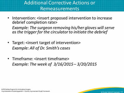
Again, this should look familiar. Additional corrective actions or remeasurements. Looks just like the slide when started our intervention. But in this case, let's go back to our causes. Remember we identified that cause of the lack of a trigger to do the debrief. Let's say we talked to the circulator, and the circulator told us that, "You know, most of the time I was able to get a debrief going, but there are a couple of times where I got sidetracked, and when I turned around to go ahead and do the debrief the surgeon was already out of the room. It would be really helpful if we had that trigger, something that always happens while the surgeon is still in the room that I could key in on and go ahead and start initiating the debrief.” Let's test that. This time around we're going to say that whenever the surgeon removes his or her gloves, that's going to serve as the cue for the circulator to start the debrief. Again, we're going to keep it down to all of Dr. Smith's cases, and we're just going to test it for a week.
Slide 19: Materials Developed (optional)
Again, we have another blank slide here for Materials Developed. You'll want to put something in there if you created anything.
Slide 20: Remeasurement
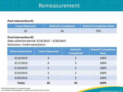
Let's look at the remeasurement again. Now look, we started at 73 percent. We're up to 100 percent completion.
Slide 21: Data Comparison
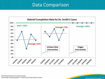
The next slide, again, just shows it graphically, but you can see that clear trend. This is the beauty of a graph. You can see sort of the steps here where you started at 52 percent, tried an intervention, improved, but not quite at goal. Tried another intervention. Now look, here we are at goal.
Slide 22: Data Comparison
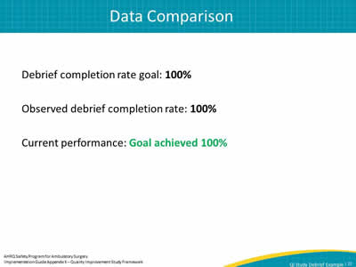
On this slide we're looking at the data comparison again in a narrative form. Our goal was 100 percent; our observed completion rate is 100 percent. The goal has been achieved; we've hit 100 percent. Now, keep in mind that this is an idealized example. In the real world it's likely that it might take multiple cycles of testing and getting some results, tweaking your intervention, testing again. You want to keep repeating the cycle over and over again until you achieve the results desired. And it might take several rounds. Don't expect it to just happen in two rounds like it did for this example. We kept it simple just for the purposes of the presentation, but just know that in reality it might take multiple times going back to the drawing board before you get what you want. In this case we'll apply the three A's, and it's pretty obvious here this is an adopt situation. We've reached our goal, let's go ahead now, let's spread this intervention to other surgeons, other operating rooms, and let’s make this the way we do business every day in our center.
Slide 23: Conclusions
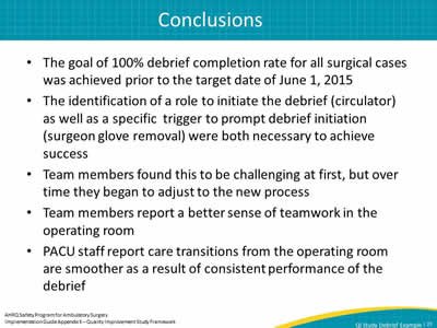
Then we start talking about conclusions. This is your opportunity to really share, what did you learn by doing all this work. Really, it ought to relate back to your change data and to your goal. Talk about what you saw happen and talk about how that relates to the goal that you set, but also this should be quantitative as well as qualitative. Quantitative, sure, we want to talk about our goal and how close we got to it or how far we were from it, but we also want to talk about the experience. How did the staff respond to this work? What are the challenges that came up that they mentioned, and how did they overcome them? This is your opportunity to tell the story, and this is going to serve as a springboard for the next project you want to take on. Really spend some time here really trying to tell that story.
Slide 24: Communication/Reporting of Findings
Then of course, communicate your findings. Let your staff know along the way how things are working out. Also, make sure you inform leadership of how this project went. Leadership buy-in and support for quality improvement work is so important, and by demonstrating that you’ve done some good work and you've gotten some good results, that's really going to help bolster support from leadership for future work. So, really make sure you communicate that information.
Slide 25: Sustaining the Gains
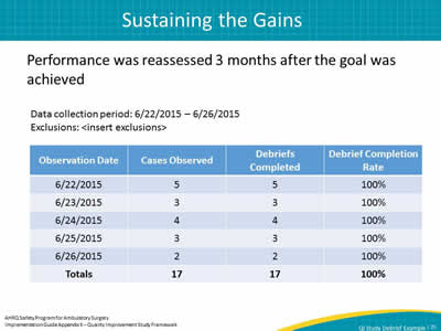
Finally, we talk about the idea of sustaining the gains. This is important, and we find that this gets overlooked quite a bit in quality improvement work. We've heard that from surveyors, and I’ve found that in my own experience and work I’ve done in the past is that we often achieve great results while testing, but then we stop looking. We walk away, and we just expect that the process is going to continue on autopilot; it's just going to keep working. But we need to keep remeasuring periodically to make sure we're sustaining those efforts that we worked so hard on. That's what this graph tells us here. We reassessed at a 3-month period after the intervention, and we see that we're still at 100 percent. Now if we weren't, what we'd want to start thinking about is why we aren’t we at 100 percent. What's changed in the period since we did our testing that we need to address? It's important to measure frequently enough so that you don't let things get too out of hand because if you wait too long, performance could actually slide all the way back to where it was before, and then you've got to start all over again, and you're starting from scratch. So, don't lose the momentum and lose those great gains that you made. Intervene early, and it'll pay off in the long run.
Slide 26: Sustaining the Gains
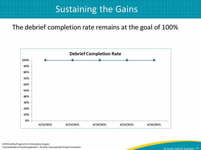
And then again, we have a graphical depiction of the data so we can see that we're at 100 percent, which is exactly where we want to be.
Slide 27: Future Work
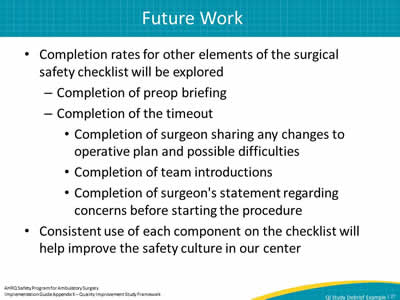
Finally, on the last slide we talk about future work. The idea here is that quality improvement work is really never done. It should really be a continuous process where opportunities for improvement are always being pursued. The surgical safety checklist is a multifaceted safety intervention, and really you could generate many QI studies out of the checklist work, and those are listed here. They all could be the subject of a study if you decide to take them on. But take the time to use the observation tool that we supply as part of the program to identify where those opportunities for improvement may be. So, I hope it's clear just how useful this tool can be to help you organize any kind of a QI study. Now that you've seen the debrief example, I encourage you to download the blank template and start inserting your own ideas for the project that you want to work on. As long as you include all the elements in the template in your project, you'll be set up for success. As always, don't hesitate to reach out to your quality improvement advisers for assistance. Thank you so much for joining me today, and best of luck in your efforts to improve the quality of care for your patients.


